Funny Bones

IMG_2806

Author: Duncan Tonatiuh

Illustrator: Duncan Tonatiuh

Publisher and Year: Abrams Books 2015

Number of pages: 35

Genre: Non-Fiction Picture Book

Analysis

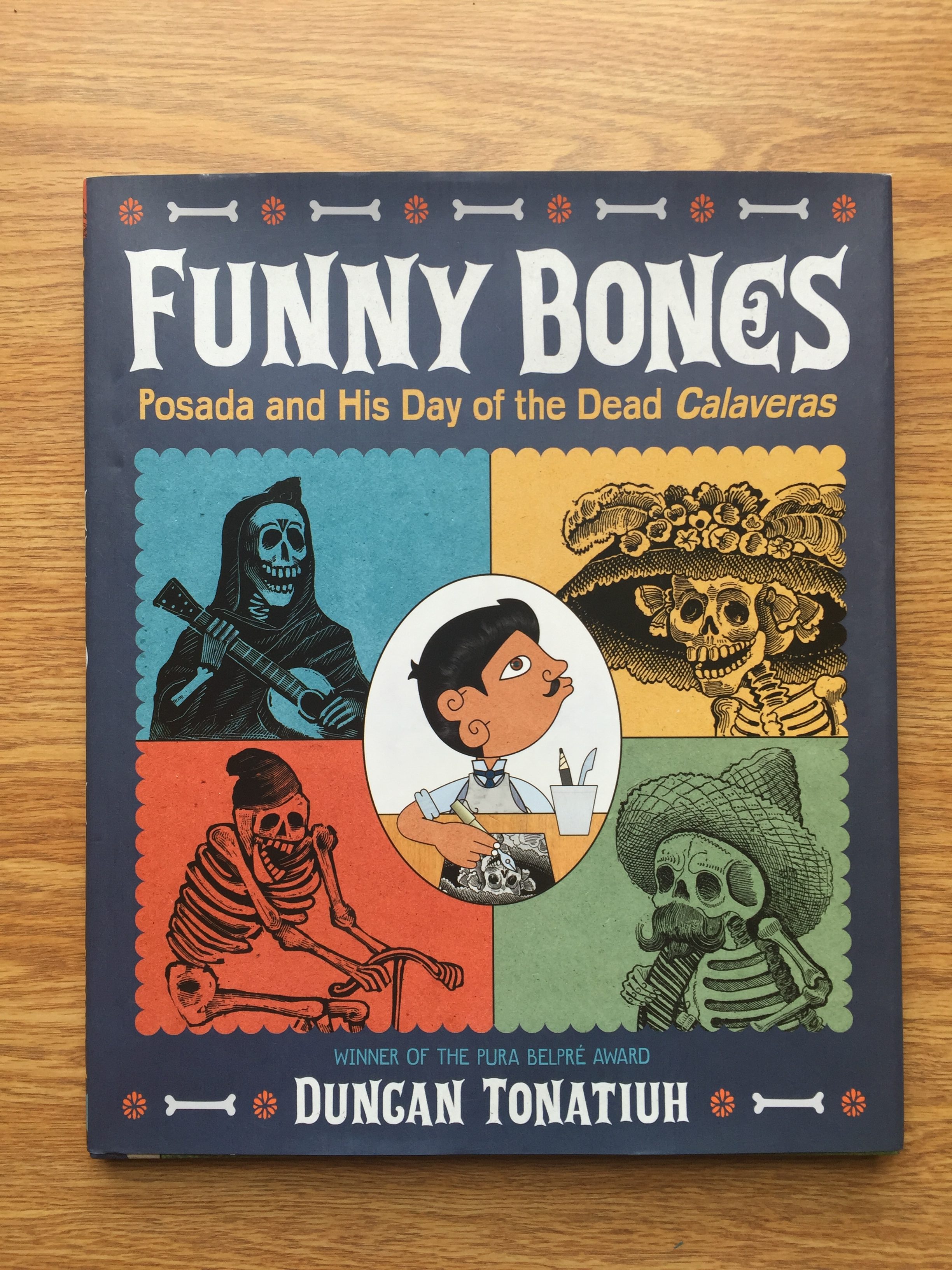
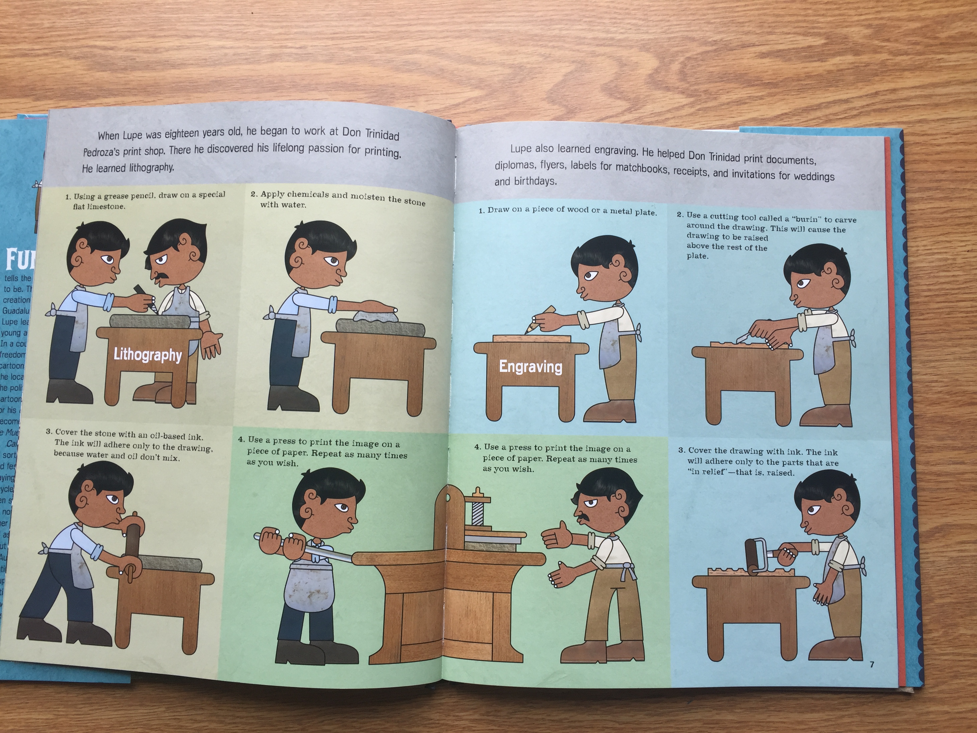
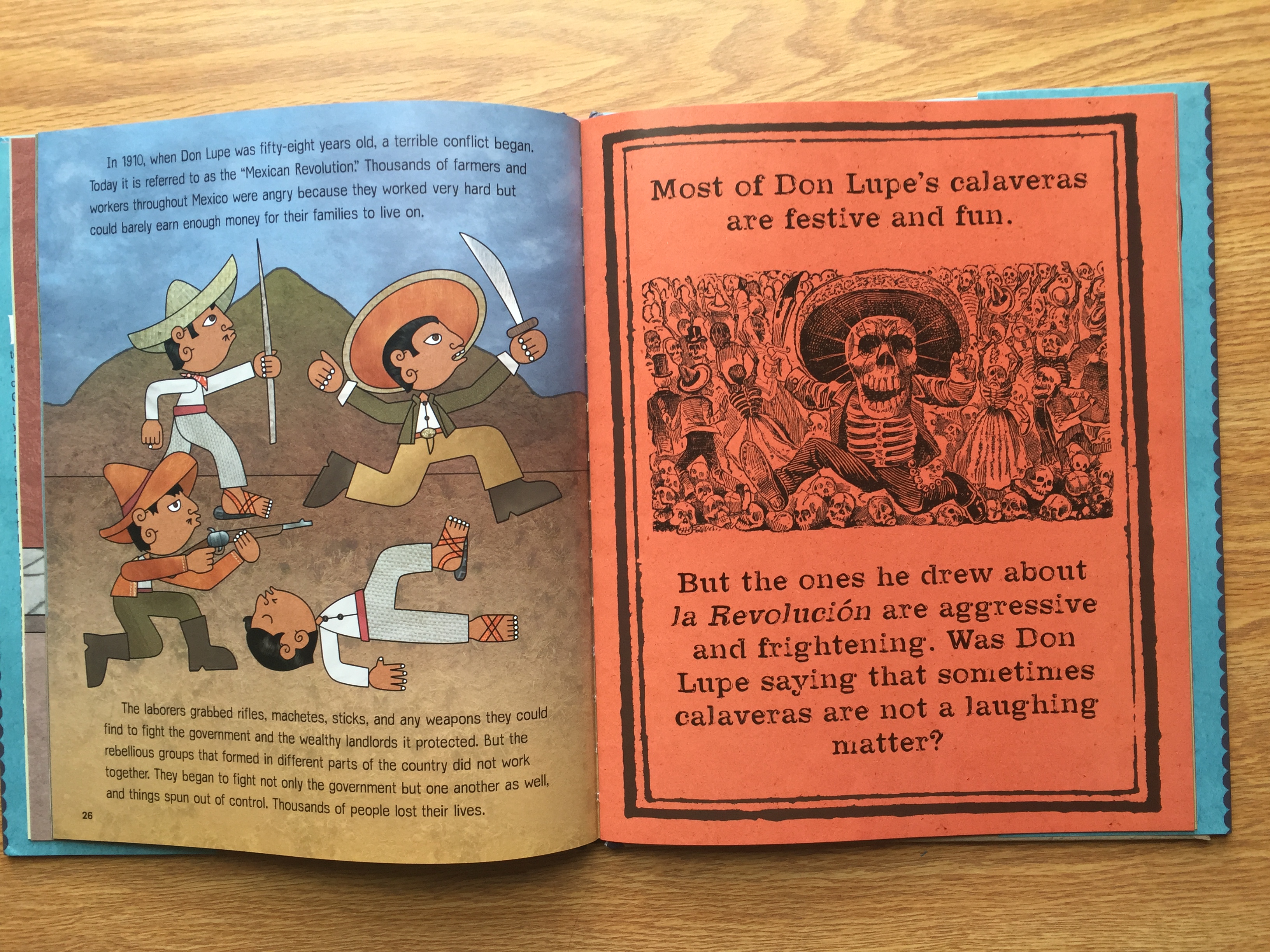
Funny Bones is the story of José Guadalupe Posada the creator of Calaveras, the festive bony figures found in Hispanic culture. The book walks through Posada’s life as he becomes an artist and eventually creates the Calaveras. The book discusses the idea that Posada created the Calaveras to show that although we are different on the outside, everyone is the same on the inside.
IMG_2807

This book is great representation of Latino culture, currently and historically.  Because the book contains copies of Posada’s actual original drawings along with Tonatiuh’s imaginative figures, it blends the historical cultural representation along with a more current cultural representation. This book also acts as a learning tool for some Spanish vocabulary. Different Spanish words are integrated into the text with a pronunciation guide and a definition. Having these words interspersed throughout the book acts as a view into the cultural context of specific words as well as a learning tool. The illustrations in the book are full of a wide range of colors. While there are many bright colors throughout the story, there is also a balance of earth tones. This makes the drawings, although done in an art style that is cartoonish, seem more realistic and helps enforce the real historical events that took place throughout José Guadalupe Posada’s life.
IMG_2808

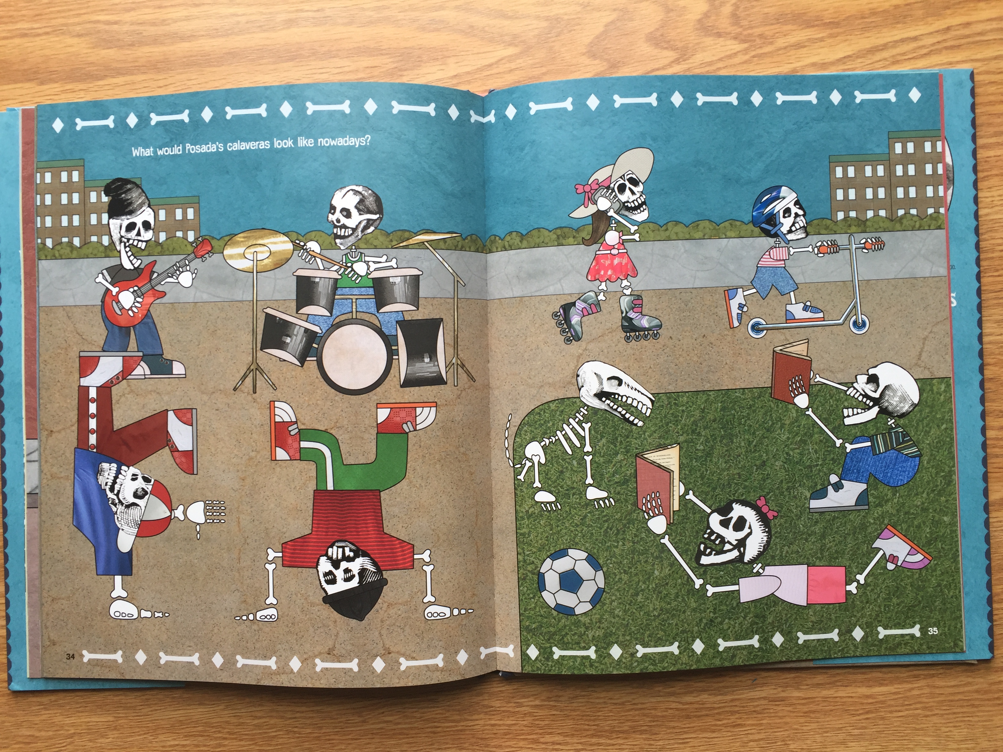
Ideologically, this book is full of empowerment and the importance of advocating for change. Posada begins his journey as an art student, but is remembered as an integral influence of change. With his creation of the Calaveras, Posada made a political statement about class divide, which was not something being discussed at the time. The book as a whole is informative about Posada’s life, but also allows for readers to ponder their own life. At the end of the book, the author asks the question “what would Posada’s Calaveras look like now a days?” which leaves room for the reader to apply Posada’s ideas to current life. This book would be a good tool in a classroom to apply Posada’s idea of Calaveras to life today. It would be easy to do an assignment focused around this idea. It is a different way to talk about Latino culture and incorporate different ideology into a classroom.
IMG_2809

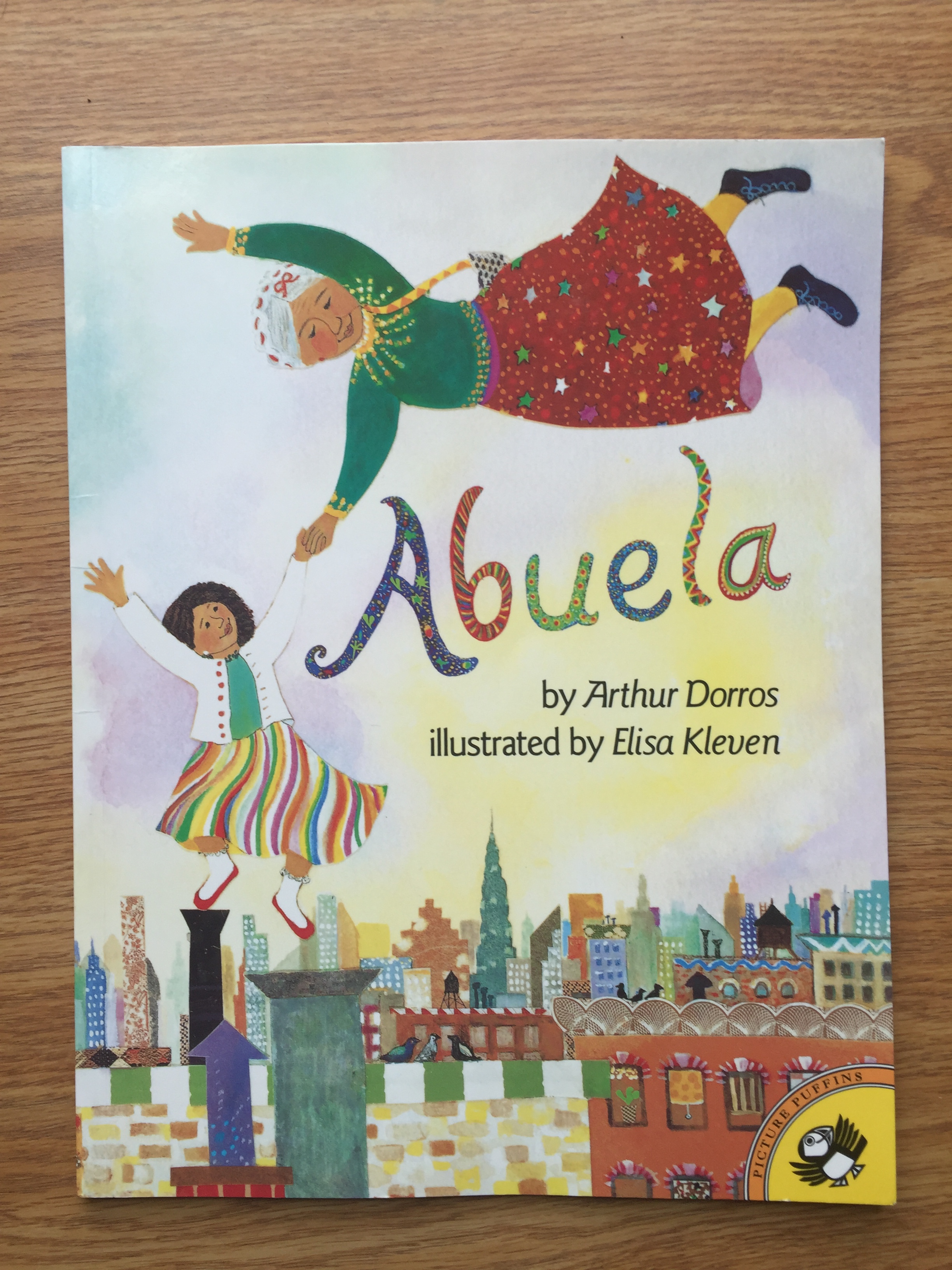
Abuela

IMG_2822

Author: Arthur Dorros

Illustrator: Elisa Kleven

Publisher and Year: Penguin Group 1991

Number of pages: 32

Genre: Fantasy Fiction Picture Book

Analysis

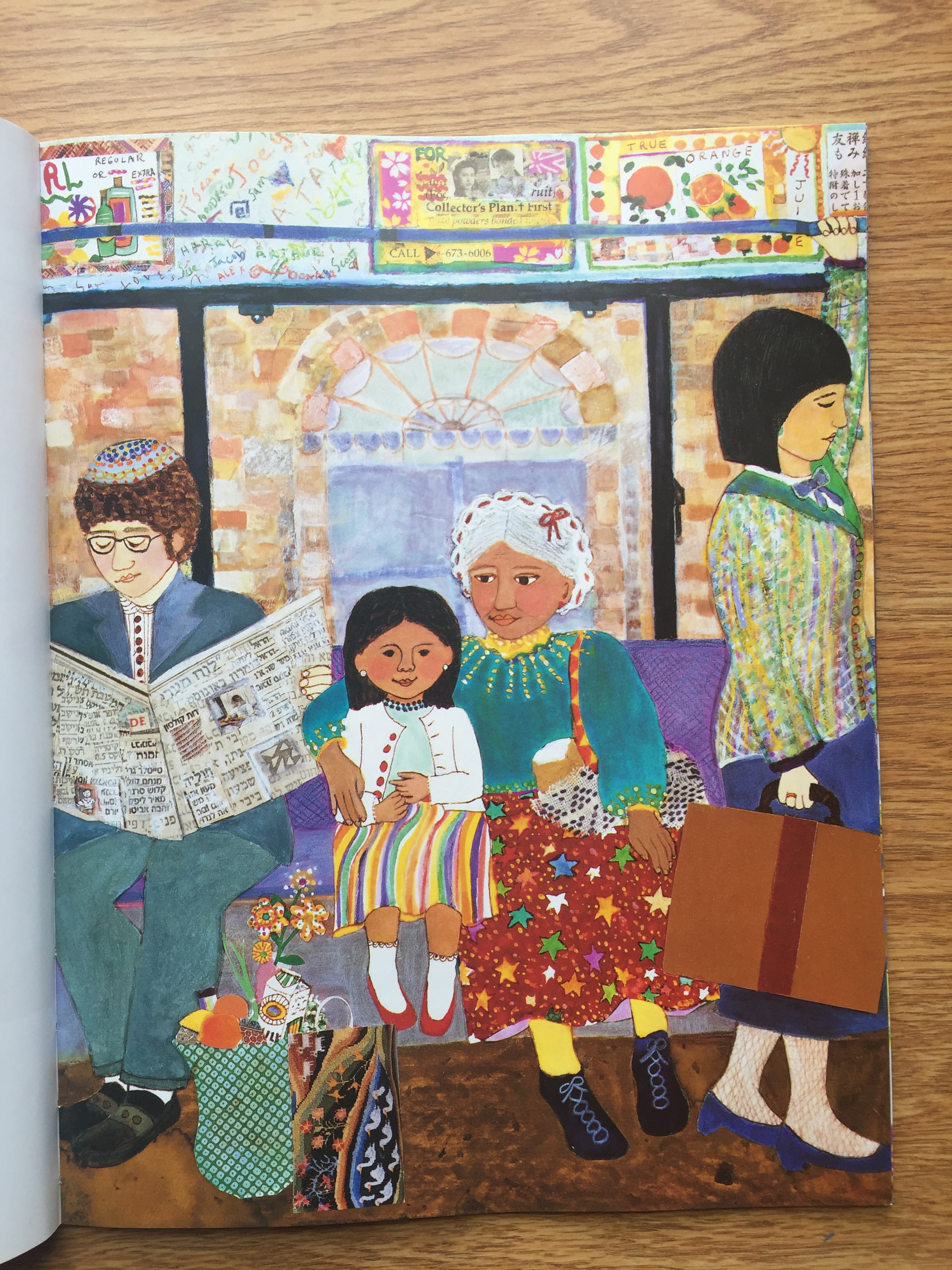
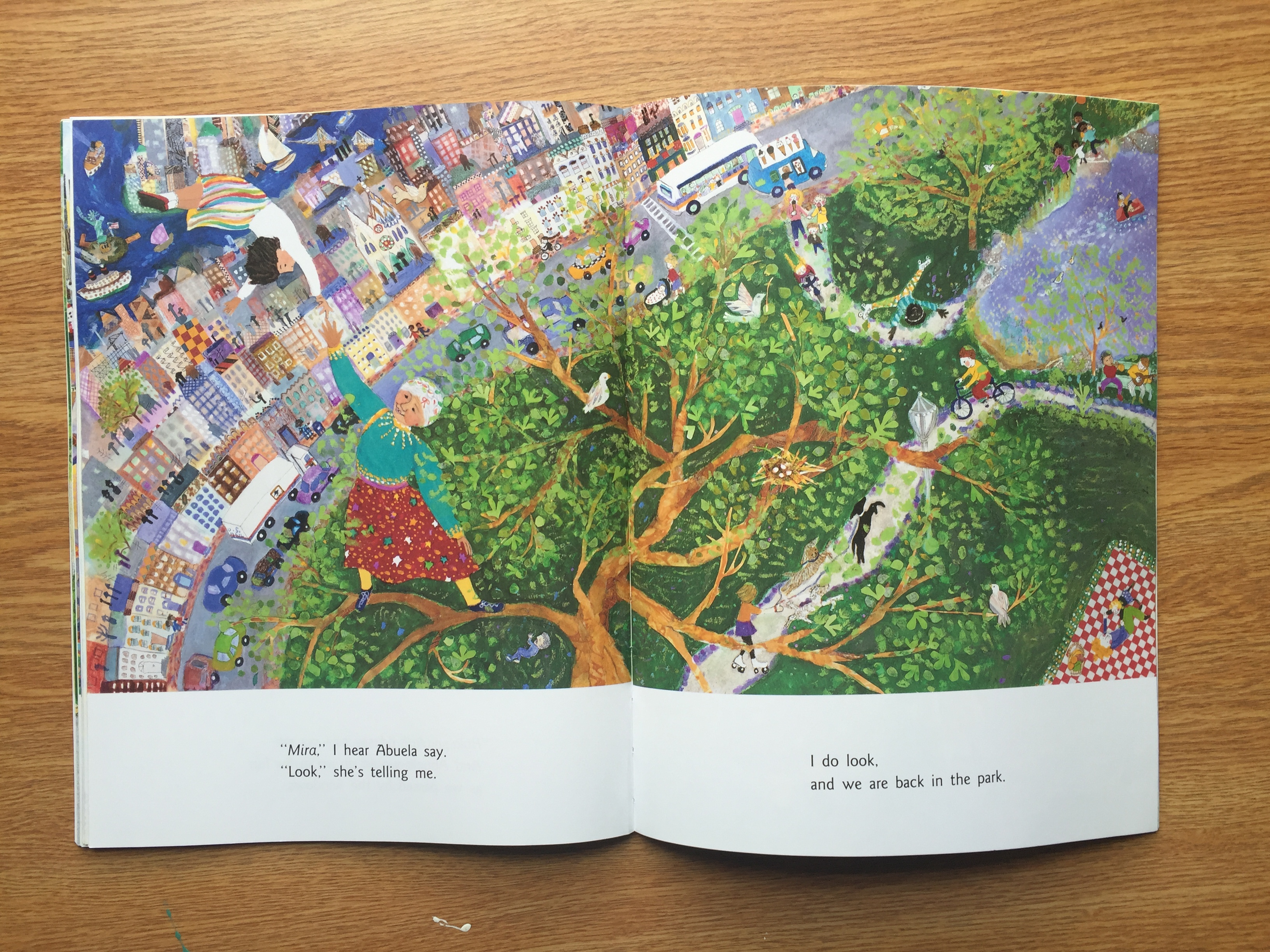
Abuela is the story of Rosalba and her Grandmother who she calls Abuela. The story begins with Rosalba and her abuela going to the park to spend the day. The story continues on a fantastical journey when Rosalba and her abuela get picked up by birds and begin flying in the sky by themselves. They fly over many different parts of New York City and say hello to many people. They continue to float around and visit different friends and family. Eventually, Rosalba and her abuela land by a lake a take a paddleboat ride.

IMG_2823

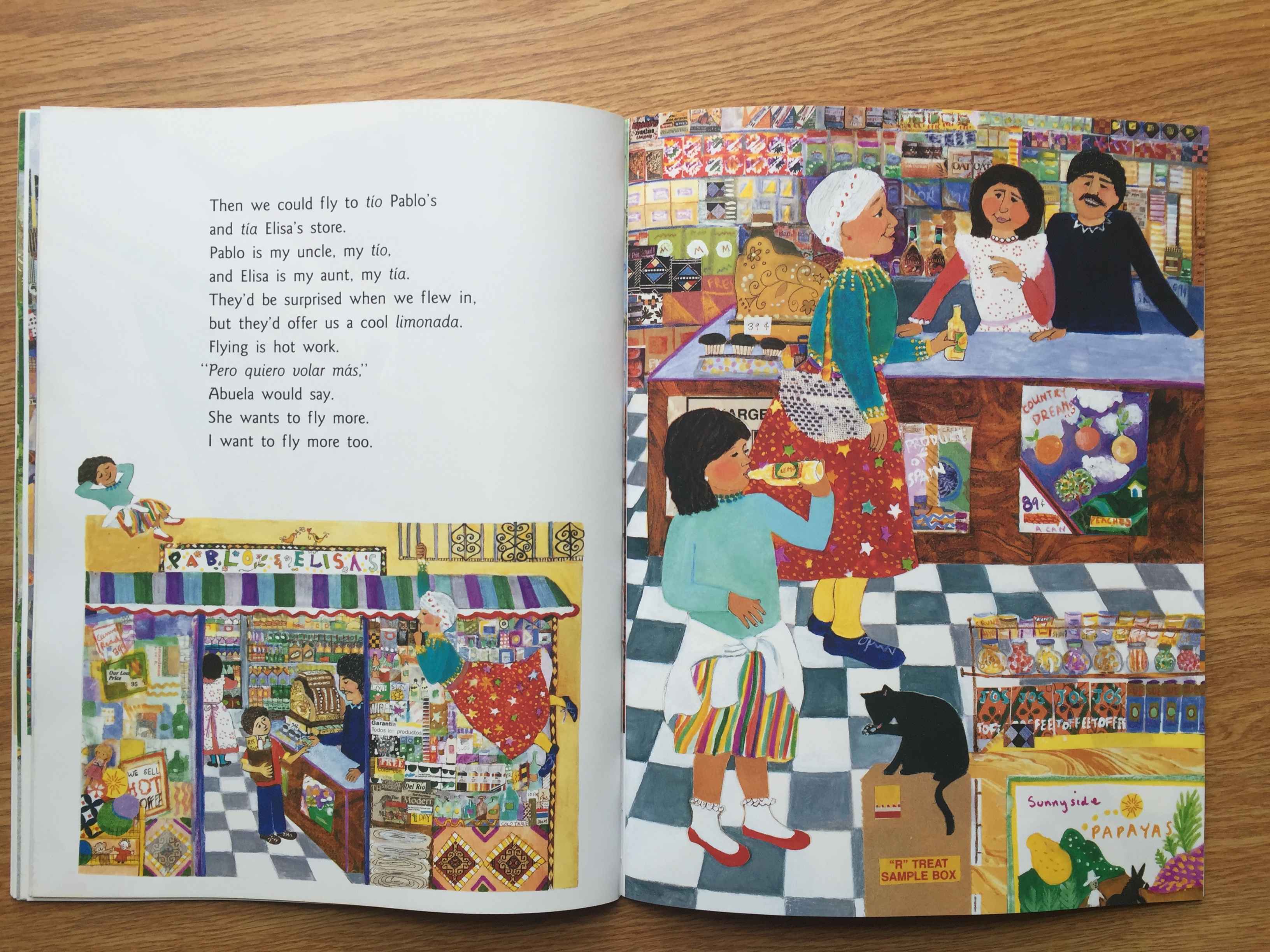
Abuela is a book that is visually very inviting to children. It contains very bright colors in everything, even though realistically the world is not that bright. It also takes care to separate the text from these inviting and exciting illustrations. Having the text in white spaces along the bottom or on another page would usually seem to separate the text from the pictures, but in this case it allows the two to work in tandem. Because of the business of the colors and patterns used in the illustrations, placing the text in its own simple space draws the eye to the text as well because of the stark contrast. It also makes it easier to read without having it over the busy pictures.

IMG_2824

Culturally, Abuela blends typical American and Hispanic culture. That is not to say that these cultures cannot coexist in a person, but rather that this book shows how they do exist. In the book, Rosalba’s abuela uses many Spanish words and then translates them so Rosalba can understand. Culturally, this can reflect the idea that some children growing up in bilingual houses in the United States tend to use and understand English more than the other language.

IMG_2825

The setting of the book is in New York City, or rather in the air above it as Rosalba and her abuela fly to different places. Having the Hispanic culture that Rosalba’s abuela brings to the book take place the most stereotypical American city combines these two cultures to represent Hispanic Americans. This book could be useful to children as a window, mirror, or door depending on what culture they identify themselves with. Overall, this book could be good tool to use in a classroom to help learn simple Spanish words. It is also a good book to have to further represent different cultures to cultivate a multicultural classroom experience.


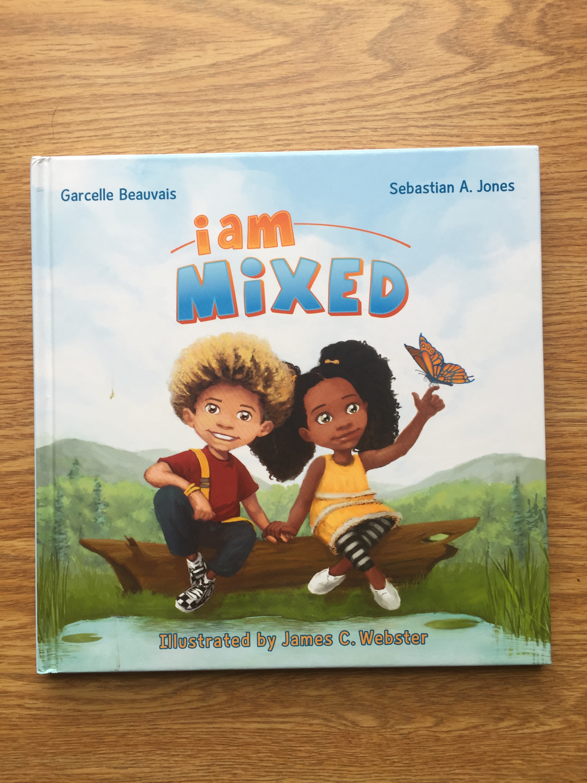
I am Mixed

IMG_2818

Authors: Garcelle Beauvais & Sebastian A. Jones

Illustrator: James C. Webster

Publisher and Year: Stranger Comics 2013

Number of pages: 36

Genre: Picture Book

Analysis

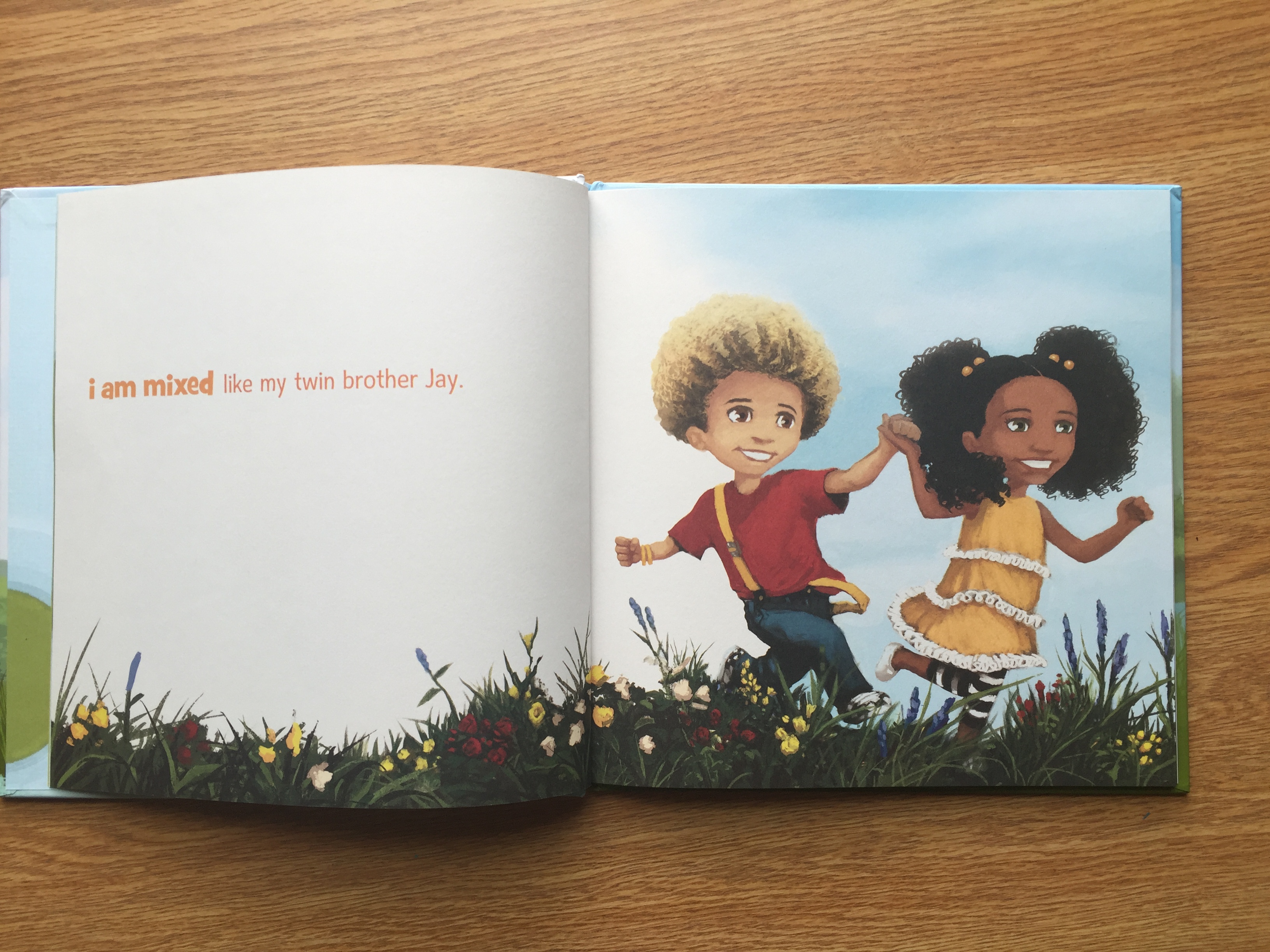
I am Mixed is a short picture book centered around two children, Nia and Jay, who are twins. The book depicts the twins with different skin tones and hair color. It starts out with Nia talking about how because she is mixed she is different than most people, even her own brother. Nia goes on to say that she loves who she is and is proud to be mixed. The book then shows Nia with her mother who is telling Nia how much she loves her. The same thing repeats with Jay and their father. The book ends with the phrase, “I am mixed,” and shows Nia and Jay smiling happily.

IMG_2819

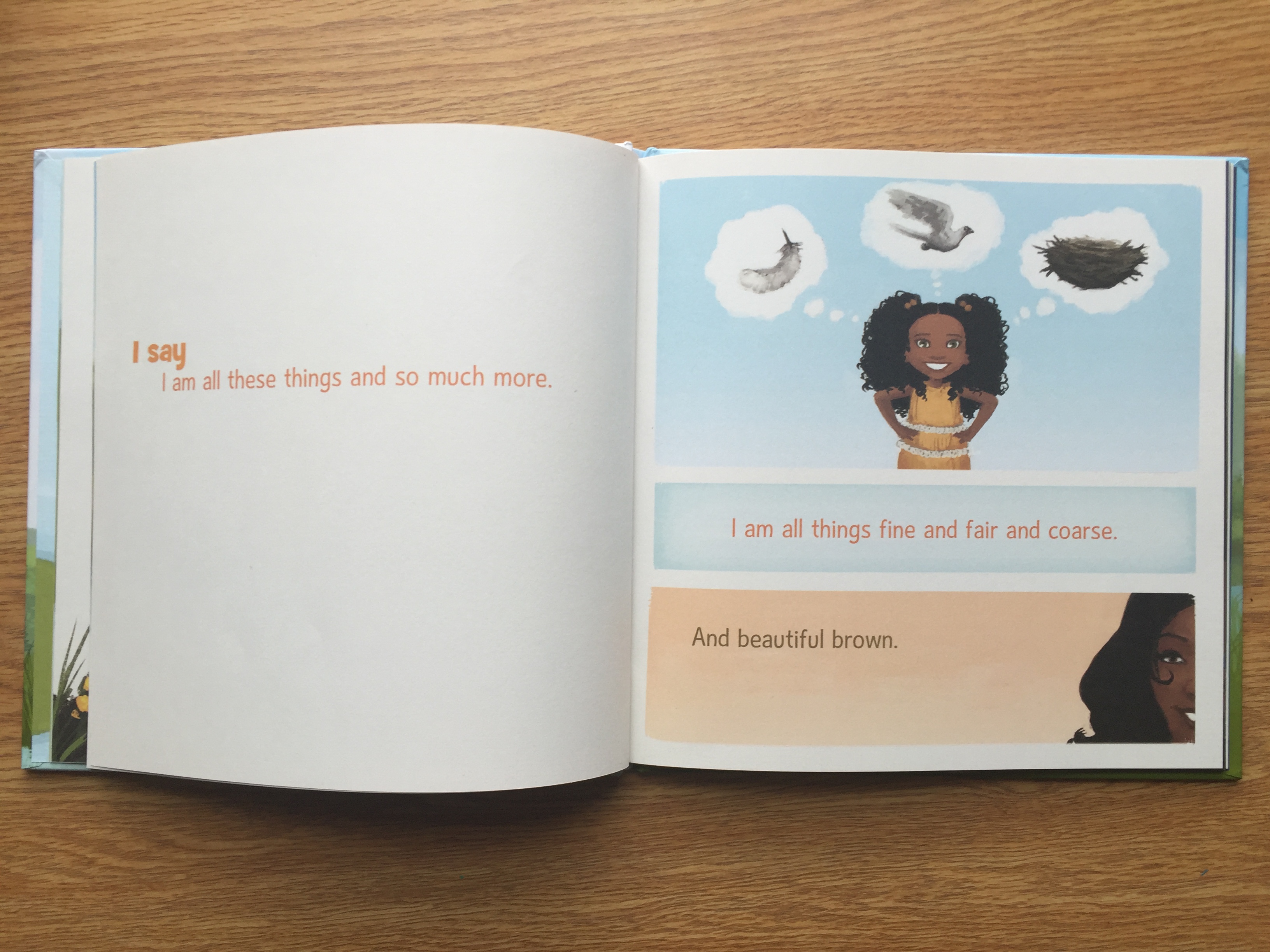
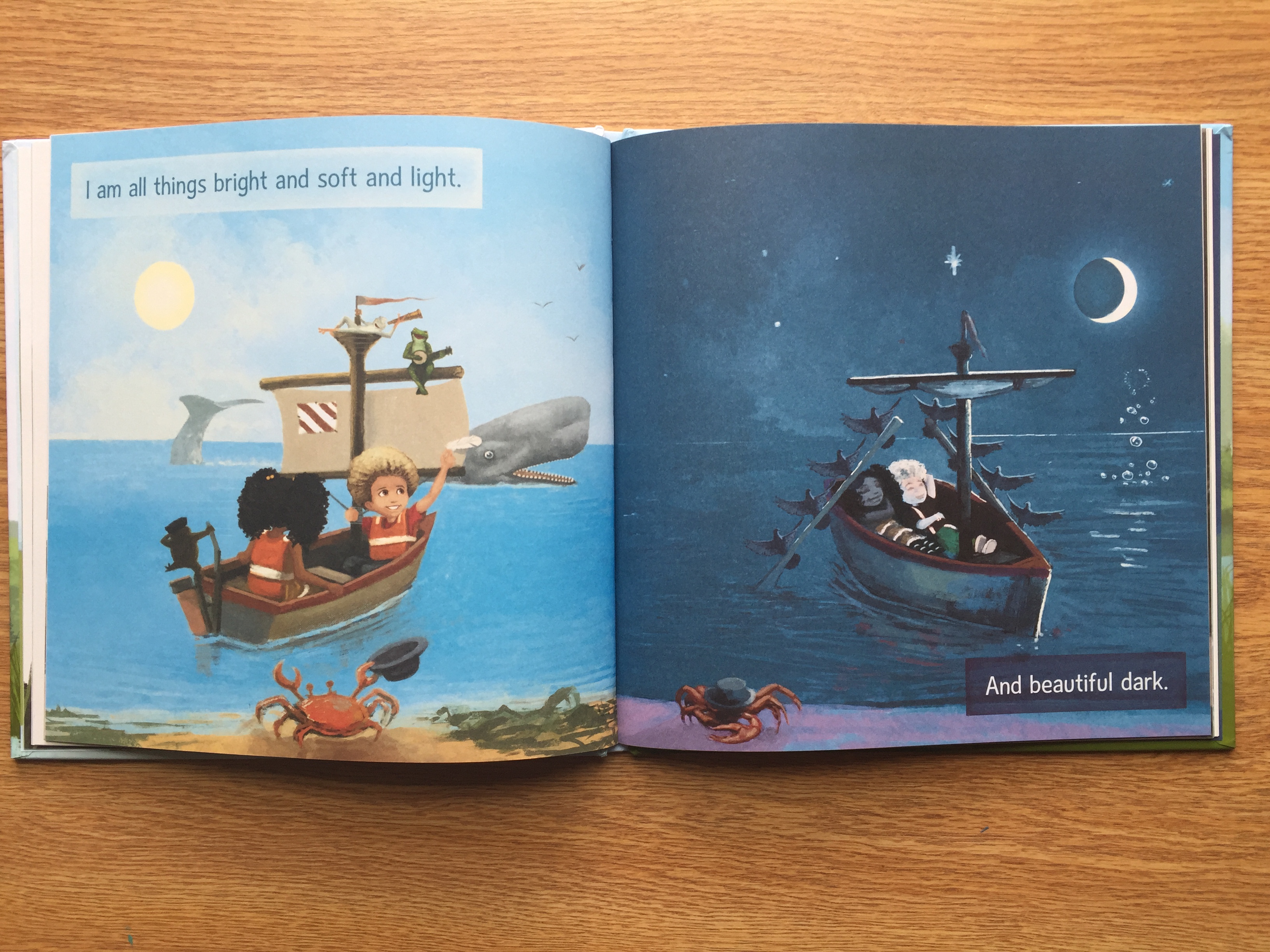
The illustrations in I am Mixed are colorful, bright, and inviting. Throughout the book, there are many pages that contrast with each other and reflect the texts meaning. While the texting is talking about the diversity of biracial or multiracial children, the illustrations are representing different cultures. On every page, Nia and Jay are smiling largely and appear to be very happy with their family and their culture. Having the Nia and Jay smile throughout the book shows that this book is geared towards encouraging biracial and multiracial children to be confident in themselves and their culture. While the drawings lean towards being cartoonish and inviting, on several pages, the smiles that Nia and Jay have seem a little unsettling. This may not be picked up by children but as an adult, some of the pictures seem a little too happy for the context.

IMG_2820

Along with the pictures in the book, the text is very kid friendly and easy to see and read. The text has a short flow to it and physically some words are emphasized through different colors of font. This text is potentially entertaining to children because it rhymes and has little text on each page and draws the attention to the illustrations. The text and the illustrations work in tandem to create a cohesive story that would be incomplete without the text or illustrations.

IMG_2821

Overall, I am Mixed is a great source of empowerment for biracial and multiracial children. It discusses the experience of biracial and multiracial children in school and in their family lives. This book can serve as positive representation for biracial and multiracial children. It can also help non-biracial children learn about biracial children and the cut down on common stereotypes biracial and multiracial children face.

Pablo Neruda: Poet of the People

IMG_2810

Author: Monica Brown

Illustrator: Julie Paschkis

Publisher and Year: Henry Hold and Company 2011

Number of pages: 26

Genre: Non-Fiction Picture Book

Analysis

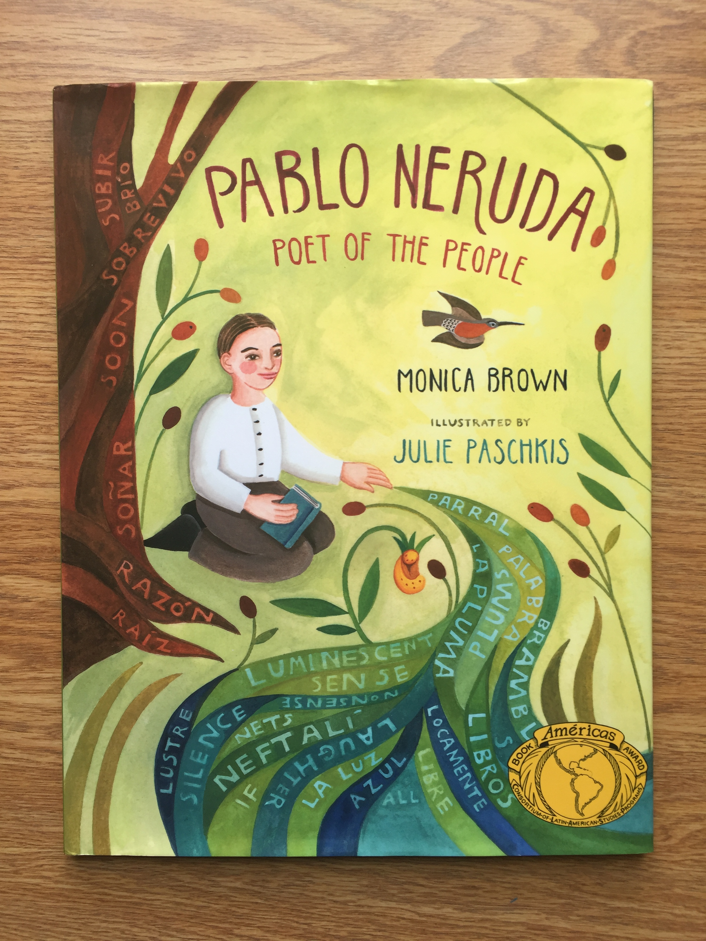
Pablo Neruda: Poet of the People is a recipient of the Américas Books Award. This book is a picturebook about Pablo Neruda, originally named Neftalí, and his experiences in Chile. In the beginning, it shows Neftalís initial interest in the nature he experiences in Chile. The book then walks through Neftalí’s schooling and the change of his name from Neftalí to Pablo Neruda. As he grows older, Neruda becomes interested in social justice and  speaking out against many injustices he sees in the world. Neruda was both an advocate and a poet and often times these two sides of him worked together. The book clearly illustrates just how Neruda was truly a poet for the people.

IMG_2811

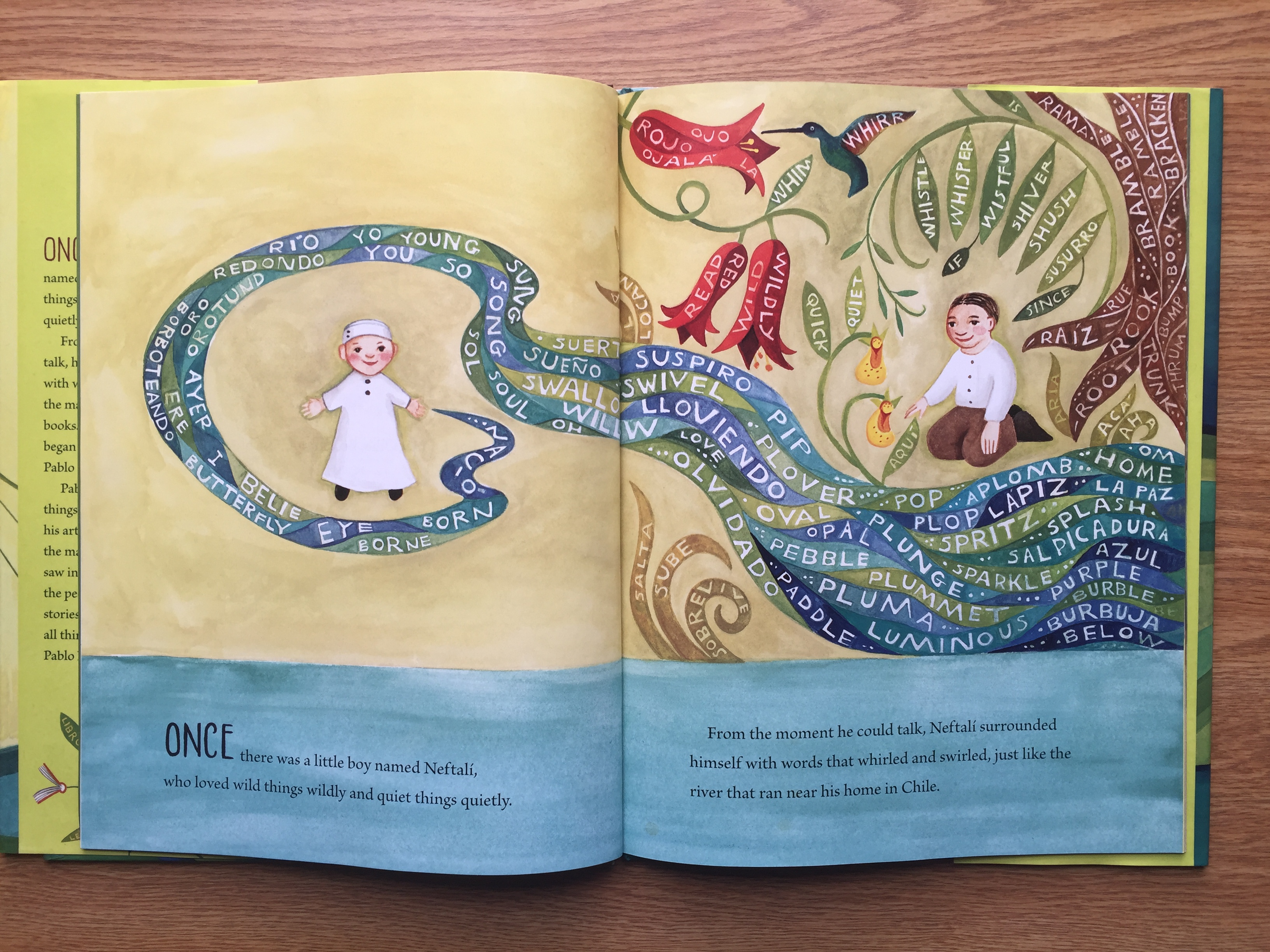
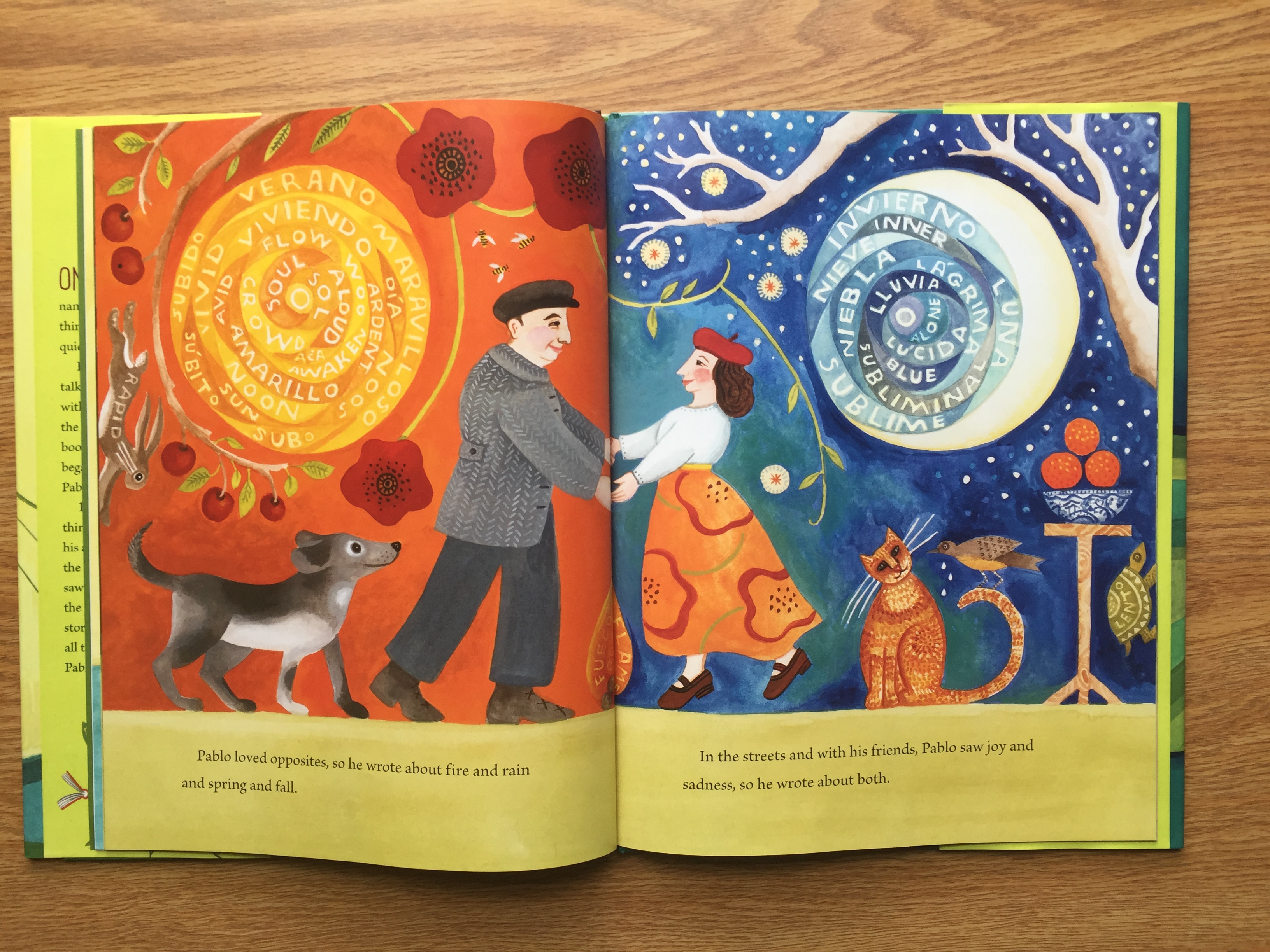
The importance of text placement in Pablo Neruda: Poet of the People goes beyond the initial body of text in the book. While the story text has short simple sentences which are easy for children to read, there is also text and words placed amongst the illustrations. Neruda’s inspiration was from the world around him, and the illustrations do an excellent job to reflect that. Without the words in the illustrations, the illustrations would be bright, colorful, and reflect what was written in the text. Overlaying words on the illustrations allows the reader to see what it was like living in Neruda’s world.

IMG_2812

The story text itself is at the bottom over plain backgrounds and is easy to read. The short sentences of the text gives children the chance to read the book for themselves because of the simple sentence structures. The simple sentences also gives the text an easy flow. Although this book would not be considered poetry, there is a sort of poetic flow to the text.

IMG_2813

Overall, this book allows readers to not only be informed about Pablo Neruda’s life, but also experience the world through Neruda’s eyes. Ideologically, this book sends the message of advocating for social justice and using talents to help others. This book is a good tool to use in a classroom because it combines poetry, history, and social events. The drawings invite children to be interested, and the story gives children a more cultured historical understanding.

Dave the Poet: Artist, Poet, Slave

Author: Laban Carrick Hill

Illustrator: Bryan Collier

Publisher and Year: Little, Brown and Company, 2010 (Caldecott honor, Coretta Scott King Award)

Number of Pages: 40 Pages

Genre: Historical Fiction

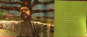
Dave the Potter tells of Dave, who was a slave in the 1800s in South Carolina (Hill, 2010). He was a very skilled potter while also being a poet. This story honors the craftsmanship of Dave’s pottery along with his poetry.

This story serves as a window into the life of Dave as a slave and as a craftsman. However, this book only focuses on Dave’s pottery and some poetry, but does not tell of his struggles as a slave. In addition, the last three pages of the book highlight some of Dave’s poetic verses while explaining historical facts about him. This book seems to portray Dave as enjoying being a slave in the South. For example, the images show Dave with facial expressions of content and serenity as if he enjoys the current position of being a slave doing his work. As a mirror, it reflects the African American culture and honors a man of color that brought beauty to pottery and poems. As with Dave being a slave, he did not have power. He is portrayed as just going about the day while creating large pots. Yet, the end of the book includes an author and illustrator’s note. Both explicitly state the extensive research they did on Dave (it is all cited in the book), and even visited the place where he was a slave. Though the way Dave was depicted was not exactly accurate (he lost a leg but is drawn with two legs), the author and illustrator made it very clear that though Dave was a slave, the purpose of this book was to honor his craft of pottery and poetry. This story represents the African American culture by honoring a man of color. As the author and illustrator made known, they wanted to represent Dave for his skills as a potter and poet. They portray him as a figure worthy of being remembered as a man of color in history. At the same time, this breaks any stereotype that showed slaves having no creative skills because Dave was able to create beautiful verses of poetry and pottery as a man of color.

Perceptually, the book is a Caldecott honor meaning that the artwork is important to the emotion of the story. In addition, image is on one page while text on another to allow the reader to focus on both text and image. The text is on a solid colored background showing it is to be noticed by the reader. Dave is portrayed as very calm, quiet, and comfortable in work. My criticism of this is that with him being a slave, I think this book portrayed him to be more comfortable with his life as a slave than he actually was. Structurally, there are three pages of Dave’s historical background included at end of book showing that the author and illustrator want to share the story of Dave’s pottery and poetry. In addition, they include citation page and author and illustrator’s note. This shows credibility to where they found their information about Dave’s story while also explaining why they chose to focus on his craftsmanship and poetry. The text and images don’t mirror one another but still need both to gain full experience from book. Also, no framing of the images allows the audience to come into Dave’s story. Overall, this book honors a man with tremendous skill even with its questionable depictions of his life. As a theme from the book, the author and illustrator highlight that the fine arts bring beauty to the world.

IMG_2859IMG_2860


A Fine, Fine School

Author: Shannon Creech

Illustrator: Harry Bliss

Publisher and Year: HarperCollins Publishers, 2001

Number of Pages: 29 Pages

Genre: Poetry, Fiction

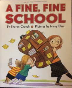
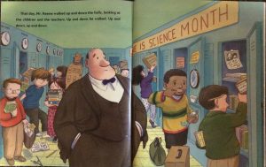
A Fine, Fine School follows Tillie’s school day and all her activities. She attended such a fine, fine school filled with fine, fine students and teachers. The headmaster, Mr. Keene, is so impressed that he begins to declare school on every day of the week and all holidays. Tillie finally speaks up, Mr. Keene sees the exhaustion in the students and teachers, and finally changes school back to normal days of the week.

This text serves as a window into the minds of students in the effects of constantly being tested or always focused on schoolwork. As a mirror, it allows the reader to reflect and critique what “learning” really means. As a door, this text allows the audience the opportunity to see the problems in the school system and redefine what learning really means.

As in any school system, the principal (headmaster) holds the power in how the school functions. The students and teachers did not speak up to Mr. Keene about how they did not want school on weekends and holidays. Mr. Keene continued to include more days in the school year, including the entire summer. Though no culture is completely represented in this book, it does bring to light the issue of the amount of schooling younger children really need. It brings to light a very important issue: how much schooling is really necessary for students to learn? The students continuously look more exhausted and upset as the book goes on, which shows that “learning” in school is becoming pointless because none of the students can focus. When Tillie finally confronts Mr. Keene to tell him that because of so much schooling, she is missing out on learning important things such as learning to climb a tree. In a way, the students are the culture being represented in this story along with the “correct” form of schooling. In addition, the author brings to light another important issue: What is learning? Is learning academic curriculum the only true way of learning? In a creative way, the author emphasizes that learning encompasses more than just academic learning in school.

Perceptually, the images are large showing that the artwork is important (the illustrator is a famous cartoonist for the New York Times). The illustrator illustrates diversity among the students and school subjects. For the reader of this book, he or she can see him or herself represented in the story along with their subject interests. There is a repeat of phrases (fine, fine) showing Shannon Creech’s poetic touch.The text and image sometimes mirror one another by the text telling the story while the images express the emotions of the characters. For example, the post-it notes throughout the story express small messages into how the students are feeling. Through this comedic tale, the author establishes important themes such as learning does not just happen in schools, children need time to be children and explore the outside world, and naivety of administration to get to know students. Finally, this story makes it known that school learning is not fine, fine all the time!

IMG_2855IMG_2856

Ruth and the Green Book

Author: Calvin Alexander Ramsey

Illustrator: Floyd Cooper

Publisher and Year: Carolrhoda Books, 2010

Number of Pages: 29 Pages

Genre: Historical Fiction

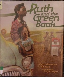
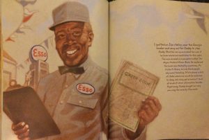
This historical fiction tells of Ruth and her family’s drive to Alabama to visit Ruth’s grandmother in 1952. Ruth’s family originates from Chicago and travels to Alabama with Daddy’s new Sea Mist Green Buick (Ramsey, 2010). On their travels, Ruth and her family encounter segregation and learn of the Negro Motorist Green Book, a pamphlet that helped African Americans travel and listed places they were allowed to go (hotels, gas stations, and restaurants). Though the story of Ruth is fictional, the book highlights the real historical event of the struggle of travel for African Americans ten years before the Civil Rights Movement.

This book serves as a window because it gives the reader (at a young age) an insight into the struggles of African Americans and historical information about Jim Crow Laws. By serving as a mirror, it reminds the audience that segregation is not good and regardless of skin color, a person is a living human being first. In addition, it serves as a door because the author presents this information to the reader in the hopes that the reader is an advocate against unequal treatment of people. This story clearly represents the African American cultures and their struggles to survive within the confines of Jim Crow Laws in the 1950s. During this time, African Americans were not allowed in certain places in the South solely because of their skin color. As terrible as this was, this book does highlight on a very positive note for African American culture: the sense of community and friendship. Through the “green book,” African Americans met with others in various places on the road and were able to share stories with each other. As Ruth shared when her family stayed in an inn one night, “It felt like I was part of one big family” (Ramsey, 2010). Through the obstacles of segregation and unequal treatment, African Americans were able to come together as one to enjoy times to share their experiences and feel like a family outside of the struggles on the road.

Perceptually, the images are very large showing that the images express the emotions of the text. At the same time, the text is easy to find, meaning that the words are just as important as well. In addition, last page of the book is historical story of the green book to allow the reader to learn the historical facts of the event. The pictures in the story have blurry background showing that the green book is an event in the past. At the same time, the facial expressions of the characters are detailed so that the reader understands the emotional hardships of segregation among group. In addition, the dialect of South is used to be historically in line with the historical event of the green book. Through this book, the African Americans culture honored and remembered for their struggles with segregation. In addition, the reader learns of a real historical event that goes unnoticed. Most important, the biggest lesson of this book is skin color does not make one superior.

IMG_2849IMG_2850


Captain Jack and the Pirates

Author: Peter Bently

Illustrator: Helen Oxenbury

Publisher and Year: Dial Books for Young Readers, 2015

Number of Pages: 30 Pages

Genre: Fantasy, Fiction

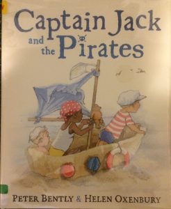
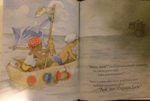
This story tells of the tale of three boys (Jack, Zack, and Caspar) and their whimsical adventures at the beach. The three boys encounter an enemy pirate ship that has the treasure the boys are seeking. The boys get shipwrecked on an island, but still continue on “hungry for glory and enemy booty” (Bently, 2015).

The story is used as a window because it shows the imagination of younger children and the crazy adventures they can make in any kind of place. As a mirror, it reminds a reader of any age the fun and joy of using one’s imagination to create anything. Also, it serves as a door to encourage all that imagination never dies and is the opportunity to be anything one wants to be. For the most part, the power is in the hands of the three boys because they collectively create and engage in the world with the enemy pirates. As the story goes on, they do indeed find the treasure: an abundance of cupcakes, soda, ice cream, and cake. In addition, the reader finds out that the “enemy pirates” were just the adults the three boys came with, attempting to get them ready to leave the beach. This book is not very diverse in terms of skin color, with the exception of Captain Jack’s right hand man Zack (African American). Also, all the “enemy pirates” are Caucasian. As one looks through the images, the adults in the story were the boys’ parents (both Caucasian) and act as if Zack is their son. Based on this, I can say the book is a little more diverse because the illustrator is showing a mixed family. At the same time, the family has only three boys and the only female figure in the story is the mother who brings the boys ice cream at the end of the book. In this story, it is mainly a male and Caucasian culture represented. In a like manner, the culture of young children’s imagination is represented in the creative adventure of the three boys.

Perceptually, the words and text mirror one another signaling the importance of both the image and text. In addition, the pictures take up most of page but text is easy to find. This means that though the images are important, the reader can focus on the text as well. Structurally, words within the text rhyme, allowing the reader to learn a simple structure of poetry and other words. On the contrary, there are some images are colored while some are black and white. The ones with color symbolize the boys on their adventures while black and white stand for the real world. The three boys also wear similar swimsuits standing for the time period of the story and/or making them equal. In addition, the beach is backdrop for the boys’ adventure, which means their imagination, can be very creative in a simple setting. Prevalent themes from this book are imagination never dies and anyone the opportunity to be anything they want to be.

IMG_2847IMG_2848

Lola Plants a Garden

Author: Anna McQuinn

Illustrator: Rosalind Beardshaw

Publisher and Year: Charlesbridge, 2014

Number of Pages: 24

Genre: Fiction

Analysis:IMG_3568

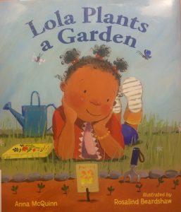
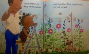
This book is about a little girl named Lola who creates a garden with her parents. Throughout the book we see how she goes about making her gar
den and we see it grow into a beautiful creation.

This text can function as a window, mirror and a door for the readers. It would
function as a window for readers who have never planted a garden of their own. In the text they will see and learn the process of how to create a garden and what one needs to help a garden grow. For readers who have experience with gardening this text would function as a mirror since it is something they can relate to. When reading this story they can connect their own experiences with Lola’s experiences. This text can also function as a door for readers who want to apply Lola’s idea to their own lives. Maybe for these readers after reading this text realize how fun it can be to plant a garden and they go off and plant on of their own. The main characters of this text are African Americans but there is diverse culture throughout the story. When Lola has her friends over to see her garden three different cultures are represented. This presence of culture makes the story a lot more relatable for many different types of readers. I like how in this story Lola decides that she wants to make a garden and she works hard to make it happen. She goes to the library to pick up books about flowers, goes to the seed store, and learns how to care for a garden. This shows how independent Lola is that she is able to work hard for something she wants without her parents doing all the work for her. I think that this is an important message for young readers to see so they know that if they want something in life they will have to work hard to achieve it, someone will not do it for you.

The images within this text are beautiful. They are full of color and the images seem to come alive when the flowers start to grow. In the text Lola is always facing towards the right showing that she is moving forward with her garden. It is seen in the illustrations how excited Lola is to plant her own garden just like her mom’s. I really enjoyed reading this book; the images made it fun and it can show readers that if they work hard towards something they want they can create a beautiful thing.IMG_3570

The Color of Us

Author: Karen Katz

Illustrator: Karen Katz

Publisher and Year: Henry Holt and Company, 1999

Number of Pages: 24

Genre: Fiction

Analysis:IMG_3560

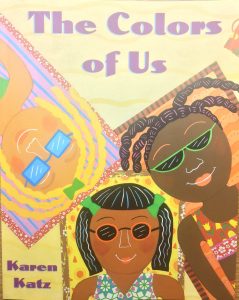
            The Colors of Us is a picture book about a young girl named
Lena. Her mother is an artist and shows Lena how to paint skin color. Lena at first only thin
ks that brown is brown so her mom takes her around town and
shows her all the different colors of skin there is.

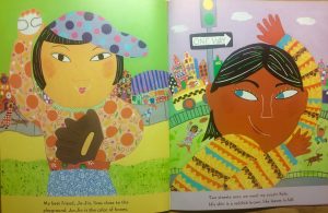
            This book can function as a mirror or a window. On every page of this book there is a character from a different culture. Since there is so much culture a lot of readers can relate to the book if they see their own culture or similar skin color within the book. For a reader who hasn’t been exposed to the cultures that are in the text then it would function as a window. These readers are then looking into this book and seeing different cultures they may have never seen before. There is a lot of diversity within this text. Every page has a different race. On each page Lena sees someone she knows and points out the color of their skin and compares it with food. For example on page 7 there is a picture of Lena’s friend Jo-Jin who looks to be of Chinese decent and Lena compares her skin to the color of honey. I really like how the author describes the different colors of skin using food. For young readers they will have a better time imagining the colors when they are described using something they know. This way they will not just consider someone who has a darker completion as brown. Young readers will see that there are so many different shades of brown and that it’s okay to be darker or lighter than the people around them. Another thing I liked about this text is that in the image there are no gender stereotypes. The girls are playing sports, listening to music, or dancing. They are not confined by their gender to certain activities.

            This text is full of beautiful colors. The images mirror the text perfectly. For example when Lena states that one of her friends skin is a “light cocoa brown” or ‘butterscotch” (Katz, page 9) the images actually resembles those foods. All the images are very close up and very detailed. On each page there is only one character with a busy background like a city street of restaurant. Even though the backgrounds are very small they are still filled with culture from the character that is taking up the page. I really enjoyed this book it has beautiful illustrations and the message that we are all the same just different shades is very clear.IMG_3561