I am Mixed

IMG_2818

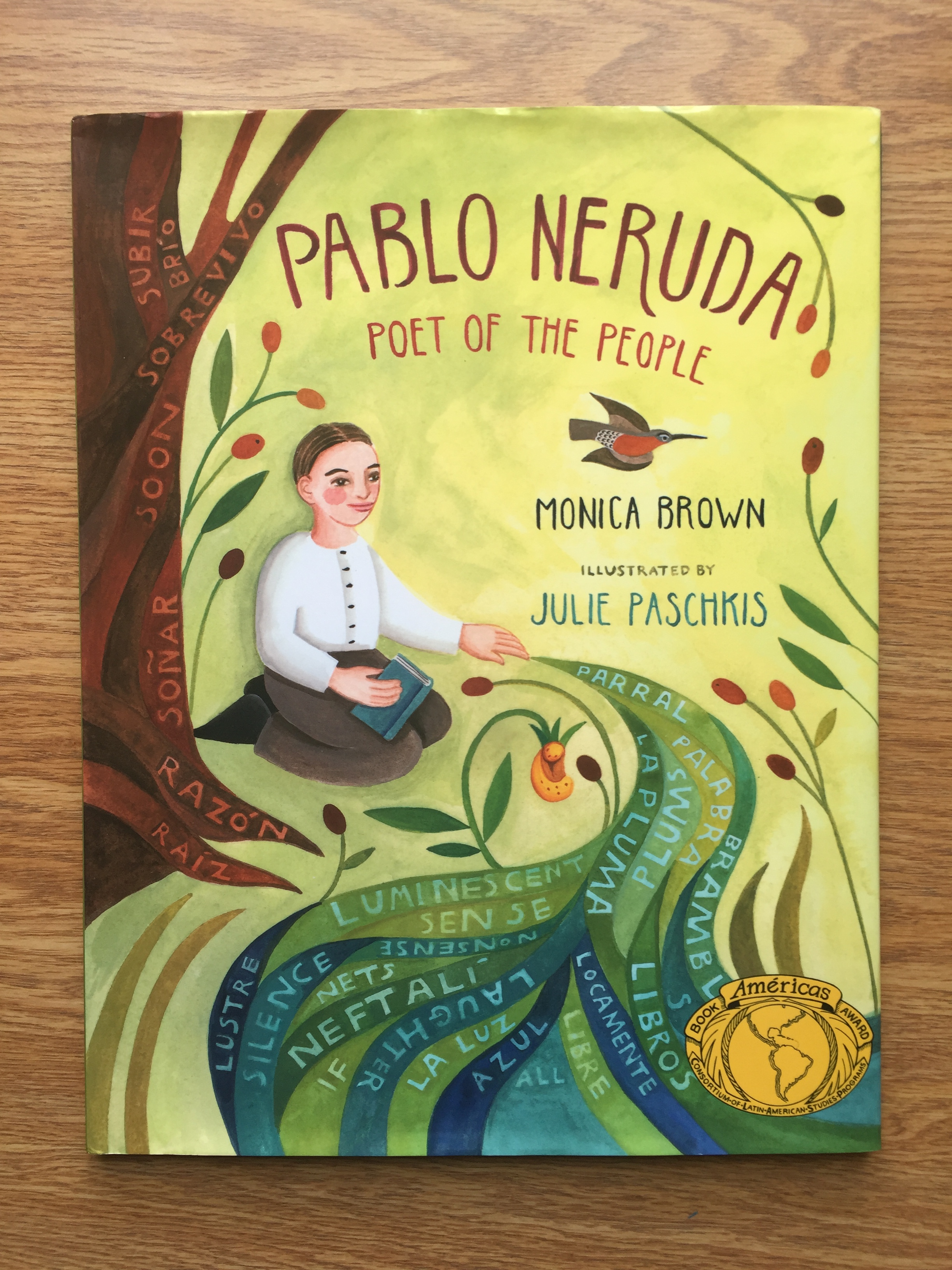
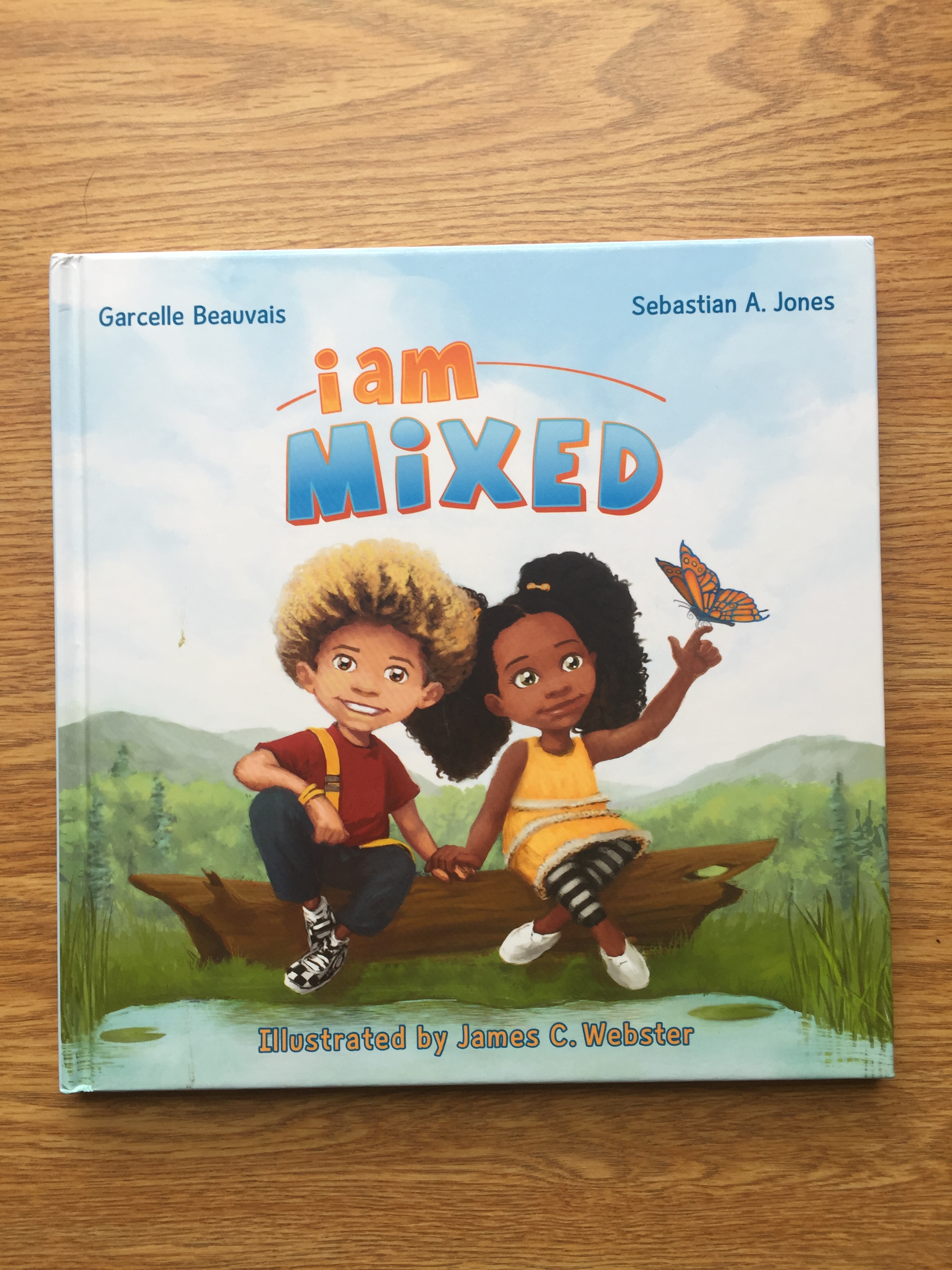
Authors: Garcelle Beauvais & Sebastian A. Jones

Illustrator: James C. Webster

Publisher and Year: Stranger Comics 2013

Number of pages: 36

Genre: Picture Book

Analysis

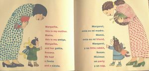
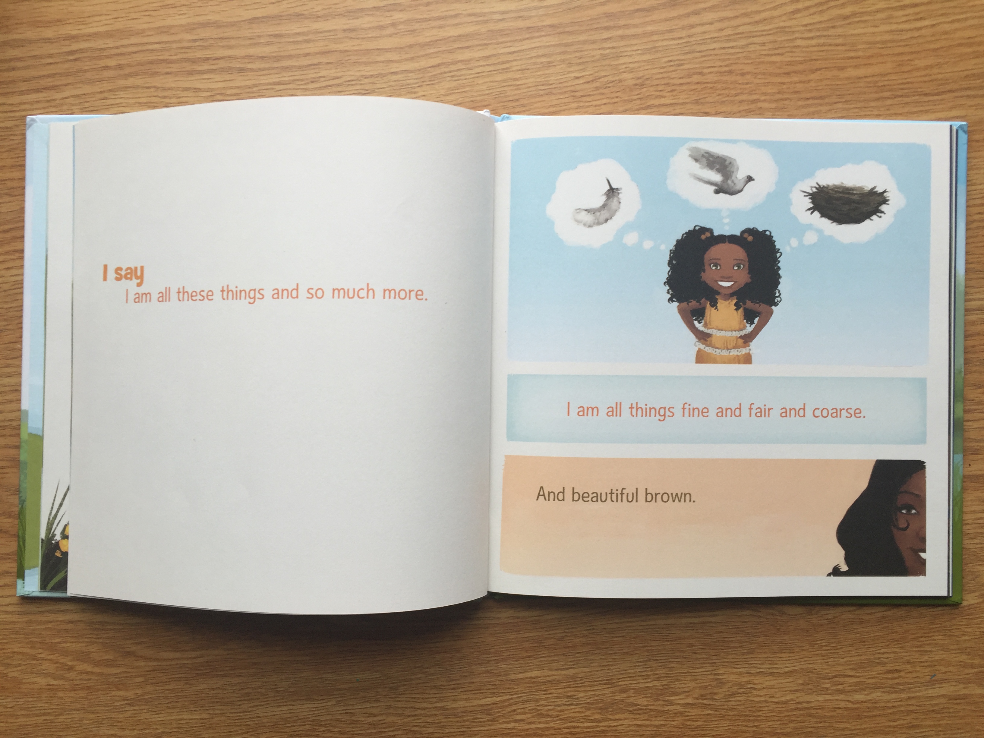
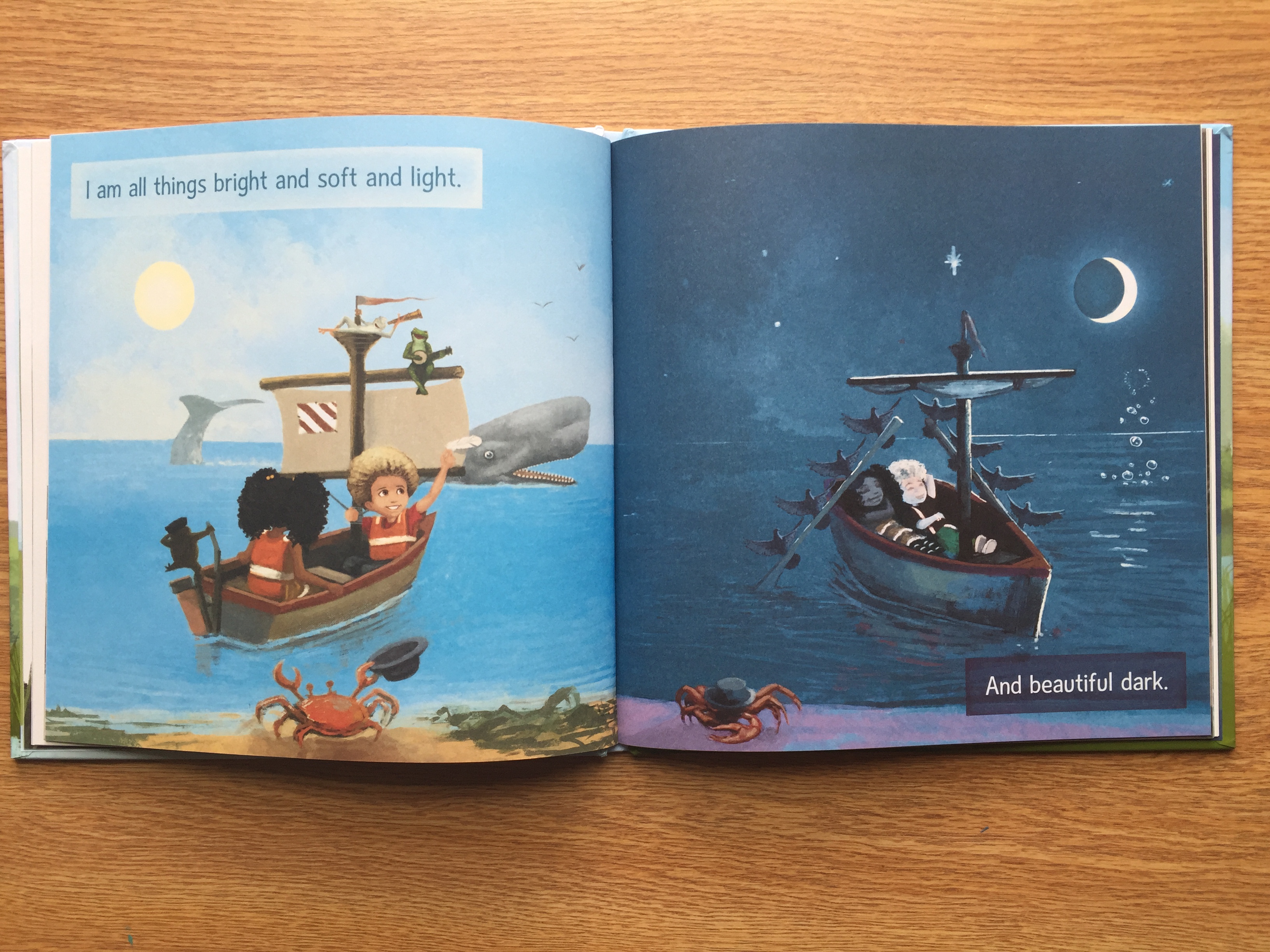
I am Mixed is a short picture book centered around two children, Nia and Jay, who are twins. The book depicts the twins with different skin tones and hair color. It starts out with Nia talking about how because she is mixed she is different than most people, even her own brother. Nia goes on to say that she loves who she is and is proud to be mixed. The book then shows Nia with her mother who is telling Nia how much she loves her. The same thing repeats with Jay and their father. The book ends with the phrase, “I am mixed,” and shows Nia and Jay smiling happily.

IMG_2819

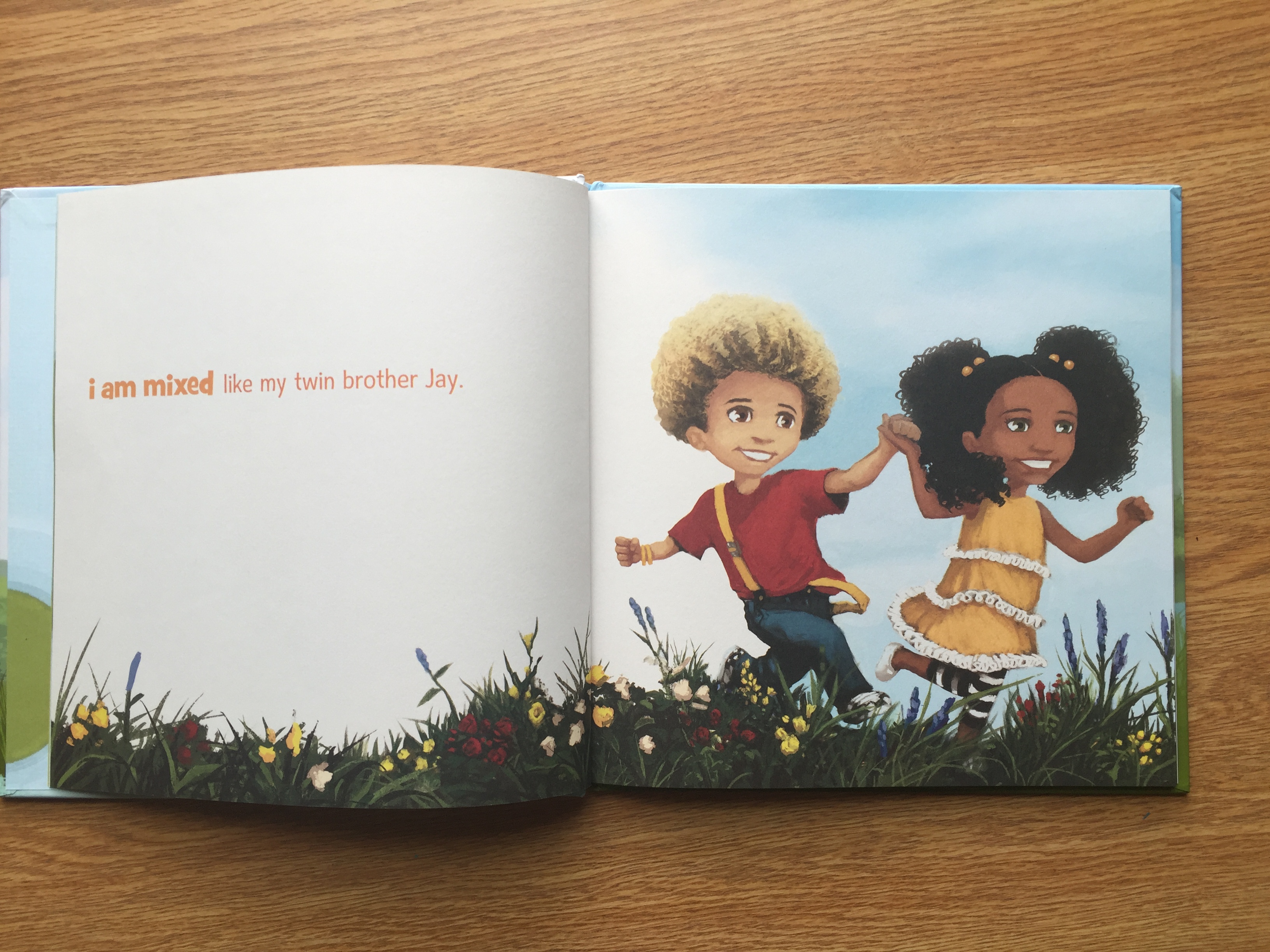
The illustrations in I am Mixed are colorful, bright, and inviting. Throughout the book, there are many pages that contrast with each other and reflect the texts meaning. While the texting is talking about the diversity of biracial or multiracial children, the illustrations are representing different cultures. On every page, Nia and Jay are smiling largely and appear to be very happy with their family and their culture. Having the Nia and Jay smile throughout the book shows that this book is geared towards encouraging biracial and multiracial children to be confident in themselves and their culture. While the drawings lean towards being cartoonish and inviting, on several pages, the smiles that Nia and Jay have seem a little unsettling. This may not be picked up by children but as an adult, some of the pictures seem a little too happy for the context.

IMG_2820

Along with the pictures in the book, the text is very kid friendly and easy to see and read. The text has a short flow to it and physically some words are emphasized through different colors of font. This text is potentially entertaining to children because it rhymes and has little text on each page and draws the attention to the illustrations. The text and the illustrations work in tandem to create a cohesive story that would be incomplete without the text or illustrations.

IMG_2821

Overall, I am Mixed is a great source of empowerment for biracial and multiracial children. It discusses the experience of biracial and multiracial children in school and in their family lives. This book can serve as positive representation for biracial and multiracial children. It can also help non-biracial children learn about biracial children and the cut down on common stereotypes biracial and multiracial children face.

Pablo Neruda: Poet of the People

IMG_2810

Author: Monica Brown

Illustrator: Julie Paschkis

Publisher and Year: Henry Hold and Company 2011

Number of pages: 26

Genre: Non-Fiction Picture Book

Analysis

Pablo Neruda: Poet of the People is a recipient of the Américas Books Award. This book is a picturebook about Pablo Neruda, originally named Neftalí, and his experiences in Chile. In the beginning, it shows Neftalís initial interest in the nature he experiences in Chile. The book then walks through Neftalí’s schooling and the change of his name from Neftalí to Pablo Neruda. As he grows older, Neruda becomes interested in social justice and  speaking out against many injustices he sees in the world. Neruda was both an advocate and a poet and often times these two sides of him worked together. The book clearly illustrates just how Neruda was truly a poet for the people.

IMG_2811

The importance of text placement in Pablo Neruda: Poet of the People goes beyond the initial body of text in the book. While the story text has short simple sentences which are easy for children to read, there is also text and words placed amongst the illustrations. Neruda’s inspiration was from the world around him, and the illustrations do an excellent job to reflect that. Without the words in the illustrations, the illustrations would be bright, colorful, and reflect what was written in the text. Overlaying words on the illustrations allows the reader to see what it was like living in Neruda’s world.

IMG_2812

The story text itself is at the bottom over plain backgrounds and is easy to read. The short sentences of the text gives children the chance to read the book for themselves because of the simple sentence structures. The simple sentences also gives the text an easy flow. Although this book would not be considered poetry, there is a sort of poetic flow to the text.

IMG_2813

Overall, this book allows readers to not only be informed about Pablo Neruda’s life, but also experience the world through Neruda’s eyes. Ideologically, this book sends the message of advocating for social justice and using talents to help others. This book is a good tool to use in a classroom because it combines poetry, history, and social events. The drawings invite children to be interested, and the story gives children a more cultured historical understanding.

The Trials of Apollo: The Hidden Oracle

IMG_2802

Author: Rick Riordan

Illustrator/Photographer: None

Publisher and Year: Disney Hyperion 2016

Number of pages: 361

Genre: Children’s Fiction Novel

Analysis

The Trials of Apollo: The Hidden Oracle is the first book in the Rick Riordan’s new series The Trials of Apollo.  This is Riordan’s third series in the Percy Jackson universe, the first being Percy Jackson and the second being Heroes of Olympus. These three series are based around the concept that the ancient Greek gods are still around in modern times and are continuing the tradition of creating half human half god children called demigods. These series create a timeline of events, all leading up to The Hidden Oracle. The book takes place from the God Apollo’s perspective. The basic plot of the book is that Apollo is being punished by Zeus and for his punishment he is turned into a mortal teenager. In order to regain his godly status, Apollo must redeem himself in some way. Apollo meets a twelve year old named Meg who becomes his companion and guide on his quest. The book is full of adventure, friendship, and past regrets.

IMG_2804

This book is not only a great adventure story, but also a great story for representation. Many times in the novel, Apollo is forced to think about the past mortals he has loved. He continually thinks about Hyacinthus and Daphne, two mortal humans he had fallen in love with throughout his years as a god. While they are both influential to Apollo’s emotions throughout the story, they are, more importantly, of the opposite gender. This novel not only creates a fantastical world of adventure, it also brings in a realistic depiction of a protagonist who identifies as bisexual. There are also other characters in the story that are not straight. This novel is an example of diversity in sexual orientation in a novel. Too often, especially in children’s literature, are protagonists only depicted as straight, which can be detrimental to children that do not identify that way.

IMG_2805

Overall, this book addresses many hard hitting themes like family dynamics, emotional abuse, and grief. This novel is engaging, exciting, and a good source of representation on many different issues. The rest of the Trials of Apollo series will be released over the next couple of years and cannot be spoken for on its depiction of diversity. The Hidden Oracle can be a great source of diversity for many students, and can broaden their world view while being an engaging and adventurous story.

Chrysanthemum

chrys chryspage

Title: Chrysanthemum

Author: Kevin Henkes

Illustrator: Kevin Henkes

Publishers and Year: Greenwillow Books, 1991

Number of pages: 30

Genre: Fiction

Chrysanthemum is a story of a young mouse girl who loves her name. Upon arriving to school, however, all of the children in her class repeatedly make fun of her name, causing Chrysanthemum to dread her own name. Only after being affirmed by her music teacher does Chrysanthemum learn to truly appreciate the name she was given.

This book serves as a mirror for its audience. Children, and sometimes adults, struggle with not only finding their true identity but also clinging to it in times of trial. In this book Chrysanthemum decided that she hates her name at the first sign of trouble. Children are very similar in that they, too, question their identity when it is picked apart by their peers. Watching Chrysanthemum realize the beauty in her own name, despite the fact that it is very different from that of her peers, teaches readers a valuable lesson: a person’s identity is not rooted in what other people say or do, and the true beauty of who someone is actually lies in their differences rather than their similarities.

The text in this book is very strong and could easily stand alone. However, the illustrations help to amplify the emotional turmoil that Chrysanthemum is experiencing. For example, all of the images are framed; revealing the confinement Chrysanthemum feels as she battles the confusion of her own identity. The illustrations also add to the text in other ways. For example, one page has a picture of each student in a yearbook style layout with their names written across the top. Each student’s name fits nicely across the top of the box, except Chrysanthemum. Her name extends outside the box in a dramatic fashion. In addition to this, each student has a cheerful expression, except for Chrysanthemum. The combination of these two helps exemplify the embarrassment and shame being felt by Chrysanthemum at the current situation. Overall, this book shares a very important theme with its readers: the best parts of a person’s identity are formed through their differences. Therefore, it challenges its readers to embrace their differences proudly and walk fully in their identity without fear of ridicule from others.

Margaret and Margarita

marg margpage

Title: Margaret and Margarita/Margarita Y Margaret

Author: Lynn Reiser

Illustrator: Lynn Reiser

Publishers and Year: Harper Collins Publishing, 1996

Number of pages: 31

Genre: Fiction

Margaret and Margarita/Margarita Y Margaret tells the story of two young girls who meet at a park. One girl speaks only English and the other girl speaks on Spanish. However, a friendship blossoms despite the language barrier proving that friendship is more powerful than the barriers that try to stop it.

I think that this book serves as both a window and a door. It serves as a window because it sheds light on two different cultures and languages. Margaret only speaks English, and Margarita only speaks Spanish. Therefore, the book is written in two languages. One girl will ask a question in English and the other will answer in Spanish. While most bilingual books simply repeat the English phrases into Spanish, this book actually allows for the natural differences of a true dialogue. Therefore, whether a student is bilingual or learning a new language, it acts as a window through which they can peer as they expand their understanding. This book acts as a door because it bridges language barrier gap. These two girls do not speak the same language, yet they bonded as best they could. So often people do not even try to bridge the language barrier gap because only one language is known. This book shows the truth that language, while powerful, is not the only form of communication and connection.

The text and illustrations share an equal role in this story. The text helps to bridge the gap for language learners as they learn new, simple vocabulary. However, the illustrations add to this by narrowing in on the part of the text that might be difficult to comprehend. For example, when a new word was introduced in either language, such as smile, the illustrations were a framed picture showing a black and white face where the only pop of color was in the smile. This pattern was repeated with numerous new words that were introduced into the text. Not only are the illustrations colored in a way that emphasizes the words being learned, but the text is color-coded as well. All of the English words in the book are written in pink and all of the Spanish words are written in blue. The illustrator intentionally colored the native language text to be the same color as the dress of the opposite daughter’s mother. This simply furthers the connection between the two girls, signifying that the foreign language is a safe place, less scary than they might have initially thought.

Another interesting observation that readers will have regarding the illustrations is that everything in the story is in black and white except for the people. The park landscape is in black and white. The bench is in black and white. Even the flowers are illustrated in black and white. However, the mom, daughters, and stuffed animals are all drawn in vibrant color. This shows the reader the exhilaration and freedom that comes from human connection and interaction so that they might realize that it is worth the effort, despite the barriers to walk through that door.   Overall, this is much more than a book about learning a new language. This is a book that shows the importance and reward of bridging cultures and languages.

Madlenka

mad madpage

Title: Madlenka

Author: Peter Sis

Illustrator: Peter Sis

Publishers and Year: South China Printing Company, 1988

Number of pages: 41

Genre: Fiction

Madlenka is the story of a young girl who goes on adventures to tell the people on her street block about her loose tooth. Each new person she encounters introduces the reader to a new culture. Eventually Madlenka comes home declaring that she has been out traveling the world.

This book is a window for the reader into a variety of different cultures. On each page Madlenka meets a new friend who is from a different part of the world. They greet her in their native language and we are provided with information about that person, on the other page, that highlights important aspects of their culture. For example, when she visits her friend Eduardo, from South America, the readers learn about the landscape of his native lands. Likewise when Madlenka meets her Mrs. Kham, her friend from China, the readers learn about the Great Wall of China, Buddhism, Silk, and different ethnic foods. Although each page is in no way a complete representation of any culture, it gives the reader an insight into a culture different than their own.

Although the text is great in that it provides culturally relevant information and exposure to various languages, the images add just as much, if not more, to the story. We are able to see drawings that further represent each culture as she meets each friend. In addition to this, the book is set up so that there is a square (sometimes circular) hole in each page. These are meant to represent windows in the shops. Through these windows the reader is able to see natural landscapes that represent the various parts of the world. As you turn the page, these windows strategically place Madlenka right into the world the reader is learning about. In addition to this, after the “window” has been turned, the full-page illustration can be seen revealing an even more in-depth drawing that depicts various parts of each culture. Overall, the illustrations in this book give a rich visual understanding of each culture represented and allows the reader to experience a piece of each culture. This models appreciation for different cultures and gets the readers excited to learn more.

Llama Llama and the Bully Goat

llama llamapage

Title: Llama Llama and the Bully Goat

Author: Anna Dewdney

Illustrator: Anna Dewdney

Publishers and Year: First Scholastic Printing, 2013

Number of pages: 29

Genre: Fiction

Llama Llama and the Bully Goat is a book about bullying for young children. It tells the story of a billy goat that bullies his peers at school one day. The book continues to show the consequence and resolutions until it ends with them getting along as friends.

This book can serve as a mirror, window, or door for its readers. As we know, bullying continues to be more of a problem with each passing year in schools around the country. This book sheds light not only on bullying but also on responses to bullying. Therefore it acts as a mirror because it causes children to think about bullying as a whole and examine examples of bullying they may have experienced or participated in themselves. If they haven’t been victim or bully in a scenario before, it serves as a window to see those situations from another’s viewpoint. The most important thing, however, is that it acts as a door. Once the readers have looked in the mirror or through the window, they are now presented with options of how to respond. This book does a great job of showing children how to stand up for themselves in a healthy way. For example, one character tells the bully goat, “Gilroy, this is not Ok. Stop it, or we’ll go away.” In addition to this, readers are presented with a solution that says, “Being bullied is no fun! Walk away and tell someone!” Given that this book is for a younger audience, it provides practical, age-appropriate responses to bullying that can be helpful to a child in that situation. Along those same lines, it can help a bully to see (window) how their bullying affects others so that they can modify their behavior (door).

The text in this book is lively and rhymes on each page. It provided a light-hearted feel to a hard but important topic. I believe that helps introduce a concept to the children in a way that they can easily understand. Although the text is vital, the illustrations are not. They provide the reader with a nice visual of what is happening, but they don’t add much more than what the text has already given. Therefore, I think the text could easily stand alone in this story. Overall, this book is overflowing with lessons on bullying and responses to bullying. It introduces the topic in a way that is easily accessible to readers of a young age.

Sam & Dave Dig A Hole

hole holepage

Title: Sam & Dave Dig A Hole

Author: Mac Barnett

Illustrator: Jon Klassen

Publishers and Year: Candlewick Press, 2014

Number of pages: 36

Genre: Fiction

In Sam & Dave Dig A Hole, two young boys decide, after digging a small hole, to continue digging until they find something spectacular. Throughout the story, the readers watch as the two young boys unknowingly pass up many hidden treasures. The story ends when the two boys, tired from a full day of digging, fall asleep. Their dog, after smelling a bone hidden beneath the surface, continues to dig until they are all falling and land back on solid ground.

This book serves as a door for its audience. Through the adventures and determination of Sam and Dave, the reader is able see the benefits of determination and perseverance. Both Sam and Dave would have missed out on an incredible adventure had they been willing to settle with their miniature hole. As they continued on, however, they passed diamonds and other treasures in the soil. This gives the reader a reminder of the benefits of remaining steadfast rather than giving up. This being said, however, neither Sam nor Dave was aware of the diamonds that they were passing. They were digging either straight down or over (once they split ways). The diamonds were so close but the readers were the only ones to have knowledge of them. I think that this speaks to the danger of tunnel vision as we pursue any endeavor. Although they were passionate in their pursuit of “something spectacular,” they missed many opportunities of such treasures along the way. Only when their dog got whiff of the hidden treasures did he break the mold and keep digging.

The images in this book also help portray the themes. The images start out light and get darker and darker as the book goes on (until the end). The children get dirtier and dirtier causing even their faces to appear darker.   This represents their inability to see the treasures that are all around them. As they get further and further into their tunnel vision, the pictures get darker and darker. It is interesting, however, that the treasures themselves are never tainted by such darkness. They remain bright and vividly displayed within the dirt. The illustrator does an amazing job of maintaining the integrity of the theme through the illustrations. They are equally as important in this story as the text. Without these images, the readers would be as lost to the treasures as the boys are themselves. Although the pictures are needed to complete the story, the structure of the text is not without its own merit. The dialogue is simple and the sentences are short, but it almost adds to the digging effect of the story. With each short, choppy sentence you feel as if you, too, are thrusting your shovel into the dirt to find something spectacular. Overall, this book sends children a very clear message masked with the sense of adventure: never give up. Although the boys continually seemed to fall short of their goal, there were always treasures just below the surface. That speaks a message of hope to anyone who is walking through a time or season of life that requires endurance.

Journey

Author and Illustrator: Aaron Becker

Publisher and Year: Candlewick Press, 2013 (Caldecott honor)

Number of Pages: 37 Pages

Genre: Fantasy

Journey is a picture book with no words and all images. It follows the adventures of a little girl who draws her way with a red crayon to an imaginary world with a castle. The guards of the castle capture a bird that the girl sets free. The bird takes her back to reality where she befriends a boy who has the same magical crayon as her, except in purple.

This text serves as a window into the whimsical and magical world that the imagination can create. As a mirror, it allows the reader to reflect on the wonders imagination can bring when trying to escape from reality. As a door, it invites the audience to join in and participate in a fantasy world with the main character. In the beginning of the story, the girl is ignored by her parents because they are busy doing other tasks. So, the girl feels powerless and lonely in the real world. However, when she discovers the magic red crayon that can draw her anything she would like, she explores the world the crayon provides. She never draws anything elaborate, just simple things that help her in the adventures in the fantasy world. As a result, she gains power and even helps free a trapped bird that the people in the fantasy world were after (it is found out that the bird is drawn by the boy with the magical purple crayon). This can possibly be a symbol that with age, the freedom in creativity and imagination are not valued and cannot exist. It can act as a parallel the girl finds in the real world that creativity is not promoted. Once again, no exact culture is represented. Instead, the broad culture of a child and the imagination are highlighted. The author/illustrator sends the message that creativity and imagination cannot be confined. On the contrary, imagination needs freedom to allow children (and all ages) to dream and explore life in a unique ways. This adds to my understanding of culture in the sense that no person (regardless of race, religion, or gender) should be stopped from exploring the positive effects of imagination.

Perceptually, the story is all images with no words because the reader can be creative and learn worlds through images. In addition, this book is a Caldecott honor, so artwork is detailed important to the story. This would make sense because girl’s red crayon is magical and through the crayon (a symbol for the fine arts) she can explore fantasy worlds. The creations of the boy and girl are brightest colors on page and even have a different texture than the background. This stands for the magic found within the crayons and the imagination of both children. The real world is dull colors showing that imagination brings color to the world. The first two pages in book are framed meaning the girl feels confined and alone in the real world. As the story moves along, the images show travels of across the world exposing the reader to places around the world. The girl draws everything she needs being a sign that she is independent.

Through this picture book is just images, the author highlights important themes such as imagination can cope with the real world, do not limit the mind to the adventures imagination can bring, independence, explore the world, and imagination can bring friendship and unity among people.

IMG_2857IMG_2858


The Adventures of Beekle: The Unimaginary Friend

Author and Illustrator: Dan Santat

Publisher and Year: Little, Brown and Company, 2014 (2015 Caldecott Winner)

Number of Pages: 38 Pages

Genre: Fantasy, Realistic Fiction

The Adventures of Beekle follows Beekle’s journey in finding his human friend. Instead of waiting for his friend to imagine him in his imaginary world, he courageously decides to go into the real world (the city) in search for his best friend.

As a mirror, it reflects a child’s creation of an imaginary friend. As a window, the story serves a unique view into how an imaginary friends view the “human world.” As a door, the reader is invited into the world of the creation of a child and his or her imaginary friend. In the beginning, the children hold the power because each imaginary friend anxiously waits to be found by a human friend. Beekle took control of his life, was tired of waiting, and did the unthinkable: set out to the real world to find his friend. Beekle quickly learned the “real world” was very different from anything he had ever imagined. The real world was not filled with creativity like his land was. However, he befriends a girl and they go on adventures to help bring imaginary friends to the real world. This power shift stands for the power of a child and his or her imagination. Though Beekle is a white “blob,” the people in a real world represent diverse races and cultures. This shows that the author/illustrator wanted to make this book relatable to children of all races and cultures. No specific human culture is being represented in this book. Instead, the culture is children. This book highlights the importance and benefit of creativity in diverse friendships.

Perceptually, lively colors are used in the imaginary world to symbolize the happiness among the imaginary people awaiting their human friends. On the contrary, dull colors are used in the real world to show how as people age, the world becomes less imaginative. However, the one place in the real world were bright colors are used is the park, where other imaginary friends are shown. This shows the reader that being outside can allow imagination to run free. Also, Beekle wears a crown, symbolizing he is different than his other imaginary friends. With this book being a Caldecott winner, artwork is heavily emphasized in this book. Through the artwork of the author/illustrator, the artwork portrays the creativity of children with the bright colors in the book. In addition, minimal words are used because the author heavily emphasized on the artwork. This was possibly done on purpose so that younger readers would look at the colors on the pages of the book and be inspired to let their imagination take them on an adventure. Also, the author makes the text look handwritten possibly symbolizing his personal journey presented through this story.

The most prevalent themes found in this whimsical story are that power lies within imagination, friends are found in unlikely shapes and sizes, it takes courage to face the real world, and imagination can bring happiness that never has an expiration date.

IMG_2853IMG_2854