Doña Flor

Author: Pat Mora

Illustrator: Raul Colón

Publishing Information: Alfred A. Knopf, 2005

Number of Pages: 30

Genre: Fiction, Picture book
df 1 df 2

Analysis:

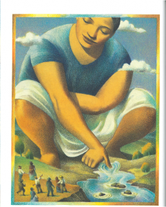
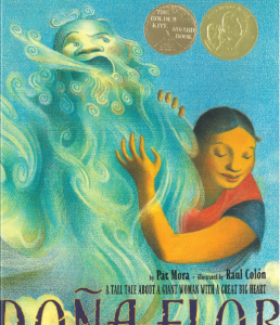
Doña Flor is a warm-hearted giant lady living in a village in the American Southwest. She can talk to all kinds of animals and make friends with them. One day, a terrifying noise scares all villagers. Doña Flor goes on an adventure. With the help of her animal friends, she finds out that the origin of the noise is a puma, which is relatively smaller than her. In the end, she makes friend with the little puma as well.

Besides the Golden Kite Award, this book also won a Pura Belpré Award for illustrations and a Pura Belpré Honor for narrative. The story demonstrates multiculturalism by depicting Doña Flor as a Latino lady. The text functions as a window for children to look at an imaginary world and at the same time shows children the beauty of human nature. She would “tuck her animal friends in and read them a good-night story” (p. 12). When the whole village is frightened by the noise, Flor is worried and thinks “what can I do to cheer my friends up” (p. 18).

I found the book problematic for the following reasons. First of all, in the story there are always some children laughing at Flor because she is giant. However, when they need Flor’s help, they would still say, “Por favor, Flor, could you give us a ride” (p. 3). And then Flor says nothing and “took just one of her giant steps and was at the school door” (p. 3). Children might interpret this plot in a wrong way and think that it is okay to be rude to other people because they are still going to help them in the future. Secondly, although it is nice to depict the main character different from normal people for teaching children to accept the differences among people, the giant figure of Flor suggests that human beings are more powerful than nature. Some texts also reveal this point. For example, “Flor knew that her village needed un rio, a river, so to make her neighbors happy, Doña Flor scratched a new riverbed with her thumb” (P. 18). Children should learn to respect nature instead of always trying to conquer nature.

Perceptually, the author uses a lot of descriptive sentences which makes the story more engaging. For instance, the first sentence of the book is “Every winter morning when the sun opened one eye, Doña Flor grabbed a handful of snow from the top of a nearby mountain” (P. 2). The pictures are not framed which give readers a view from within. The illustrator uses warm colors generally to depict the gentle atmosphere. Structurally, most of the text and images do not overlap. Ideologically, the book teaches children to be brave and not afraid of nature. Also, the nobility of Doña Flor tells children that it is nice to help others. Overall, it is an amazing and beautiful story.

Goggles!

Author/ Illustrator: Ezra Jack Keats

Publishing Information: the Penguin Group, 1969.

Number of Pages: 32

Genre: Non-fiction, Picture book

gg 1 gg 2

Analysis:

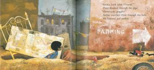
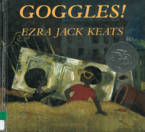
Two boys Archie and Peter find a pair of goggles. They like it very much. However, some big boys appear and threat Archie and Peter for their goggles. Archie and Peter try to escape with the help of their smart dog Willie. Finally, they fool the big boys and run away with their precious goggles.

The main characters of the book are African Americans. The text serves as a door to for children to explore the life of minorities. I found the book problematic in the following two ways. First of all, although the story is about African Americans, I do not think it can count as a multicultural book because there is hardly any cultural elements presented in either the text or the illustrations. The story only exposes the dark side of African American society. The whole book is about two boys running away from bully and blackmail. Besides, I notice the poor environmental condition in the illustrations. Readers might get wrong impressions about African Americans. That is how stereotypes are made. Also, younger children who read the book might develop a fear for older children which leads to a result that they may be reluctant to school or any other places where there are children older than them.

Perceptually, the first part of the book uses a lot of dark colors to demonstrate the depression and the confined situation Archie and Peter face. But after they escape successfully and save the goggles, the main colors of the illustrations become brighter which depict free and joyful atmosphere. The pictures are not framed so that readers can have a view from within. There are a lot of dialogs in the text which make the story vivid. Structurally, text and images overlap so readers can easily combine the text and illustrations together. There are not many ideologies conveyed through this book. The only thing I notice as a takeaway is to keep calm and be brave in front of danger. Use your judgement and find the best way to save yourself.

Smoky Night

15

Author: Eve Bunting

Illustrator: David Diaz

Publishing Information: Voyager Books, 1994

Number of Pages: 28

Genre: Historical Fiction

Analysis:

16

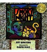
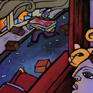
                        Smoky Night is the Caldecott Award-winning book that tells the story of a young boy and his mother witnessing the rioting in the streets below their apartment building. When a fire breaks out they must flee for safety all while taking in the wreckage the rioters have caused in their neighborhood. They find safety in a shelter, and the incident unifies the people of the neighborhood.

The book was published in 1994, which led me to wonder if there was a particular incident that could have inspired the story. Sure enough, the story was inspired by the rioting that took place in 1992 after an incident of alleged police brutality against Mr. Rodney King. I think this book does an exceptional job of providing children with a window to look at this piece of history, as it gives the perspective of a child living through that chaos without being too detailed or frightening for young readers. The story mainly focuses on the child’s search for his cat, who gets lost in the midst of tenants fleeing from the apartment, which can be both problematic and useful. I can see where readers may find this problematic as it shifts focus away from the riots and focuses more on the lost cat. However, this can be useful as it makes the story more accessible to a younger audience.

The illustrations of the book were certainly eye-catching and very additive to the text. The background of each page featured real-life objects (such as hangers, plastic bags, and wooden signs) that conveyed the point that this story is based off of real-world happenings. Furthermore, the illustrations are done in dark paint and are always featured on the right-hand page which demonstrates the mood of chaos and dreariness that surrounds the events in the story. The illustrations are framed with thick, black paint, so readers are looking in on this story from afar. In addition, although the text is always featured on the left-hand page, it is written on a crumpled paper which further demonstrates the mess of the situation playing out in the story.

This book provides children with an accessible window to examine a real-life event through the eyes of a child living through it. Furthermore, they are taught the value of coming together in a tough time, as the neighbors in the story demonstrate.

Families, Families, Families

7

Author: Suzanne Lang

Illustrator: Max Lang

Publishing Information: Random House Children’s Books, 2015

Number of Pages: 24

Genre: Realistic Fiction

Analysis:

8

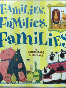
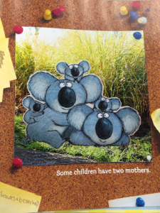
This Monarch Award-winning children’s book provides a glimpse at the various kinds of families that people may belong to, as an alternative to the nuclear family dynamic. With explanations such as “Some families have two moms,” “Some families have one dad,” and “Some families are children living with the aunt,” children are able to see that families come in a multitude of sizes and have can be made up in all different kinds of ways. Furthermore, it ends by explaining that no matter who or how many people make up one’s family, they are all bonded by love.

This gives children a mirror that allows them to see their own family demonstrated in the text. It is helpful because it can, therefore, make them feel included and have their family composition validated to themselves and other readers. It also provides a window to show them a multitude of different ways a family can be structured, all while stressing the importance that no one family structure is better or worse than any of the others. I especially appreciated the book’s inclusion of same-sex parents, as that is a structure that society is still working toward accepting today. By including these types of families, children who belong to a family with same-sex parents can feel more accepted and appreciate that their family is recognized by the book. Additionally, by including all different kinds of families throughout the book, it provides children with a door to practice inclusion and acceptance for all types of family structures, even if they do not mirror the one they see at home.

The illustrations in the book are unframed, with the exception of a frame that surrounds each family in a way that is designed to give it the appearance of a family portrait. Although the text could exist alone, the illustrations mirror the text and are able to provide a visual representation of each family composition that is being described by the text. Additionally, the illustrations are done in bright watercolors to mirror the happiness and freedom within the story. Facial expressions on the characters are all smiles to reflect this theme as well.

March: Book One

 march_lg

Authors: John Lewis and Andrew Aydin

Illustrator: Nate Powell

Publisher and Year: Top Shelf Productions, 2013

Number of Pages: 121

Genre: Non-fiction

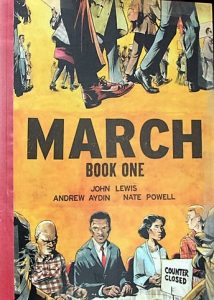
march book one page preview 1In March: Book One John Lewis tells about the struggle he has gone through and witnessed since the beginning days of segregation. He highlights the highs and lows of the Civil Rights Movement, and how much influence he had in the process.
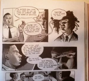
This book works hugely as a mirror. There are so many people that can identify with this text, and it is always helpful to get history on one’s culture. This book could work as a mirror for those who can identify with it, a window for those who can’t, and a door for those could learn a lesson from it. The 1950’s-1960’s weren’t an exciting time for African Americans, and John Lewis elaborates on that. In the beginning of the graphic novel, the Whites have all of the power. As time goes on and more Black people realize how powerful a peaceful protest could be, they begin to gain power. The use of peaceful protests is something that is still prevalent and effective today. Perceptually, the pictures mirror and add to the text, and vice versa. Most of the text is dialogue, and the rest are descriptions of scenes, people, and situations.

Structurally, the novel is set up as typical graphic novel would be: pop-out speech balloons and lots of pictures. The characters continuously move to the right, which symbolizes them moving forward. The entire book is in black and white, but the reader can still feel when a scene is “darker” than others. This may also be because the book was about problems between Blacks and Whites, so it would make sense to have the book in black and white only. Some backgrounds are white with black panels, which makes us feel lighter and less tense about what is going to happen next. Other backgrounds are black with white panels or no frames at all. There is usually a life-changing moment occurring on these pages. Ideologically, this story can serve to teach readers about African American history, if nothing else. It shows that everything does not have to be solved with violence, and that peacefully hashing things out can be more beneficial. This story also teaches readers that there are perks to being the bigger person and not letting others get to you.

The Pigeon Needs a Bath!

1503850_4942986348530_7521447933107286851_n

Author/Illustrator: Mo Willems

Publisher and Year: Hyperion Books for Children, 2014

Number of Pages: 32

Genre: Fiction

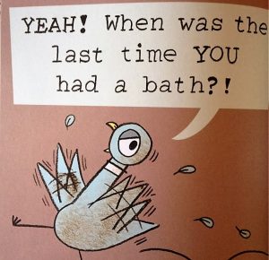
IMG_4397This dirty pigeon uses sarcasm and reverse psychology to get out of taking a bath. When his tactics don’t work and he is forced to take a bath, he realizes that baths aren’t so bad after all.

This book could work well as a way to get young, stubborn children to bathe. For some children, bathing isn’t the highlight of their day, so seeing the Pigeon do it could make them feel better about it.  Many parents could probably relate to the Pigeon’s parent who can’t seem to convince him to take a bath. The Pigeon Needs a Bath! Is a book that has some different humor, but is ultimately just a fun read. Like a typical parent-child relationship, the man (assuming he is the parent of the Pigeon) has the power to make the Pigeon take a bath. The Pigeon may feel that it is a choice, but in the end he will take a bath. Some parents could relate to this as well; they allow children to think that they have a choice if they do something, but in reality they don’t.

Perceptually, the entire book is just a conversation the Pigeon is having with himself. He invites the reader into the conversation a few times, but he is really just convincing himself that he shouldn’t take a bath. The text adds to the images, and the images are dependent on the text. Because the illustrations are so simple, it is not clear what exactly the scenes would mean without the text. Structurally, the pigeon is having conversations with the reader as if we someone is actually responding to him. This makes the reader feel more engaged with the book. Emphasized sounds help readers get acquainted with onomatopoeia.

Grandpa Green

2016-05-16_16.19.14[1]

Author: Lane Smith

Illustrator: Lane Smith

Publisher/Year: Roaring Book Press, 2011

Pages: 34

Genre: Realistic Fiction

Analysis:

In Grandpa Green, a little boy gives a history of his great-grandfather as he wanders among the artfully shaped trees and hedges of his garden. The boy’s history exposes his great-grandfather as a humble farm boy, a soldier, a husband, and most of all, an artist whose memories lie in his garden creations. The book ends with the boy trimming a topiary tree in the shape (memory) of his great-grandfather.

In a touching and whimsical way, young readers who feel a great sense of pride and respect towards a role model, friend, or family member, can relate to the little boy’s fascination with his great-grandfather and his desire to bond in the garden. Grandpa Green acts as a window by exposing young readers to the experiences of a different generation, one where children got chicken pox, did not have cell phones, and had to serve in the war as young adults. Grandpa Green also introduces readers to the process of aging, but not as they have experienced it thus far in their lives; for boy’s great-grandfather, aging involves forgetfulness and handing down his memories and legacy through garden creations. Finally, the boy’s honorable behavior allows Grandpa Green to act as a door for readers. Instead of mocking or judging his great-grandfather in his old age, the young boy shows great curiosity and respect for him. The boy both interacts with his great-grandfather’s memories (in the form of shaped trees) and helps him to not forget things like his hat.

2016-05-16_16.32.01[1]

Power is distributed evenly in Grandpa Green. Although the great-grandfather is old and growing forgetful, Smith celebrates the power of older generations to pass down memories and family history. The boy as well has power—the power to keep his great-grandfather’s art and spirit alive by learning how to trim trees and shrubs. Although concepts of family history and aging are universal (or race-less), Grandpa Green focuses on those themes within the setting of a white, American family. Some readers might get the message that gardens as spectacular and elaborate as the great-grandfather’s are typical of white people, and senior citizens especially. Grandpa Green only explores one way family history can be shared, even though it is different across cultures.

The text communicates the identity transformation of the great-grandfather as he ages and grows from a farmer to a lover, soldier, husband, and artist. The text, while limited, also provides context to the illustrations. Sif’s illustrations add a whimsical feeling to the story and symbolize how imagination and artful skill can preserve things (i.e. memories) otherwise forgotten. On each page, trees and bushes are shaped to mimic each event in the great grandfather’s life (e.g. trees shaped like a plane and parachuting soldier to represent war). The boy is drawn very lightly and is almost invisible; the purpose of Grandpa Green is to celebrate the great-grandfather, not the boy. Also, the way the young boy plays with his great-grandfather’s garden creations in the illustrations symbolizes how history is lived through the memories of loved ones. Themes present in Grandpa Green include respect for elders and the use of art as a means of story-telling and sharing of culture.

The Day the Crayons Quit

2016-05-16_16.28.25[1]

Author: Drew Daywalt

Illustrator: Oliver Jeffers

Publisher/Year: Philomel Books, 2013

Pages: 32

Genre: Fiction

Analysis:

In The Day the Crayons Quit, Duncan receives a stack of letters written by his twelve crayons: red, purple, beige, gray, white, black, green, yellow, orange, blue, pink, and peach. In their own letter, each crayon describes his or her unique woes, including being used too much or too little, being a “girl” color, or only being used for outlines. Duncan’s responds by using all twelve colors in his next drawing, scoring him As for creativity and coloring.

The Day the Crayons Quit acts as both a mirror and a door. Although indirectly, each crayon’s woe is not too far related to the real life struggles of young readers. The red, gray, and blue crayons describe how they often work harder than other crayons because there are so many (large) things of their color. Readers who have ever felt used, overworked, or underappreciated can personally identify with these three crayons. Likewise, just as Beige is tired of being incorrectly labeled “’light brown’” or “’dark tan,’” elementary aged students have surely dealt with threats to their individuality. Finally, Pink complains of never being used because of her association as “girl” color; this woe can speak to both girls and boys who have felt swayed to act in a certain way because of their gender. Woes a reader cannot personally identify with can help expand their world view, maybe even alerting them to the troubles their peers are experiencing. For very young readers, Daywalt’s book provides a basic understanding of the colors used to draw certain things. Duncan’s response also functions as an appropriate model of behavior, for he not only addresses the complaints of each crayon but uses their unique ability to create an interesting illustration.

Power rests with Duncan for only he can attend to the woes he unknowingly wreaked upon his crayons. Through each crayon’s letter, Daywalt creatively and humorously explores the concept of power struggles.

2016-05-16_16.29.33[1]

Exclamations, purposeful capitalization and underlining, and humor captivate the intense desire of each crayon to have their concerns met. The signature and closing of each letter communicates very briefly the situation each crayon wants recognized and fixed (e.g. “Your very stubby friend” (p. 22)) and type that mimics a child’s handwriting helps give each crayon personality. Jeffers’ illustrations mirror the text but more symbolically and literally show the emotions felt by each crayon. For example, as Beige complains of being used only for wheat he is drawn with a sorrow expression and weak posture like that of a lonely stalk of wheat. White complains of meaning nothing without a black outline, and is thus illustrated by Jeffers without a black outline, causing White to be nearly invisible and easily overlooked by readers, myself included. The illustrations also contrast the current and ideal worlds perceived by each crayon. The placement of the majority of crayons lower on the page signifies their low spirits and power so long as Duncan does not respond as they please. Many themes in The Day the Crayons Quit deal with social justice concerns, such as challenging gender norms, oppression, and the democratic right to free speech and expression (i.e. striking). The theme of teamwork without the loss of individuality is also explored, as exemplified by Duncan equally addressing the unique needs and wants of each crayon.


Last Stop on Market Street

2016-05-16_16.27.04[1]

Author: Matt de la Peña

Illustrator: Christian Robinson

Publisher/Year: Penguin Group, 2015

Pages: 28

Genre: Realistic Fiction

2016-05-27_11.03.56[1]

Analysis:

On one particularly rainy Sunday, CJ is far from excited about riding across town with his grandma to the soup kitchen where they volunteer; he questions Nana as to why they must wait for the bus, why they do not have a car like his friends do, and why they cannot just go home after church. Nana helps CJ’s imagination grow by encouraging him to look for the beauty along their journey—from the magic of music and city life, to the spirited characters of the soup kitchen.

The Last Stop on Market Street can speak to young readers, such as CJ, who feel uncomfortable living a lifestyle different from that of their peers, and needed a push from someone they love to appreciate what they have and are working for. Young readers who live with and/or spend most of their time with a grandparent or other non-parent caregiver can also relate to CJ’s experiences with Nana. Likewise, The Last Stop on Market Street functions as a window. As a narrative of a young boy living modestly in the city, Matt de la Peña’s book introduces readers to a day in the life of someone who may be less advantaged (i.e. financially) than they are. White readers of the middle class are given a chance to empathize with CJ as he realizes the cultural differences that divide he and his friends (e.g. CJ must wait in all weather for the public bus, and has to volunteer after church instead of going home to relax). Finally, The Last Stop on Market Street acts as a door through Nana’s example of respect and optimism. Specifically, Nana models for CJ how to be a “better witness for what’s beautiful” by not being narrow-minded (p. 22). For example, when CJ questions why the blind man cannot see, Nana invites CJ to consider understanding the world through one’s ears.

Symbolic power—the ability to see the beauty in even the most imperfect and overlooked aspects of life—is imparted on CJ through his Nana’s wise advice and model behavior. Both the text and illustrations accurately and respectfully represent African American culture. Many, but certainly not all, African American parents are absent in their children’s lives due to divorce or multiple jobs, as can be inferred by the intimacy between CJ and Nana. The language used by CJ and Nana is not always grammatically correct (e.g. “gotta;” “Boy” to refer to CJ) and resembles slang. Although CJ and Nana are stereotypically living and working in an urban environment, Peña and Robinson celebrate the spirit and diversity of such a place. Contrary to what one might expect, Robinson’s soup kitchen is a place where men and women of all colors work and eat.

Text, in the form of out-loud wonderings, questions, and wishes, is used to communicate CJ’s initial resentment and discontentment with his lifestyle. Nana’s wisdom and her helpful advice for CJ are also communicated through words. Illustrations in The Last Stop on Market Street embrace the theme of human diversity. Many characters are illustrated with a distinctive look (e.g. tattooed man; pregnant woman), and represent a wide range of ability (e.g. blind; physically handicapped) and race (black, white, and all colors in between). In this way, Robinson’s illustrations challenge various stereotypes, such as how soup kitchens and public transportation are not just for people of color. Late in the book, hawks flying towards the right of the page, and the use of brighter, more optimistic colors to illustrate the neighborhood slum symbolize the return of CJ’s pride for their work at the soup kitchen, and respect for the community he lives in. The Last Stop on Market Street preaches the value of humility, or the idea that having less allows a person to see more beauty in the world. Another, perhaps unintended theme is orthopraxy, explored by how CJ and Nana go to church but also do good works (volunteer work).

A Story A Story: An African Tale

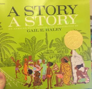
IMG_4281 Author(s): Gail E. Haley

Illustrator/Photographer: Gail E. Haley

Publisher and Year: Aladdin Paperbacks in 1970

Number of Pages: 32

Genre: Fiction, Folklore

Analysis:

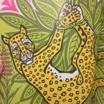
In this African tale, Ananse, or the spider man, decided one day that he wanted all the stories that the Sky God had in his golden box. Ananse had to first outsmart and capture a leopard, hornets, and a fairy to give to the Sky God in order to receive these stories. But after collecting these items for the Sky God, he received the golden box of stories and brought them back down to share with the people of earth, which is why African tales are now called spider stories.

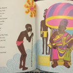
I believe that this text could function as a window for readers who are not familiar with the African culture because it describes the reason that many African stories are called “Spider Stories,” it mentions a god or religious figure, and the illustrations show traditional African clothing and face paint. I also believe this could be an opportunity to introduce more cultures to the classroom, as well as, the chance to explore more traditional folklores and fables. This story could also function as a mirror for African American children to realize and understand the importance of their culture in a Westernized society. In the text, the Sky God is the character with all the stories and, therefore, all the power. I also thought that the stories were symbolic of knowledge, and Ananse wanted more knowledge but had to prove to the Sky God he was worthy of it first. The Sky God was also illustrated as larger and dressed more colorfully than all the other characters to represent his high status and power. The illustrations throughout the text are very colorful and contain lots of different patterns which help give the story a more energetic and tribal feel to it. I also believe that the images made the story more interesting and added to the overall message of the story.

Therefore, I would say that the text did a nice job of making the reader more aware of another culture and their thoughts and beliefs about why things are the way they are today. The original intent of this story was to help explain to others why African stories are often called “Spider Stories,” but in the process it also showed that someone can be successful even if they have all odds against them.