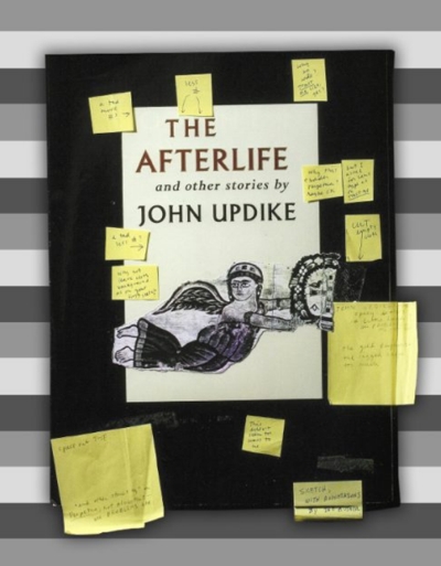
Carol Devine Carson, a designer at Alfred A. Knopf, summarized what it was like designing a book cover for John Updike: “He was very hands on,” she told Eye on Design writer Rachel Berger. “You had to learn what he liked in order to get anything approved.” Carson and designer Chip Kidd said Updike’s “likes” were consistent, Berger wrote. “For body copy, Janson of course. For jackets, Updike favored Albertus, a craggy Depression-era display face with tapering serifs resembling letters carved in metal, centered and in all caps. He loved certain shades of blue. He preferred 18-point type. Original art, yes. Contemporary photography, no. ‘He didn’t want to see too much letter spacing or type used in any kind of bizarre way,’ recalled Carson. ‘It was very straightforward,'” whereas Kidd and Carson’s design tastes were varied.
Updike’s first ambition was to become an artist, and all of his dust jackets proudly list the year he spent at the Ruskin School of Drawing and Fine Arts in Oxford, England. Visitors to The John Updike Childhood Home can see numerous examples of his work.
What did Kidd, a Reading native who was a keynote speaker at the 3rd Biennial John Updike Society Conference, think of Updike’s design sensibilities? Consider the famous dust jacket for Rabbit, Run, which Updike designed. “What about that cover suggests middle class suburbia?” Kidd wondered. “Unless I’m missing something, conceptually it doesn’t mean anything”—those patterned thin yellow, green and blue stripes with a large circle in the center.
“I would call Updike’s design taste very conservative,” Kidd told Berger, contrasting it with his own aesthetic, which was “just completely all over the place.” Berger wrote that Kidd and Updike occasionally “butted heads,” with one letter to editor Judith Jones “requesting ‘no Kiddian theatrics, please’ for an upcoming title.”

