
Title: Happy in Our Skin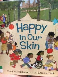
Author: Fran Manushkin
Illustrator: Lauren Tobia
Publisher: Candlewick Press 2015
Number of pages: 32 pages
Tags: Diversity, Culture, Picture Book, K-1, Stephanie Prentice
Genre: Realistic Fiction
Analysis
Happy in Our Skin is a book that discusses the many differences that children have, while showing that we should be proud of our differences. It shows a family of mixed ethnicities going to the park, the pool, and a block party.
In all these scenes, the author shows how everybody is the same regardless of what they look like. The similarities and differences discussed in this book aim to show that even though someone’s skin may look different, it is the same in reality. For example, the author discusses the function of skin as “keeping the outsides out and the insides in” (Manushkin, p. 8). Serving as a window, the diversity in this book allows children of many different ethnicities to relate. It also allows children to reflect on their own personal attributes and find similarities and differences that make them unique. The illustrator incorporates children of many different ethnicities and cultures to emphasize the author’s main idea that each child has the same skin regardless of it’s color or other features. They also include illustrations of children in wheelchairs.
Structurally the book includes a slight rhyming scheme that allows for fluent reading. The text is important, but the location of the words on the page is not relevant. The images are very vibrant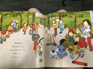 and bright. The images often reinforce the ideas presented in the text, and sometimes act as an enhancement. They show the diversity in skin color and features as well as the physical abilities that are discussed in the text. This book allows for children to see that each person has the same physical feature, skin. It teaches them the importance of skin and how it helps our body. This allows for an easy opportunity for educators or parents to have discussions about race. It teaches the importance of tolerance and acceptance of others who may look different. The illustrations radiate the idea of acceptance, as we see children of all ethnicities and cultures interacting in public places.
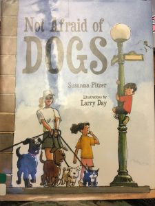 Title: Not Afraid of Dogs
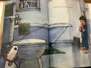 such as dogs, is normal and even common. The images, a Society of Children’s Book Writers and Illustrators’ Golden Kite Award for Illustrations winner, capture the emotions a child might have while facing their fears for the first time. For example, the cover picture shows Daniel climbing up a lamp post in the city when a group of dogs walk past him. Taking a first glance, the reader can easily tell the child is nervous and unfamiliar with dogs. The boy is usually placed on the opposite side of the dog, most of the time looking back to make sure he was safe from the dog. This is an accurate depiction of many other children who are afraid of or unsure of many animals. The text placement is not important in the story, however the author’s decision to emphasize Bandit’s howls in a different text size and alignment allows the reader to imagine the sound in their mind.
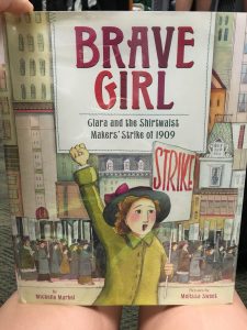 Author: Michelle Markel
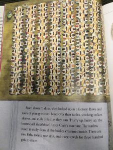 r example, when Clara arrives in America on the boat, the illustrator included an image of the long line of people waiting on the boat for their new life in America. The text is displayed on a stitched piece of fabric that connects to the main theme of the story very well. The pictures are often sewn into the text, making them resemble a quilt. Clara is often found looking or moving to the right of the page, signifying the change that is going to happen. The author uses many adjectives that emphasize the struggles Clara and her colleagues faced. For example, when Clara first arrives, the author introduces her as dirt poor and five feet tall. Ideologically, this story has many things that children can take away after reading. First and foremost, this book gives the students a historical look into the life of immigrants, especially those of women. This book focuses on the hardships and challenges that Clara faced with work and learning to speak English. Secondly, it shows students how important it is to stand up for what they know is right. If Clara were not to stand up for what she believed was right, many workers would have suffered for a longer period of time. Even after Clara faced many arrests, beatings, and threats to be fired, she kept the fight for her rights alive. It proves that determination and perseverance can lead to change for what is right. At the end of the book, readers are introduced to more information about the garment industry that can further their understanding on the topic.
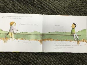
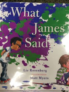
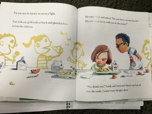 Perceptually, the images are very bright and enticing for the children. The use of faded watercolor pictures, such as in the picture below, allows the focus to remain on the narrator and James. The use of large text in certain areas allows the reader to recognize which points should be emphasized while reading the story aloud. Some of the illustrations resemble the ones that children would draw, making it very relatable for the readers. The layout of the text in relation to the pictures also allows the readers to follow the sequence very well, especially when the author is describing how each classmate heard the rumor about the narrator. Ideologically, this book shows the dangers of gossip and rumors and the effects they have on friendships. The misunderstanding during the “game of telephone” leads to the narrator’s feelings getting hurt by her best friend. Children who read this book are able to see the damage done by gossip and rumors. The ending of the book allows readers to see some things can be misunderstood and taken out of proportion. It also emphasizes the idea of friendship and its importance. The two sided story, the narrator and James’ actions, also show the different emotions when two friends are fighting. This book also gives an example of how children can solve problems with their friends. However, the way in which the narrator reacts is not recommended for children.