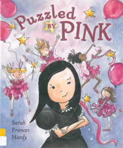
Puzzled By Pink

Author/ Illustrator: Sarah Frances Hardy

Publishing Information: Penguin Group, 2012.

Number of Pages: 30

Genre: Non-fiction, Picture book
pbyp 1 pbyp 2

Analysis:

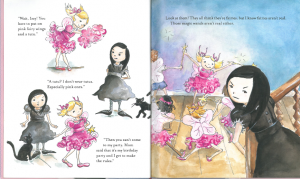
Rose is a little girl who loves pink. She wants everyone coming to her birthday party wear pink fairy wings and tutus. However, her sister Izzy hates pink and tutus. She does not believe in magic or the wand. Suddenly, the wand works and turns Izzy’s cat into a dragon. They play together at the party downstairs.

The text functions as a window for children to look at the story of other people’s life. The author and illustrator really did a great job presenting diversity through the story. There are both boys and girls coming to Rose’s party and boys can be fairies. Children who show up at the party have different skin colors. It teaches children that people of different races or different genders can be friends.

In the story, the character Izzy is kind of mean to her little sister Rose. It was Rose’s birthday but in the text Izzy never congratulates her or even wishes her a happy birthday. It is not the right way how sisters should treat each other. Even though Izzy comes to the party downstairs and plays with Rose in the end, the reason she does that is to escape from the dragon instead of celebrating her sister’s birthday. A possible revision of the text could be even though Izzy won’t wear pink things, she still helps Rose prepare for the party and has fun. Also, for me, the ending is a little confusing. The fact that the dragon shows up as a vicious creature at first but then it comes downstairs to play with children might confuse readers.

Perceptually, the book uses contrastive colors to demonstrate the differences of personality between Rose and Izzy. Rose always wears pink while Izzy wears black and white. The images are not framed so that readers can actually participate in the story. When Izzy decides to go upstairs and has her own party, she moves to the right which conveys a sense of less security. Structurally, text and images do not overlap. Children might not have any insightful takeaways from the book but they can notice the diversity of people through this interesting little story.

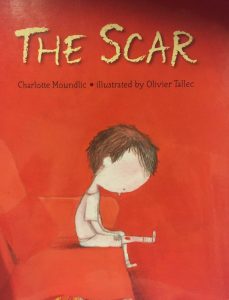
The Scar

Author(s): Charlotte MoundlicIMG_4357

Illustrator/Photographer: Olivier Tallec

Publisher and Year: Candlewick Press in 2011

Number of Pages: 31

Genre: Fiction

Analysis:

This story began with a little boy explaining that his mother had just died and left him with just his father. The boy goes through a series of emotions and feelings like being angry that his mother left him, sad that she won’t be there as he grows up, tired from trying to take care of his father, and fearful that he might forget his mother. In the end, his grandmother, his mom’s mom, reminds him that his mother is always with him in his heart.

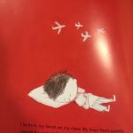
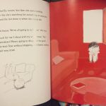
The illustrations in the story were an important part of this text because they helped add to the overall tone of the story and they helped to depict the feelings of the characters. For example, the color red is the primary color on every page, which can represent a variety of intense emotions such as, anger, fear, love, and passion, which are all emotions felt by the main characters. In fact, the little boy is always a different shade of red depending on his current mood, the more upset or angry he is feeling, the darker the shade of red. I also noticed that the characters sometimes have a mouth on their face and at other times there is no mouth on their faces at all. I think the illustrator did this to show that sometimes the characters may seem fine on the outside, but the text explains that they are still struggling with the loss of the mother.

I believe that this story could work well as a window for children to be introduced to and help to teach the different stages of grief. This could be especially helpful for children who have not been exposed to death to help them to understand the feelings that their friends or family members may have experienced or are experiencing. This book could also function as a mirror for children who have lost a family member, because it can help them understand that having different emotions is completely normal. None of the characters in the story have names, which symbolizes that this little boy and his father can represent all people who feel these emotions, not just this one fictional family. I also believe that it is important to note that the mother is the one who dies in this story, which leaves the little boy with his father to show a different family dynamic where there is a widowed father and his son. Overall, I believe that this is a great story to read to children to help them understand that it is okay to grieve when someone important to you has died, and that there are many stages and emotions associated with grief.

Whoever You Are

Author(s): Mem FoxIMG_4398

Illustrator/Photographer: Leslie Staub

Publisher and Year: Harcourt in 1997

Number of Pages: 26

Genre: Fiction

Analysis:

This book begins with the main character telling the reader, who they assume is a “little one,” that people all over the world may have different homes, skin color, schools, and lands, but they all have a heart that is capable of all the same emotions. Then the story continues to tell the “little one” that people may be different as they get older, but again reinforces the idea that everyone is similar because everyone has the same emotions.

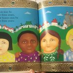
The illustrations in the story are very important in adding dimension to the text on the pages. The author talks about how there are many different people throughout the world, but the illustrator captures the different cultures in the images by including characters of many different ethnicities, genders, and ages. The images are all brightly colored which is inviting for children to look at, as well as creating the idea that differences make the world a more colorful place. Because of the multitude of ethnicities on each page, I would conclude that no specific race has been given power. However, I believe that some of the images portrayed women as the stereotypical gentle caregiver. For example, in the last few pages, a group of women are all holding children in dresses waving goodbye to the main character, even though there were males throughout the story. Another issue I had with some of the images was the fact that I was not sure that all the different cultures were accurately represented, because I was unsure how the illustrator went about deciding how to represent each culture.

I believe that this story is a great way to teach young children about diversity and also about how everyone is similar when it comes to emotional capabilities. I believe that this story works as a window for children to see that there are many different people and cultures throughout the world, which may be different from what they have experienced in their life. This story also works as a mirror for some children because it represents a multitude of cultures, some of which are not often shown in books. I also believe this book can work as a door for children to learn to see differences in other people but to realize that these differences make individuals special, yet all people are the same on the inside. Overall, this story would work well for teaching young children that all humans are similar in that they all have feelings, especially living in a world that tries to put other people or groups down in order to feel powerful.

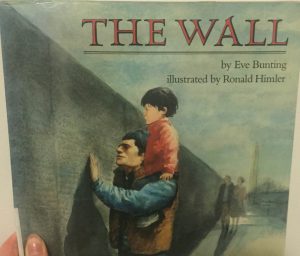
The Wall

Author(s): Eve BuntingIMG_4401

Illustrator/Photographer: Ronald Himler

Publisher and Year: Clarion Books in 1990

Number of Pages: 29

Genre: Fiction

Analysis:

This story is about a little boy and his father who go to the Vietnam Veterans Memorial in order to find the name of the little boy’s grandfather, who is the father of the boy’s father. While the father is searching the wall for his father’s name, the little boy is looking around at the other visitors and describing the gifts left at the wall. In the end, the boy’s father traces over his father’s name that is on the wall and takes the paper home, and the little boy is proud that his grandfather’s name is on the wall but he wishes he were there.

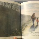
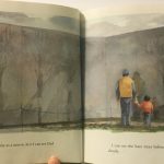
            The images in this book do a great job of reinforcing the somber tone; for example, the color gray is used in every image, the details of the images look a bit blurry or smudged, and most of the images are not framed all the way which makes it seem like they are fading away. All the background characters drawn in this book are white but the main characters seem to be of Hispanic descent, however, they don’t look that different from the other white characters except for their dark brown hair. This instills the idea that many of the Vietnam veterans were white, which can give the impression that the white man is the hero in war and that other ethnicities were not as valuable in war. I also noticed that the two main characters were males and many of the other characters discussed in the book were males, and this also gives the wrong impression that men are to be associated with war which can also show that men are valued more than women in war and in society.

I originally thought that this book was intended as a way to teach young children about how to cope with the loss of a family member. But I realized that this book could also function as a window for children to learn about the effects of war on the more personal level, as well as, teaching them about the Vietnam War and how it impacted America as a whole. For children who have lost a family member, specifically to war, this story can be used to mirror their feelings to show that it is okay to grieve for a loved one. Overall, this story does a great job of explaining a deep message to young readers.

Smoky Night

15

Author: Eve Bunting

Illustrator: David Diaz

Publishing Information: Voyager Books, 1994

Number of Pages: 28

Genre: Historical Fiction

Analysis:

16

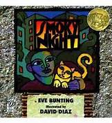
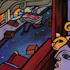
                        Smoky Night is the Caldecott Award-winning book that tells the story of a young boy and his mother witnessing the rioting in the streets below their apartment building. When a fire breaks out they must flee for safety all while taking in the wreckage the rioters have caused in their neighborhood. They find safety in a shelter, and the incident unifies the people of the neighborhood.

The book was published in 1994, which led me to wonder if there was a particular incident that could have inspired the story. Sure enough, the story was inspired by the rioting that took place in 1992 after an incident of alleged police brutality against Mr. Rodney King. I think this book does an exceptional job of providing children with a window to look at this piece of history, as it gives the perspective of a child living through that chaos without being too detailed or frightening for young readers. The story mainly focuses on the child’s search for his cat, who gets lost in the midst of tenants fleeing from the apartment, which can be both problematic and useful. I can see where readers may find this problematic as it shifts focus away from the riots and focuses more on the lost cat. However, this can be useful as it makes the story more accessible to a younger audience.

The illustrations of the book were certainly eye-catching and very additive to the text. The background of each page featured real-life objects (such as hangers, plastic bags, and wooden signs) that conveyed the point that this story is based off of real-world happenings. Furthermore, the illustrations are done in dark paint and are always featured on the right-hand page which demonstrates the mood of chaos and dreariness that surrounds the events in the story. The illustrations are framed with thick, black paint, so readers are looking in on this story from afar. In addition, although the text is always featured on the left-hand page, it is written on a crumpled paper which further demonstrates the mess of the situation playing out in the story.

This book provides children with an accessible window to examine a real-life event through the eyes of a child living through it. Furthermore, they are taught the value of coming together in a tough time, as the neighbors in the story demonstrate.

All My Stripes

13

Author: Shawna Rudolph and Danielle Royer

Illustrator: Jennifer Zivon

Publishing Information: Magination Press, 2015

Number of Pages: 34

Genre: Realistic Fiction

Analysis:

14

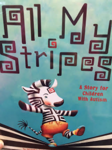
            All my stripes tells the story of a zebra named Zane, and his experiences with autism in a classroom setting. Zane can tell he is different from his classmates, and begins worry as he feels that they only see his autism stripe (a red stripe on his forehead that indicates he has autism). It isn’t until his mother explains his many other wonderful stripes that Zane learns that his autism stripe is just one of many stripes, and does not define who he is.

This is quite possibly my favorite book of the ones I have analyzed, as it gives children a way to understand autism and the everyday differences and hardships of people who are effected by the condition. For example, it portrays Zane’s distress when the fire alarm sounds, whereas his classmates were able to remain calm and quiet. Also, the author creates a scene in which the classmates cannot understand why Zane wants to use a paintbrush instead of his hoof when doing a painting activity, because Zane does not like the feeling of paint. The back of the book provides an explanation of these scenes, and how they connect to the behaviors of real people with autism. Furthermore, it provides a guide for how caretakers can help to address and aid with these behaviors for their students/child. This provides an excellent door for both children and adults to respond to those with autism in a caring and understanding manner.

The illustrations are unframed, so readers are able to really put themselves in the scene with Zane. One is able to see the distressed look on his face as he shares his concerns with his mother, and is self-conscious around his classmates. I thought it was interesting as well that on the first page when Zane addresses his concerns to his mother, it is raining which can signify the sadness he feels.

Zane’s mother goes on to explain that the autism stripe is not his only stripe, and he has many other wonderful stripes; his “pilot stripe” that makes him good with directions, his “caring stripe” that reflects his concern for others, his “honesty stripe” which reflects his willingness to tell the truth, and his “curiosity stripe” that shows his eagerness to learn. This teaches children that no one aspect of their life defines them, and the value of self-acceptance. Furthermore, they are learning about autism and how to help in a way that they can better understand at a younger age.

Monster Knows Please & Thank You

1112

Author: Connie Colwell Miller

Illustrator: Maira Chiodi

Publishing Information: Picture Window Books, 2014

Number of Pages: 20

Genre: Fable

Analysis:

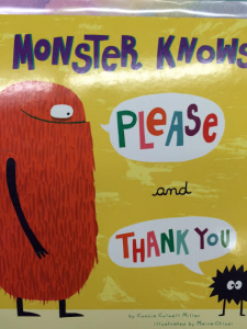
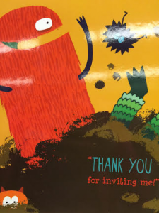
This book gives the story of a group of monster friends who are invited to a party to participate in a variety of activities. While participating in different activities and socializing with the other partygoers, each monster is sure to remember to say “please” and “thank you” where it is warranted. As a result, all the monsters are able to get along nicely and are invited back in the end.

This book struck me as a cute and fun type of introductory to a lesson in manners for children. I thought having monsters as the main characters in the story was an interesting choice, but also tactful. Monsters are typically seen by children as mean and/or scary, so it was even more impactful that these monsters were very well-mannered; if even monsters can say “please” and “thank you,” so can the children reading the story. This provides children with a window to see how others behave in a social setting, a mirror so they may reflect on their own manners, and a door to continue to practice good manners in their everyday lives and social settings.

The illustrations in the book are quite interesting, as the text is integrated within the illustrations. The words “please” and “thank you” are in different colors than the rest of each of the words in the sentences they are included in, and are in large, capital letters. This puts extra emphasis on the importance of these words, and makes them stand out from the rest of the text so children pay more attention to them. Furthermore, the pictures are unframed, allowing children to really put themselves in the scene with the characters. As for the illustrations themselves, the colors remain bright throughout the story, giving a fun and lighthearted feel as the good manners the monsters demonstrate help them to avoid conflict.

I found that this book is certainly a fun and easy way for children to learn proper manners, and how having good manners can help them in social situations. It is easily accessible and quite applicable to the everyday lives of young readers.


Tweak Tweak

9 10

Author: Eve Bunting

Illustrator: Sergio Ruzzier

Publishing Information: Clarion Books, 2011

Number of Pages: 40

Genre: Folktale

Analysis:

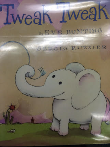
            Tweak Tweak tells the story of a baby elephant and her mother as they wander through the jungle and encounter a variety of different animals that live there as well. Tweak Tweak’s curiosity is piqued each time she sees an animal displaying a skill/behavior that she is unfamiliar with, and she asks her mother if she is capable of doing the same thing as each animal she sees. Although her mother explains that Tweak Tweak cannot do the same thing as the other animal, she enlightens her on the different skills/behaviors that Tweak Tweak is able to do that are just as unique.

The illustrations in the story are noteworthy, as I was able to see a variety of picture codes that could be applicable to different aspects of the illustrations. For example, each time Tweak Tweak asks her mother, “Can I do that?”, she is pictured on the right-hand side of the page, indicating a lack of security. Then, when her mother explains a skill that she is able to do instead of the one she has seen the other animal display, Tweak Tweak is pictured on the left-hand side of the page to demonstrate a greater sense of security now that she is reassured of her own talents. Additionally, there is always a round frame surrounding Tweak Tweak and her mother on the page that follows the mother’s explanation of Tweak Tweak’s unique skill, as they move on from their current location. This indicates a contentedness that is felt by Tweak Tweak and her mother after they are both aware of a skill that Tweak Tweak has that is unique to her, rather than focusing on the skill the other animal has. Furthermore, the illustrations are done in bright watercolors, and the facial expressions of the two elephants are always jovial.

The story teaches children that everyone has their own unique set of abilities, and provides them with a mirror to reflect on their own. The lack of a frame around the illustrations helps children to also put themselves into the scenario with Tweak Tweak, so they can reflect further on this lesson. Also, it teaches them that instead of focusing on what someone else can do that they cannot do, they should focus on those abilities that they do possess and make them unique.

Families, Families, Families

7

Author: Suzanne Lang

Illustrator: Max Lang

Publishing Information: Random House Children’s Books, 2015

Number of Pages: 24

Genre: Realistic Fiction

Analysis:

8

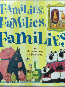
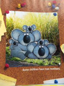
This Monarch Award-winning children’s book provides a glimpse at the various kinds of families that people may belong to, as an alternative to the nuclear family dynamic. With explanations such as “Some families have two moms,” “Some families have one dad,” and “Some families are children living with the aunt,” children are able to see that families come in a multitude of sizes and have can be made up in all different kinds of ways. Furthermore, it ends by explaining that no matter who or how many people make up one’s family, they are all bonded by love.

This gives children a mirror that allows them to see their own family demonstrated in the text. It is helpful because it can, therefore, make them feel included and have their family composition validated to themselves and other readers. It also provides a window to show them a multitude of different ways a family can be structured, all while stressing the importance that no one family structure is better or worse than any of the others. I especially appreciated the book’s inclusion of same-sex parents, as that is a structure that society is still working toward accepting today. By including these types of families, children who belong to a family with same-sex parents can feel more accepted and appreciate that their family is recognized by the book. Additionally, by including all different kinds of families throughout the book, it provides children with a door to practice inclusion and acceptance for all types of family structures, even if they do not mirror the one they see at home.

The illustrations in the book are unframed, with the exception of a frame that surrounds each family in a way that is designed to give it the appearance of a family portrait. Although the text could exist alone, the illustrations mirror the text and are able to provide a visual representation of each family composition that is being described by the text. Additionally, the illustrations are done in bright watercolors to mirror the happiness and freedom within the story. Facial expressions on the characters are all smiles to reflect this theme as well.

The Broken Cat


image_isbn

Author/Illustrator: Lynne Rae Perkins

Publisher and Year: Greenwillow Books, 2002

Number of Pages: 30

Genre: Realistic Fiction

A young girl breaks her arm and it isn’t until she sees that it gets better, that she starts to feel better. As time passes, the young girl gets older and has a son. When her son’s cat breaks his leg, she reassures them both that it’ll get better.

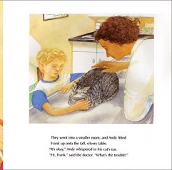
This text could work well as a mirror for children who can identify with Frank. At a young age, a child’s best friend is typically their pet. There may be children who feel for Frank and his cat because they love their pet in the same way. Some children also look to pets for direction as to how to react to a situation. For example, when Frank sees that his cat is depressed about breaking his leg, he also gets depressed. When the cat starts to feel better emotionally about the situation, Frank follows. The only characters who appear in the story are Frank’s family, who are White. However, when Frank’s mom breaks her arm and the town welcomes her home, there don’t appear to be any non-White neighbors. There could be more diversity in this book. Also, typical of gender roles, the woman is a nurse and the male is the doctor.

Perceptually, the text adds to the images. The images are dependent on the text, as the illustrations are very basic so a reader could not take much from them alone. Structurally, many of the images in the beginning are in, what appear to be, faded bubbles. The beginning of the story is filled with memories of when Frank’s mom was a child and broke her arm, so the faded pictures may just be her faded memories. When the story comes back into the present, the images are no longer in bubbles. One picture of the cat is a real picture, as parts of the story are based on true events. Ideologically, this story brings to life the true relationship of a child and their pet. The book never mentions that Frank’s mother felt bad for having the cast because she was made fun of, she just felt that it inconvenienced her. In a way, that sheds light on the situation.