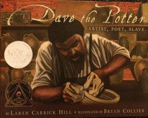
Dave the Poet: Artist, Poet, Slave

Author: Laban Carrick Hill

Illustrator: Bryan Collier

Publisher and Year: Little, Brown and Company, 2010 (Caldecott honor, Coretta Scott King Award)

Number of Pages: 40 Pages

Genre: Historical Fiction

Dave the Potter tells of Dave, who was a slave in the 1800s in South Carolina (Hill, 2010). He was a very skilled potter while also being a poet. This story honors the craftsmanship of Dave’s pottery along with his poetry.

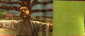
This story serves as a window into the life of Dave as a slave and as a craftsman. However, this book only focuses on Dave’s pottery and some poetry, but does not tell of his struggles as a slave. In addition, the last three pages of the book highlight some of Dave’s poetic verses while explaining historical facts about him. This book seems to portray Dave as enjoying being a slave in the South. For example, the images show Dave with facial expressions of content and serenity as if he enjoys the current position of being a slave doing his work. As a mirror, it reflects the African American culture and honors a man of color that brought beauty to pottery and poems. As with Dave being a slave, he did not have power. He is portrayed as just going about the day while creating large pots. Yet, the end of the book includes an author and illustrator’s note. Both explicitly state the extensive research they did on Dave (it is all cited in the book), and even visited the place where he was a slave. Though the way Dave was depicted was not exactly accurate (he lost a leg but is drawn with two legs), the author and illustrator made it very clear that though Dave was a slave, the purpose of this book was to honor his craft of pottery and poetry. This story represents the African American culture by honoring a man of color. As the author and illustrator made known, they wanted to represent Dave for his skills as a potter and poet. They portray him as a figure worthy of being remembered as a man of color in history. At the same time, this breaks any stereotype that showed slaves having no creative skills because Dave was able to create beautiful verses of poetry and pottery as a man of color.

Perceptually, the book is a Caldecott honor meaning that the artwork is important to the emotion of the story. In addition, image is on one page while text on another to allow the reader to focus on both text and image. The text is on a solid colored background showing it is to be noticed by the reader. Dave is portrayed as very calm, quiet, and comfortable in work. My criticism of this is that with him being a slave, I think this book portrayed him to be more comfortable with his life as a slave than he actually was. Structurally, there are three pages of Dave’s historical background included at end of book showing that the author and illustrator want to share the story of Dave’s pottery and poetry. In addition, they include citation page and author and illustrator’s note. This shows credibility to where they found their information about Dave’s story while also explaining why they chose to focus on his craftsmanship and poetry. The text and images don’t mirror one another but still need both to gain full experience from book. Also, no framing of the images allows the audience to come into Dave’s story. Overall, this book honors a man with tremendous skill even with its questionable depictions of his life. As a theme from the book, the author and illustrator highlight that the fine arts bring beauty to the world.
IMG_2859IMG_2860


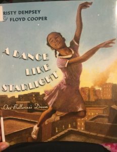
A Dance Like Starlight: One Ballerina’s Dream

Author(s): Kristy DempseyIMG_4365

Illustrator/Photographer: Floyd Cooper

Publisher and Year: Philomel Books in 2014

Number of Pages: 28

Genre: Historical Fiction

Analysis:

This story is set in New York in the 1950s, and is about a little African American girl who goes with her mother to work, which is at a ballet school, and she falls in love with ballet. The story continues with the young girl always wishing and dreaming of becoming a prima ballerina, and one day the Ballet Master sees her dancing backstage and allows her to join ballet lessons at the school. At the end of the story, the little girl’s mother takes her to see Janet Collins perform at the Metropolitan Opera House, as she debuts as the first African American prima ballerina, and the little girl then realizes that she can do anything she sets her mind to.

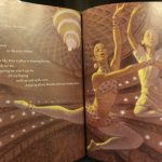
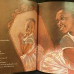
The illustrations in this book are large and drawn with detail. All the images have a pinkish-brown color scheme, which I believe adds warmth to the images and makes the reader feel comfortable with the main character. The illustrations are also unframed and take up the whole page, which helps the reader to feel as though they are also experiencing everything with the characters. Also, the way the text is placed on each page almost resembles movement and dancing, which can be related to the little girl’s never ending dream of becoming a dancer and how she is always moving towards her end goal.

When first reading through this story I thought it was a great story about a little girl who never gives up on her dreams of dancing, but after reading through the story again, and reading the author’s note, I realized that there was a deeper message within this story. The author was inspired to write this story based on the true event of Janet Collins becoming the first prima ballerina to be hired from the Metropolitan Opera, and the story briefly touches on segregation within the U.S. pre-Civil Rights Movement. I believe that this story could be used as a window for children to learn about segregation and how everyone was not allowed the same opportunities. However, this story does not explicitly state anything about segregation or the Civil Rights Movement, and the young girl is portrayed in a way that is very happy, which does not send the reader the correct message about the hardships that many African Americans may have faced during the 1950s. I also think this book can be used as a mirror for African American children who may feel like they have struggled with having the same opportunities as white children, and also for children who are living with a single parent who has to work a lot in order to provide support for their family. This book could also be used as a door to teach children to never give up on their dreams. Overall, I believe this story does a great job of encouraging children to follow their dreams, but I am not sure that this book accurately represents the way many African Americans felt during segregation.

A Day with No Crayons

2016-05-13_14.06.41[1]

Author: Elizabeth Rusch

Illustrator: Chad Cameron

Publisher/Year: Rising Moon, 2007

Pages: 27

Genre: Realistic Fiction

2016-05-13_14.05.50[1]

Analysis:

In A Day with No Crayons, a young Hispanic girl named Liza has her beloved crayons taken away for a day when she colors the walls of her room. Although sad at first, Liza quickly realizes that she does not need crayons to make art; art is all around her just waiting to be uncovered. Slowly, Liza’s world turns less and less gray as she colors her world using grass, flowers, mud, berries, leaves, and bricks.

 On a very basic level, many young readers can relate to Liza’s challenge of having to find alternate means of fun after getting in trouble and having things taken away. A Day with No Crayons does not really provide a window to the lives of others but it does, however, provide a window to the unexplored world we live in. Liza is surprised to find all of the beautiful and exotic colors around her, just waiting to be discovered, named, and transformed. Liza even concludes that a day apart from her crayons was actually quite liberating. Liza also models good problem solving skills, such as how to create something out of seemingly nothing.

 Although initially power rests with the mother and her ability to take away or give back Liza’s crayons, creative power ultimately rests with Liza, for she can choose to find and work with the color and art around her. The absence of crayons does not create a power struggle between Liza and her mother, nor does it represent an unconquerable obstacle for Liza. The mother is the only parent involved in the story and is rather stereotypically shown to be the rule-enforcing, punishment-giving parent. Although this instance of taking the crayons away helps Liza to grow (as an artist), it may still enforce in young readers’ minds the notion of a father as a buddy and only-around-for-the-fun sort of guy, rather than as an involved or active parent.

 The beauty and uniqueness of the world is conveyed by the use of creative and descriptive color names, such as cornflower, laser lemon, meadow green, and wondermelon. These words help communicate Liza’s excitement about the rainbow of colors around her. To help Liza’s world come alive in color, actual photographs of nature are skillfully blended with painted illustrations. Cameron’s changing color scheme is symbolic. When first deprived of her crayons, Liza feels blue and everything around her is illustrated in grayscale. However, bright colored illustrations gradually consume more and more of the page as Liza realizes the freedom of not being tied to her crayons and coloring books. The illustrations are also diverse in style, ranging from a two page spreads, to multiple unframed images per page, and to paintings that seem to crawl up the edge of the page. Liza is similarly drawn at different perspectives and with changing expressions. These dynamic illustrations captivate the book’s creative energy and show Liza to be a lively individual with spunk. With Rusch’s decision to have a female main character, A Day with No Crayons advertises, to a degree, that art and coloring are feminine hobbies. However, Rusch’s book nonetheless embodies a positive sky-is-the-limit attitude, and makes an interesting claim about art: that nature is more inspiring than material objects, such as crayons and coloring books.

The Artist and Me

2016-05-10_00.46.11[1]

Author: Shane Peacock

Illustrator: Sophie Casson

Publisher/Year: Owlkids Books Inc., 2016

Pages: 36

Genre: Historical Fiction

2016-05-10_00.44.45[1]

Analysis:

In The Artist and Me, an elderly French grandfather writes in a diary about “an ugly thing” he is ashamed of doing as a child: tormenting a starving artist (Vincent van Gogh) for his “awful pictures” and strange style (p. 3, 9). Admitting himself to be a coward and a bully, the aged man recounts how when alone he actually enjoyed looking at the artist’s paintings and admired Vincent van Gogh’s mission. On a trip to a famous art museum with his grandson, the old man finds one of Vincent van Gogh’s paintings—the same painting he had refused so coldly as a boy—and realizes how horrible he had been towards a man of extraordinary and priceless talent.

 The Artist and Me validates any young reader who has felt underappreciated or misunderstood. Readers who have ever missed out on an interesting friendship because they bullied someone can relate to the regret felt by the aged young boy. The Artist and Me also provides a window to the experiences of those who bully and those who have been bullied. One explored idea is how people sometimes bully others in public (to protect image), when, deep down they secretly admire and are curious about their victims. Through the old man’s criticism of his cruel close-mindedness as a boy, Peacock teaches readers to not mock or belittle those who are misunderstood for it not only blinds them from the talent of others, but also ruins their chances at forming valuable relationships. Peacock highlights how although Vincent van Gogh started poor he nonetheless completed his “mission” of telling the truth through art. Peacock gives no evidence, textual or otherwise, that the old man, having wasted his energy bullying, ever completed a mission of his own. The Artist and Me celebrates the culture of artists of all kinds. Individuals who doubt, fear, or mock misunderstood and unconventional artists are depicted as the crazy fools.

 Deep shame is evident through the old man’s criticism and mockery of his own behavior as a child. Although everything about Vincent van Gogh—personality, appearance, and artistic style—made him an eccentric “fool,” the text also conveys the boy’s hidden wonder in and admiration for the artist.  Both text and images communicate the idea that oppression dehumanizes and isolates those who are misunderstood. In his narrative account, the old man never refers to Vincent van Gogh by his name, and only by a “him” or a “someone.” Such a nameless identity symbolizes how the boy did not stick around long enough to know the man as Vincent van Gogh, the artist. Readers never see the front of Van Gogh or his face until he kindly offers the young boy a painting. Casson’s choice to hide the artist’s face emphasizes the isolation felt by the misunderstood and how their oppressors believe them to be feeling-less humans. Unframed, two-page spread illustrations invite readers into the lives of the boy and bullied artist, while warm and electric colors raise sympathy for the misunderstood Vincent van Gogh. The Artist and Me shows the relationship between ignorance, close-mindedness, peer pressure, and oppression, and highlights the effect of bullying on the life of the oppressor.

The Dot

2016-05-10_00.48.04[1]

Author: Peter H. Reynolds

Illustrator: Peter H. Reynolds

Publisher/Year: Candlewick Press, 2003

Pages: 28

Genre: Realistic Fiction

Analysis:

The Dot chronicles the creative endeavors of a young Indian student, Vashti, who transforms a simple jab of her pencil into a diverse gallery of dot masterpieces after her art teacher suggests she “make a mark” (p. 5).  At the end of the story, Vashti instills confidence in a little boy and his squiggle by encouraging him to sign his work, just as Vashti’s art teacher had done for her.

2016-05-10_00.39.24[1]

The Dot illustrates Vashti’s transformation from a young girl who stubbornly accepts her artistic inability to an artist who found her personal calling after taking a leap of faith. Children who have felt racked for inspiration, doubtful of their talent, or motivated to action by the sheer encouragement of an elder can relate to Vashti’s transformation and her relationship with her art teacher. For children who do not identify with Vashti’s inspiration struggle, The Dot can function as a window. The Dot raises the idea that talent does not always come easily, and that not all those who are talented realize it immediately and without fear, anxiety, or a leap into the unknown. The Dot also functions as a door by modeling appropriate behavior and responses; rather than competing with others, Vashti decides to test her own ability. The Dot also encourages readers to pay it forward as Vashti did by inspiring confidence and pride in a classmate who faced a similar struggle.

Power, in the form of confidence, is evenly distributed in The Dot because it is relayed between the art teacher, Vashti, and the young boy. Culture and diversity are represented through multiracial characters; Vashti is Indian, and the art teacher, young boy, and other characters are drawn as African Americans. The Dot assumes a non-traditional view of culture and race; Vashti and her teacher challenge the norms of teachers being white and individuals of Indian descent being geared towards careers in math, science, and medicine.

Adjectives and exclamations add a dramatic feel and describe the creative energy Vashti experiences. The placement of text in The Dot does not influence the readers understanding of the story. In fact, the images can stand alone for they adequately sequence all of Vashti’s trials and successes. A watercolor dot becomes the symbol for Vashti’s creative energy (both positive and negative) and acts as a sort of spotlight and frame. As she moves from stubbornness to success, Vashti is drawn amidst a filled dot; the brushstrokes also get softer and less jagged as Vashti opens up to the creative experience. A filled dot also encircles the young boy during his talk with Vashti, further showing the power of inspiration. The Dot indirectly explores gender roles. Although Vashti and her female art teacher fit the stereotype of women being interested in the fine arts, Reynolds treats this representation with positivity. Vashti, though a girl, is illustrated in relatively gender-neutral clothing, which suggests that any child create art. Reynolds does not demean or objectify women either; the authority to give confidence and inspiration to others lies with the female characters. The young boy even looks up to Vashti as a role model and talented individual.