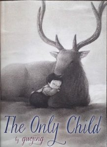
The Only Child

Author/Illustrator: Guojing

Publisher and Year: Schwartz & Wade Books, 2015

Number of Pages: 100

Genre: Fantasy/Fiction
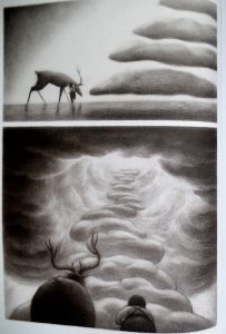
A lonely, only child runs away from home and finds a mysterious stag that takes her to a magical world. In this world, she feels loved and eventually misses home. Guojing takes us through the young girl’s journey back home to her family.

This book could serve as a mirror for those who can identify with the young girl. Some children may feel lonely and are only children, or at least feel as such. Children often use their imagination to “run away” to a place where they feel wanted and empowered. This story could also work as a window into the Chinese culture. The author has stated that this book “…reflects very real feelings of isolation and loneliness I experienced growing up in the 1980’s under the one-child policy in China” (P. 1). The longing for attention and love that a child feels is something that a multitude of readers can relate to.

There are no words in this book, as it is a picture narrative. Structurally, the entire story is told with pictures. For majority of the pages, the images are framed. There is no apparent pattern to the unframed images, but the reader feels more connected to those pages. The images are dark, which emphasizes the sadness the girl feels. The background to the images is more of a sepia when she is home and unhappy, but it is white when she runs away. This change in background emphasizes which images are happier than others. However, this story could just be a huge fantasy. When the child goes to bed, we see that she is holding what appears to be the stag that she rode to this mysterious land. Ideologically, this story shows readers that although it is very easy to become lost, there is always a path guiding the way back home. This story also conveys the idea that running away is an acceptable solution to feeling alone or abandoned. The parents of the child search helplessly for their lost child, but the child moseys on home like nothing happened.

The Pigeon Needs a Bath!

1503850_4942986348530_7521447933107286851_n

Author/Illustrator: Mo Willems

Publisher and Year: Hyperion Books for Children, 2014

Number of Pages: 32

Genre: Fiction

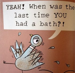
IMG_4397This dirty pigeon uses sarcasm and reverse psychology to get out of taking a bath. When his tactics don’t work and he is forced to take a bath, he realizes that baths aren’t so bad after all.

This book could work well as a way to get young, stubborn children to bathe. For some children, bathing isn’t the highlight of their day, so seeing the Pigeon do it could make them feel better about it.  Many parents could probably relate to the Pigeon’s parent who can’t seem to convince him to take a bath. The Pigeon Needs a Bath! Is a book that has some different humor, but is ultimately just a fun read. Like a typical parent-child relationship, the man (assuming he is the parent of the Pigeon) has the power to make the Pigeon take a bath. The Pigeon may feel that it is a choice, but in the end he will take a bath. Some parents could relate to this as well; they allow children to think that they have a choice if they do something, but in reality they don’t.

Perceptually, the entire book is just a conversation the Pigeon is having with himself. He invites the reader into the conversation a few times, but he is really just convincing himself that he shouldn’t take a bath. The text adds to the images, and the images are dependent on the text. Because the illustrations are so simple, it is not clear what exactly the scenes would mean without the text. Structurally, the pigeon is having conversations with the reader as if we someone is actually responding to him. This makes the reader feel more engaged with the book. Emphasized sounds help readers get acquainted with onomatopoeia.

Leo: A Ghost Story

IMG_9670 [2578141] 

Author: Marc Barnett

Illustrator: Christian Robinson

Publisher and Year: Chronical Books, 2015

Number of Pages: 42

Genre: Fiction/Fantasy

IMG_9671 [2578142]When an unwanted ghost boy, Leo, is “evicted” from his ghost home, he is forced to live on the streets. It isn’t until he meets a young, believing girl that he finally feels accepted and seen.

This book could work as a mirror for those who feel that they are “invisible.” Even though Leo is actually invisible because he is a ghost, some children may feel that they are just as invisible and unloved as Leo. It isn’t until Leo sees that he can use his ghostliness for good that he starts to gain power. When he realizes that he can scare the robber into captivity, Leo feels better about the way that he is.

Perceptually, the images depend on the text. Without the text, the images would not really make sense. The texts begins with letting the reader know that people cannot see Leo, but the reader can. This makes readers feel like they are in the story with Leo, or it at least builds a connection between the  reader and the text. Structurally, the images remain on the darker side because Leo is a ghost. Leo can also touch objects such as doorknobs and blankets, but people cannot touch feel his touch. The only person who can see and feel him is Jane, but just as people cannot see him, he cannot see the crown that Jane says she is wearing. This puts emphasis on the idea that the characters in this book can only see what they believe in. Ideologically, this book could teach readers that they should accept who they are, and if they can, find someone who accepts them for who they are as well.

Do Unto Otters: A Book About Manners

IMG_9673 [2578143]

Author/Illustrator: Laurie Keller

Publisher and Year: Christy Ottaviano Books, 2007

Number of Pages: 34

Genre: Fiction/Fable

IMG_9675 [2578144]A rabbit is skeptical about what his new otter neighbors will be like. He is told to treat them as he would want them to treat him. After realizing how he’d like to be treated, he sees that maybe his new neighbors won’t be so bad after all.

This story works well as a mirror and a door. There may be some children who feel torn about how to treat someone because they are different, this book would help with that. When people see others who are different they tend to feel that maybe that person shouldn’t be treated like everyone else. There is no real power distribution in this book, as this book just really focuses on the idea that one should treat others how they’d like to be treated.

Perceptually, lots of onomatopoeia is used throughout the book, making the book easier to read and helping children with sounds. The text adds to the images and the images add to the text. There is a lot of dialogue used, as the whole book is really just the rabbit going through his thoughts. Structurally, images are bright and full of color, making the text more entertaining. Facial expressions and specific fonts help the reader understand how the text should be read. The illustrator gives examples of ways to be friendly, so there is little confusion as to what the author means (they are the same person). The illustrator also breaks down and defines certain words, such as “cooperate” for beginning readers. Ideologically, this book teaches manners such as saying please, thank you, and excuse me to others. It also teaches readers how to be polite in different languages, such as Spanish, French, German, Japanese, and Pig Latin. It emphasizes great traits such as honesty, kindness, and sharing, which are important to teach children at a young age.

The Day the Crayons Quit

2016-05-16_16.28.25[1]

Author: Drew Daywalt

Illustrator: Oliver Jeffers

Publisher/Year: Philomel Books, 2013

Pages: 32

Genre: Fiction

Analysis:

In The Day the Crayons Quit, Duncan receives a stack of letters written by his twelve crayons: red, purple, beige, gray, white, black, green, yellow, orange, blue, pink, and peach. In their own letter, each crayon describes his or her unique woes, including being used too much or too little, being a “girl” color, or only being used for outlines. Duncan’s responds by using all twelve colors in his next drawing, scoring him As for creativity and coloring.

The Day the Crayons Quit acts as both a mirror and a door. Although indirectly, each crayon’s woe is not too far related to the real life struggles of young readers. The red, gray, and blue crayons describe how they often work harder than other crayons because there are so many (large) things of their color. Readers who have ever felt used, overworked, or underappreciated can personally identify with these three crayons. Likewise, just as Beige is tired of being incorrectly labeled “’light brown’” or “’dark tan,’” elementary aged students have surely dealt with threats to their individuality. Finally, Pink complains of never being used because of her association as “girl” color; this woe can speak to both girls and boys who have felt swayed to act in a certain way because of their gender. Woes a reader cannot personally identify with can help expand their world view, maybe even alerting them to the troubles their peers are experiencing. For very young readers, Daywalt’s book provides a basic understanding of the colors used to draw certain things. Duncan’s response also functions as an appropriate model of behavior, for he not only addresses the complaints of each crayon but uses their unique ability to create an interesting illustration.

Power rests with Duncan for only he can attend to the woes he unknowingly wreaked upon his crayons. Through each crayon’s letter, Daywalt creatively and humorously explores the concept of power struggles.

2016-05-16_16.29.33[1]

Exclamations, purposeful capitalization and underlining, and humor captivate the intense desire of each crayon to have their concerns met. The signature and closing of each letter communicates very briefly the situation each crayon wants recognized and fixed (e.g. “Your very stubby friend” (p. 22)) and type that mimics a child’s handwriting helps give each crayon personality. Jeffers’ illustrations mirror the text but more symbolically and literally show the emotions felt by each crayon. For example, as Beige complains of being used only for wheat he is drawn with a sorrow expression and weak posture like that of a lonely stalk of wheat. White complains of meaning nothing without a black outline, and is thus illustrated by Jeffers without a black outline, causing White to be nearly invisible and easily overlooked by readers, myself included. The illustrations also contrast the current and ideal worlds perceived by each crayon. The placement of the majority of crayons lower on the page signifies their low spirits and power so long as Duncan does not respond as they please. Many themes in The Day the Crayons Quit deal with social justice concerns, such as challenging gender norms, oppression, and the democratic right to free speech and expression (i.e. striking). The theme of teamwork without the loss of individuality is also explored, as exemplified by Duncan equally addressing the unique needs and wants of each crayon.


The Dark

thedarkthedarkpage

Title: The Dark

Author: Lemony Snicket

Illustrator: Jon Klassen

Publishers and Year: Little Brown and Company 2013

Number of pages: 36

Genre: Fiction

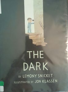
This book is about a little boy who is afraid of the dark that lives in his basement. The story starts off by him describing the dark. However, the dark eventually beckons to him and reveals to him the light within the dark (a light bulb in a dresser of the dark, scary basement). After this, the boy overcomes his fear of the dark, and they live in harmony.

This text functions as both a mirror and a door. It functions as a mirror because many children are indeed afraid of the dark. Throughout the book common fears and misunderstandings about the dark are addressed both in the text and in the illustrations. This allows the audience to remember their own fears and connect with the boy on a deeper level. I believe it is a door as well, however, because the readers get to watch as the boy overcomes his fear of the dark and learn the truth of the dark. This presents the reader with the opportunity to take the same leap in their own lives.

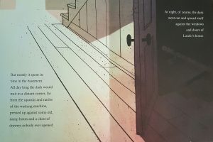
In this book, color is intensely used to distribute power. There is not a lot of color used in the book, but there is an intense use of shadowing. There is a stark contrast between the dark and the light, with the dark clearly overpowering. The ominous darkness that the illustrator used plays into the fear that is evoked through the author’s words.

In addition to this, the illustrator was very purposeful with his placement of the boy. On the first page the readers see him as a small, two-dimensional character squatting low to the ground on the left-hand side of the page, just out of the line of the shadow. So, although being in the lit part of the room helped to make the boy secure, he was depicted as small, weak, disadvantaged, and closed minded by the illustrator. As the story progressed, the pages got darker and darker while the boy got smaller and smaller. Eventually the boy wasn’t even on the pages anymore; it was only darkness. This speaks volumes to me of the power that the darkness held over the boy. Once the boy meets with the darkness and the colors/light have left completely from the pages, the story starts to change again. Color and light is slowly brought back into the frames quickly to show the vibrancy and lack of fear. Eventually the author brings the story back full circle, and it ends with the exact same picture of the boy in the left-hand corner. This time, however, there is contentment on the boy’s face rather than fear.

This intense use of shadowing helps the readers to follow the progression of fear and then freedom from fear throughout the book. Although the placement of the text does not provide any additions to the story, it is fairly plain text that simply serves the purpose of stating the words. This goes well with the lack of color seen throughout the story. This helps the book achieve its goal of unpacking fear in a new way. It reveals the benefits of facing fears in order to gain freedom from the fear that can be crippling. It empowers children to walk fearlessly and to be brave in the face of fear.

Will Princess Isabel Ever Say Please?

untitled

Author: Steve Metzger

Illustrator: Amanda Haley

Publishing Information: Holiday House, 2012

Number of Pages: 30

Genre: Fantasy


Analysis:untitled2

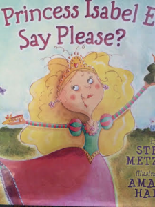
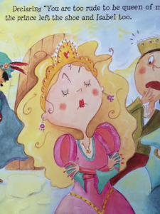
            Isabel is a beautiful princess who is seemingly perfect, except for her bad manners and refusal to ever say “please.” Although she has many suitors that initially wish to marry her, each one changes his mind as soon as he realizes how rude she is and marries a kinder princess. It is not until the end of the story that she learns the importance of saying “please” and having good manners, which helps her find a prince who will love her.             I think this story sends a good message to children that contrasts the typical theme of princess stories. In most stories of a princess, she is praised for her beauty and marries a prince because she is a beautiful princess. However, in the case of Princess Isabel, her beauty is not enough for the princes to marry her, as they are turned off by her rudeness. It is not until the very end of the story, when Isabel finally says “please” that she is able to woo one of the princes. The author notes, “When the prince heard Isabel say ‘please,’ he was so impressed by her humility and fine manners that he fell in love with her on the spot” (pg. 28). Although the “love at first sight” critique is apparent, this sends a much better message to children as it explicitly states that it was the humility and fine manners that led the prince to fall in love with Princess Isabel. As a result, children are able to see that inner beauty and being a good person is more important than outer beauty. Furthermore, it teaches them the value of manners, and that a lack of manners will yield consequences even for a beautiful princess who seems to have it all.

The illustrations are done in bright watercolors, and remain unframed to allow readers to really experience this story from within. However, more detail and brighter colors are given to the illustrations of Isabel, symbolizing her central importance to the story. Despite the nicely done illustrations, the text could exist alone and still convey all of the messages to readers that it is intended to.

As a whole, I believe the ideologies of manners and the importance of inner beauty make this a refreshing change of pace from the typical princess fairytales children see more often.

Tom’s Tree

7

Author: Gillian Shields

Illustrator: Gemma Raynor

Publishing Information: Good Books, 2009

Number of Pages: 24

Genre: Fantasy

8

Analysis:

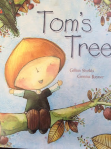
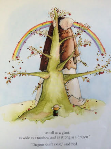
Tom’s Tree tells the story of a young boy named Tom who plants a tree and tells the reader all of the fantastical things he will be able to do in his tree when it grows. However, he becomes discouraged when the tree takes longer to grow than he had hoped, and his dreams are dashed. In the end, he finds that the tree will grow just as big and strong as he had hoped, and he is able to share this moment with his son when he is grown.

This is a very imaginative story, with illustrations that work well with the text to assist in the storytelling. Frankly, I found that the illustrations were additive, as the text alone would not have been able to tell the story as well. There are bright illustrations that cover both pages, and personify all the hopefulness Tom has for the future of his tree. Furthermore, we are able to see Tom’s changing facial expressions as time goes on and the process of the tree growing is taking longer than he had hoped. All of the illustrations are done without frames, letting us really dive into Tom’s fantasies with him. I found it interesting that readers were able to see the parallels between the size of Tom and the size of his tree as they changed over time; as Tom got older, the tree grew larger, showing the connection between the two rather than merely the passing of time.

The story can certainly serve to teach children to allow their imaginations to flourish, and that patience is a virtue. Although Tom’s tree did not grow as quickly as he had hoped it would, it still grew to just the size and splendor that he was hoping for as a boy. Furthermore, in my opinion, it was even more special because he got to share the tree and his ideas for it with his son when it had finally grown large enough. Therefore, I found that this was an imaginative story with valuable undertones that would be a fun read for young readers.

Abracadabra, It’s Spring!

Author: Anne Sibley O’ Brien

Illustrator/ Photographer: Susan Gal

Publisher and Year: Abrams Appleseed, 2016

Number of Pages: 42 Pages

Genre: Poetry, Realistic Fiction

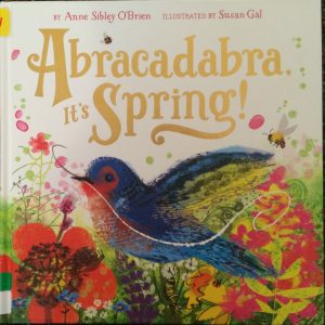
This story tells of the reawakening of nature and its inhabitants when the spring season comes around. The snow and cold melt away and the blossoming of flowers, sunshine, and green engulf the world.

The story serves as a window for the audience to show the beauty of the spring season. In the spring, nature and all the animals reawaken to beautiful and lively colors. At the same time, humans can be outdoors once again with fresh air and sunshine on their faces. The book also serves as a mirror to remind the reader how beautiful the spring season is. If humans want to enjoy the beauty depicted in this book, then humans have to care for the Earth and protect it. The book has a unique approach to the distribution of power in the sense that nature has the power. Each year, the Earth allows the spring to bring all plants back to life and animals out of hibernation after a long and cold winter. The author and illustrator focus on the “magic” of the spring season that brings the community of animals and people together to enjoy the wonders of nature. In this story, the artwork speaks more than the text because the elaborate and detailed pictures depict the liveliness spring brings to all. By the artwork of the illustrator, my understanding of culture has broadened to mean more than just people. Nature can be its own culture as well.

The book symbolizes the magic and joy that spring brings to the world. At the same time, it sends a message to current generations to protect the earth and its exquisiteness so that spring can continue to bloom flowers with many bursts of color for future generations to enjoy. Just as the last page of the story shows, nature is able to bring children and adults of all types and cultures to enjoy the magnificence of the season. Nature welcomes all and does not exclude based on race, religion, or gender. The artwork is more important because the text is small, and one page opens to another flap to reveal the artwork of spring season. In addition, the animals are noticeably large and close up, which allows the reader to pay attention to the artwork portrayed in the story. The text is simple with words such as “presto change”, “alakazam”, and “open sesame.” This shows that the season of spring is like a magic trick and can bring wonderful things out of the seemingly impossible. This is emphasized by the artwork being very colorful and busy, just like the season of spring. In the end, the main themes of this book are nature reawakens in the spring, humans must protect the Earth to allow spring to continue, spring brings color to the Earth, and spring weather brings people of all kinds outdoors to come together.      IMG_2815IMG_2817

The Three Pigs

IMG_9614 [405971]

Author/Illustrator: David Wiesner

Publisher and Year: Clarion Books, 2001

Number of Pages: 38

Genre: Fantasy/Fiction

IMG_9615 [405972]

Analysis: “The Three Pigs” is a book where Wiesner puts a weird but interesting twist on the typical “The Three Little Pigs” story by not only allowing the pigs to stand strong, but to move on into a whole different story. From there, they escape the big bad wolf along with a new friend. This book could function as a door into the imaginative world of the three pigs. An old tale that many of us grew up on now has a huge twist on it, opening up our eyes to the many possibilities. In the typical beginning of the story, the wolf has all of the power. Then, the pigs become powerful and essentially “create their own ending” to the story. The images align with my understanding of culture by allowing the pigs to go in and out of reality. They are also allowed to dip into another story and experience something from that and (literally) take something from it.

Perceptually, the words in this book sometimes contradict the images, but it works. The words are typical “The Three Little Pigs,” and dialog is used often.

Structurally, the pigs “come out” of story and “go into” another. They look realistic when they’re not in their story, and the pictures are framed when their classic story is being told. The pigs move in the right direction into the new story.

Similar to the original story, “The Three Pigs” shows us that bullies never prevail.