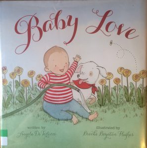
Author: Angela DiTerlizzi
 Illustrator: Brooke Boynton Hughes
Publisher and Year: Beach Lane Books 2015
Number of Pages: 31
Genre: Realistic Fiction
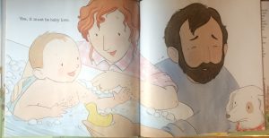
Baby Love is a book that would be considered a picture narrative; there are very few words throughout the book. It is a story about a couple and their newborn baby and all the cute things the baby does and all the love the parents have for their baby. This story could function as both a mirror and window for the readers depending on their background and their current family status. I believe that parents could view this book as a mirror. For example if a new mother and father are reading this to their baby it would be a mirror of their current stage of life. The story shows everything that most people love about babies, “warm hugs” and “chubby thighs”(page 7 and 13) which is why I would consider this book a mirror for new or soon to be parents. On the other hand for people who do not have children or have experience with babies Baby Love would be more of a window. They probably would not understand how chubby thighs would be considered cute since they are unable to connect to the pictures or text. The main focus of this book is mainly on the child. He or she is on every page thus proving the focus is meant to be on the baby. There is no cultural diversity in this text, the baby, both parent and even the dog is white. The first sentence in the book is “Rosy cheeks. Button nose” (page 1) I found this interesting because not all babies have rosy cheeks, usually only babies with lighter skin color. This shows that the book only represents the white race. The illustrations show a typical American family, a Mom, Dad, baby and dog living in a house with a nice yard. I also noticed in the pictures that the baby has many toys, which insinuates that the family is well off. When looking at the images I noticed that when the baby is alone he or she will usually just take up one side of the page except for page 13 and 14 which has three different images of the baby covering both pages. Having multiple pictures on two pages usually means that the character is losing control. This may be the case for other stories but I believe it was just the way the illustrator decided to picture the child. When the child is pictured with both its parents the image takes up both pages and it is a close up picture of the family or it is an image of the parents watching over their child.
