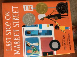
Last Stop on Market Street
Written by Matt de la Peña and illustrated by Christian Robinson
Putnam’s Sons, 2015
28 pages, Realistic Fiction
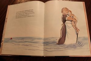
Last Stop on Market Street follows a young boy named CJ and his grandmother as they take the bus into the city after church on a Sunday. During the beginning of the book, CJ is distraught about taking the bus, and he asks about why they don’t have a car or why they have to go somewhere after church. CJ’s Nana shows him how to appreciate what he has in his life, such as the opportunity to make new friends when he is on the bus, like the blind man and the guitar player. CJ begins to see what his grandmother sees, and he starts to enjoy the trip. As CJ and Nana get off the bus, they arrive in a low-income neighborhood, and the two go into a soup kitchen where they are volunteering. By the end of the book, CJ can see the beauty in simple, everyday sights.
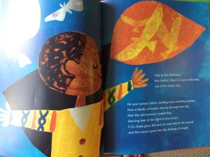
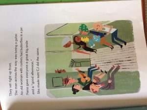
This book can be a mirror for African American children, children who live in an urban environment, or children who live with their grandparents. These groups often do not have much representation in children’s literature, so this story provides an example of someone like them. However, because CJ wants to have something new and better, like a car or an iPod, many children can relate to CJ’s discovery of the simple beauties in life. Because Nana always has an answer to CJ’s questions about why they don’t have something, CJ, and readers, can look to see the sights in life that are breathtaking. Last Stop on Market Street was painted in acrylics and complied with collage. The colors are very vibrant and add to the energy that Nana wants CJ to see in the city. The artwork differs based on the page, especially in regards to framed images or images that run off the page. On some pages, the image takes up the entire page, and the text is inserted into the background, but on others, the image is smaller and on a white sheet where the text is printed.
Last Stop on Market Street is a highly honored book. Matt de la Peña won the Newbery Award for his text, and Christian Robinson received honorable mentions for both the Caldecott Honors and the Coretta Scott King Award for illustrations in 2016. Both de la Peña and Robinson dedicated this book to their grandmothers who have influenced their lives.

 Title:
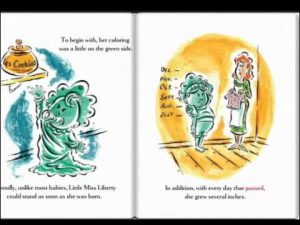
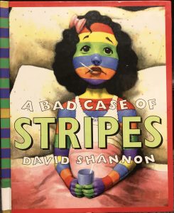
 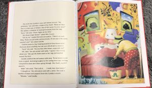 Camilla Cream, having a frown or open-mouth showing her disgusted and worried emotions. She is perceived to be sad and irritated with her case of stripes. Once the case of stripes is treated her facial expressions are bright and inviting. The main character is large on the page representing her acceptance of herself and positive self-image. Throughout the book there is the constant theme of individuality and accepting the differences of oneself. Camilla goes through a period where she is constantly worrying about what her classmates are thinking of her. She diminishes her love for lima beans because she did not want to be seen as weird. The case of the stripes represents the individuality of Camilla, and results in a change of her self-image. This is signified through the illustrations and social activities of the main character. Camilla overcame the worries of pleasing her classmates and changed to just pleasing herself by sharing her love for lima beans. This relates to the current issues of the influence from peers and classmates of children to have a greater impact on their life, rather than having a child be confident of themselves.