My Friend Rabbit

Title: My Friend Rabbit

Author(s): Eric Rohmann

Illustrator/Photographer: Eric Rohmann

Publisher and Year: Scholastic Inc. 2002

Number of pages: 31

Genre: Fantasy, Fiction, Friendship

Analysis:

1)      Summary:

A rabbit and a mouse are playing with a toy air plane. It gets stuck in a tree, and rabbit comes up with a plan to stack other animals on top of each other to get it out of the tree.  They all fall down but mouse saves rabbit from the angry animals only to get stuck in another tree.

2)      Theoretical Framework:

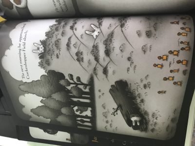
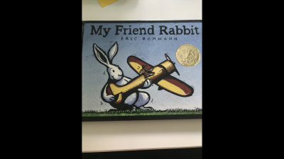
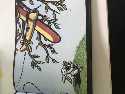
There a blue sky with green grass. There are trees and dash marks to show the different directions of the plane. The animals are a mouse, rabbit, elephant, rhino, hippo, deer, alligator, squirrel, bear, and ducks. They are all stacked on each other, and eventually fell. The animals looked angrily at the rabbit, but the mouse swoops in and saves the rabbit when the other animals were reaching for him. It shows that the mouse loses control of plan then crashes into another tree. The background stays colorful the whole time, which gives a relaxing feeling.

The characters which are animals are the exact color they are in real life. The mouse and rabbit shows a satisfied, thinking, and worried face at times, while the other animals show a confused or angry face. The rabbit position is everywhere in this book, he is high up, lowest of the lows, all the way to the right, or all the way to the left at times. They all relate because they are animals and out in free world which may not be right for some of them.

One of the smaller animals seems to control them all and pick them up. Also, the mouse touches the elephant which is funny because elephants are scared of them. Also, the message gives off a bad saying to me. It shows that someone should always be there for their friend even if trouble follows them.

The rabbit is at the top because he probably thinks he smart since he thinks of these ideas.

It is framed so it is a glimpse of the world. The bright colors gives off a sense of freedom especially considering the animals that are out.

3)      Illustrations:

The images are bright colors and correlate with real world colors. They give off the emotions of the animals very well. The backgrounds turns a reddish orange when the animals get angry which may help to show their anger even more.

Posted in Uncategorized | Tagged , , , , , , , | Comments Off on My Friend Rabbit

Creepy Carrots

Title: Creepy Carrots!

Author(s): Aaron Reynolds

Illustrator/Photographer: Peter Brown

Publisher and Year: Simon & Schuster Books 2012

Number of pages: 30

Genre: Fantasy, Fiction, Horror

Analysis: Each analysis should be about 350 to 500 words and include the following information:

1)      Summary:

A rabbit named Jasper ate carrots every chance he could, breakfast, lunch, dinner and snacks. The carrots, who are portrayed with human characteristics, were fed up with it so, they came up with a diabolical plan to make him hate them. Three carrots haunted and made him go crazy to the point he built a fence around them so they could never get out.

2)      Theoretical Framework:

The characters are rabbits. There is one family through the whole book.

Jasper, the main character, is represented as happy at first and scared and worried towards the end. The story almost makes it seem like he is going crazy. His parents are confused because they do not know what is going on with him. The reader is both far and up close sometimes. There is an outside looking in point of view all of the time.

It is ironic that the book makes carrots scary looking, since it is a children’s book and many children do not like vegetables.

There were times where Jasper was to the right of the page when he thought carrots were following him. He pretty much remained the same size not showing that he was disadvantaged even though he was.

The parents only showed up when there were problems and Jasper asked them for help.

There are a couple lines of capillarity which shows a bit of nervousness that Jasper had.

I feel the texts and images mirrored each other, so this is a Picturebook.

3)      Illustrations:

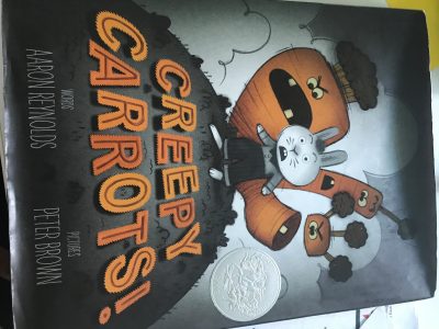
There are only four colors. At the beginning Jasper is very excited and there are carrots that are able to come up out of the ground. The carrots that haunted him had creepy yellow eyes. But every time he would run from them, and then turn around, they would act like nothing happened. They use the color orange to trick Jasper into thinking the carrots are following him. There seems to be a lot of shadows and they are huge shadows for small roles. He started to get so scared he thought he was seeing them everywhere. That’s until he built the fence that kept them inside. Then the carrots were happy some doing back flips just because he could not eat them anymore.

4)      Commentary

The author tells the reader how that he was afraid of black olives, so I’m guessing the carrots took the place of them in this book. Jasper dedicated the book to Paul Rodeen and called him a 24-carrot gem of an agent.

Posted in Uncategorized | Tagged , , , , , | Comments Off on Creepy Carrots

Playing from the Heart

  1. Title: Playing from the Heart
  2. Author(s): Peter H. Reynolds
  3. Illustrator/Photographer: Peter H. Reynolds
  4. Number of Pages: 32
  5. Publisher and Year: Candlewick Press, 2016
  6. Genre: Realistic Fiction
  7. Analysis: Playing from the Heart is the story of a boy named Raj and his love for the piano. After noticing Raj’s talent, his father signs him up for lessons; but the older Raj got and the more his talent developed, the less he enjoyed playing, until he stopped playing the piano altogether. When Raj’s father becomes ill, Raj goes home to see him; asking Raj to play for him, Raj starts to play a song that he remembers, but instead, his father asks him to play from the heart.

While Playing from the Heart was not a mirror for me, I know people who have been in a similar position as Raj. Some parents unintentionally force things on their children which can lead to resentment, so for those people, this book could be a mirror. For those who view this book as window, the author is able to make Raj’s story relatable. Through this relatability, the reader can empathize with Raj, even if he or she has never experienced the situation that Raj went through.

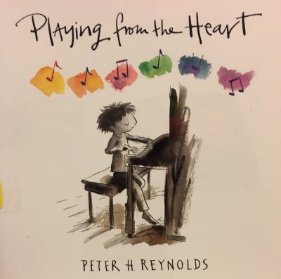
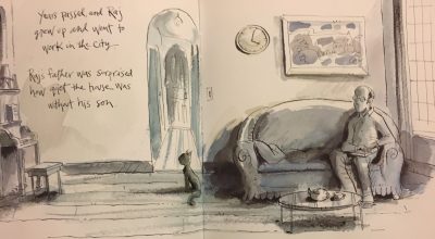
What I loved most about Playing from the Heart were the illustrations. Self-illustrated, Peter H. Reynolds uses a blend of pen, ink, watercolor, gouache, and tea to beautifully illustrate the story. Most of the story has a neutral-colored tone, except for the frames with Raj, which contain slightly warmer and complementary colors like brown and yellow. When Raj played sheet music, everything was gray. When he left the house, everything became a sort of blue, giving the reader a better portrayal of Raj’s father’s loneliness and the warmth he felt when Raj was around.  However, the music notes that came from Raj’s heart were different colors of the rainbow. I took this as the illustrator showing that in such a bland world, there was beauty or life in Raj’s music. Overall, I feel that the illustrations in Playing from the Heart added to the mood of the story.

Finally, in the back of the book, the author explains how when writing this story, he wanted to “celebrate the natural energy and fearlessness that children are born with,” but also to encourage people not to forget that original joy, even after learning rules and techniques. Moreover, he claims that creativity thrives on bravery and originality. I like that Reynolds incorporated this theme throughout the book because I feel that it is important for children to follow their hearts and pursue their dreams, rather than the dreams others have for them.

Posted in Uncategorized | Tagged , , , , , , | Comments Off on Playing from the Heart

Fly Free!

  1. Title: Fly Free!
  2. Author(s): Roseanne Thong
  3. Illustrator/Photographer: Enjin Kim Neilan
  4. Publisher and Year: Boyds Mills Press, 2010
  5. Number of Pages: 30
  6. Genre: Fiction
  7. Analysis: Fly Free! is the story of a little Vietnamese girl named Mai. Mai loves to feed the birds and one day wants to set them free. After Mai performs a good deed, a wheel of karma is set into motion that eventually allows Mai to release the birds. Fly Free! teaches young children not only about the ideology of karma, but about Vietnamese traditions as well.

Fly Free! can be analyzed as a window, mirror, or door. For children who are from Southeast Asia, or children who are familiar with the culture, this book can be a mirror. For those who are not familiar with certain customs, or have never experienced the lifestyle of Mai, this book is a window or door. Fly Free! also uses ideological theoretical frameworks. I liked the fact that words that might be unfamiliar to children were italicized. For instance, words like, karma, samsara, and nirvana are all italicized. Moreover, the author defines the unfamiliar word so that the reader can get a better understanding of the text. The ideological framework in this story ties into cultural representation. For Vietnamese children, they not only see themselves in this book, but also values that they know. With this being a cultural book, I think it is important that the author had a background of working with Vietnamese children, as well as spending fifteen years in Asia teaching, writing, and learning the culture. By doing this, Thong is able to tell a more culturally accurate story through her personal experiences.

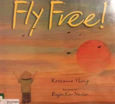
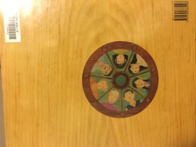
The illustrations in Fly Free! were created by Enjin Kim Neilan. The illustrations are very smooth and are reminiscent of a painting. The images are framed, so the reader is looking into the world of Mai throughout her journey. The frame around images in the book looks like wood, and the illustrations look like they were drawn on the wood background. The back cover of the book shows a wheel of life, samsara, which is a Buddhist belief, and an overarching theme in the story. I think that the gentle tones of the artwork in this book help to keep the peaceful feeling of the story.

Finally, in the author’s notes, Thong explains karma and other Buddhist beliefs. She describes her time traveling in Vietnam and how a student named Mai explained the Buddhists ideas of reincarnation, karma, and samsara to her. The lessons in Fly Free! go beyond borders. While children are, in fact, learning about Southeast Asian customs, they are also learning the importance of good character traits.

Posted in Uncategorized | Tagged , , , , | Comments Off on Fly Free!

Not All Princesses Dress in Pink

  1. Title: Not All Princesses Dress in Pink
  2. Author(s): Jane Yolen, Heidi E. Y. Stemple
  3. Illustrator/Photographer: Anne-Sophie Lanquetin
  4. Publisher and Year: Simon and Schuster Books for Young Readers, 2010
  5. Number of Pages: 29
  6. Genre: Fiction
  7. Analysis: Not All Princesses Dress in Pink explains the different types of princesses there are, and how it is possible to still do “unprincess-like” things, while still wearing a “sparkly crown.” These princesses are not afraid to get dirty and have fun, but that does not alter the fact that they can still be princesses. This book teaches young children that gender roles and stereotypical images of princesses should not apply to all girls.

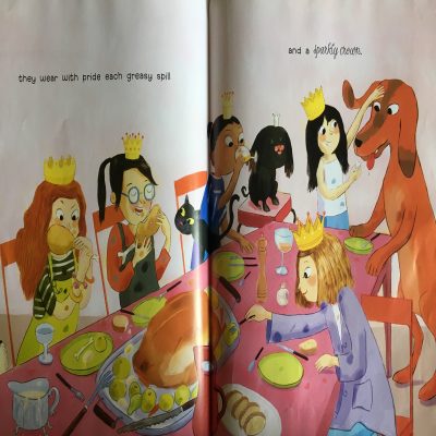
I believe that Not All Princesses Dress in Pink can be used as a mirror for girls who feel as though their love for “nongirly” things are not the norm, when in fact, it is perfectly normal. Girls need to see themselves represented in books that are not overloaded with the color pink, or books that do not say all girls need to be clean and ladylike. It is possible to still be a princess and roll around in the mud or play sports. Girls are children too, so their fun should not be limited to Barbie dolls and shoe-shopping. While dismissing the stereotype of girly girls, Not All Princesses Dress in Pink also touches on gender norms. “Some princesses wear their jewels while fixing things with power tools (13),” is a great example of deconstructing the myth that only men can do physical labor; it is important for young girls to see this message and understand that they are just as powerful as any boy.

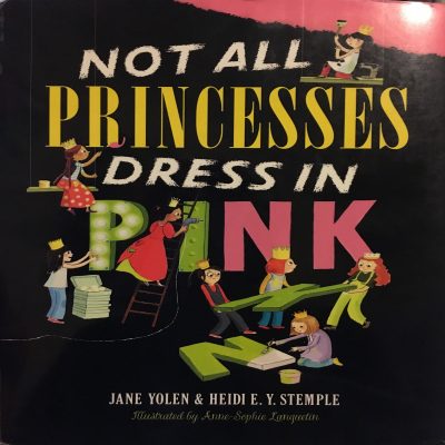
The front cover of the book shows girls wearing their princess crowns, which changes the initial cover. Most of the page is black, except for the top right corner, which is pink. A young girl is portrayed painting over the pink background, depicting the fact that not all girls like pink. Another aspect shows young girls do construction work and designing the cover how they see fit, once again, changing any pink that was initially there. The cover sets the tone for the whole book, because throughout the story we see these themes of girls living their lives the way they want to, rather than through society’s standards. In a typical book about princesses, you see plenty of pink and dresses, however, the illustrator shows girls with dirt stains, paint-covered clothes, overalls, and any other form of regular clothing. This helps to articulate the fact that girls can be normal, just like boys. I think that Not All Princesses Dress in Pink does a great job in showing young girls that it is okay to be different. It also shows that the oversaturation of femininity is not that common, and that there are other girls who behave just like them.

Posted in Uncategorized | Tagged , , , , , | Comments Off on Not All Princesses Dress in Pink

A Call for a New Alphabet

  1. Title: A Call for a New Alphabet
  2. Author(s): Jef Czekaj
  3. Illustrator/Photographer: Jef Czekaj
  4. Publisher and Year: Charlesbridge, 2011
  5. Number of Pages: 38
  6. Genre: Fantasy, Fiction
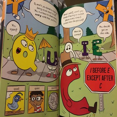
  7. Analysis: In A Call for a New Alphabet, X is tired of being at the end of the alphabet and being excluded from all the fun that the other letters have. X proposes the idea of a voting process that would lead to a new alphabet, and erasing the alphabet as we know it. X learns that all the letters have a certain place in the alphabet and fulfill their specific purposes properly, leading X to decide to keep the current alphabet and appreciate his place in it.

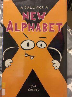
When first picking up the book, you see X in the middle of the page, hands on hips, looking confident and in charge. He takes up the whole cover, implying his importance and power in this book. On the back cover of the book, you see A, B, and C, much smaller, and appearing afraid of X. This illustration reiterates X’s significance throughout the story. On one of the pages, X exclaims that he is sick of the rules. While making this statement, X is drawn stepping out of the frame. By showing X leaving the frame, the illustrator could also be showcasing X’s rebellious attitude, which is seen through him wanting to eliminate the traditional alphabet.

The illustrations in this book consist of the letters of the alphabet wearing different items or portraying characters that relate to the letter. For instance, W is a white W with a witch hat and a watch, G is a ghost and is also green, and R is red and wearing roller skates with a rainbow on them. Although the drawings are not necessary for understanding the text, they can serve to help children with vocabulary. Outside of illustration, I believe that the book can also be helpful in teaching children grammar and spelling skills. A Call for a New Alphabet is perfect for children who are learning phonics and grammar, but it is also a fun read that anyone can pick up and enjoy!

Posted in Uncategorized | Tagged , , , , | Comments Off on A Call for a New Alphabet

Skunk on a String

  1. Title: Skunk on a String
  2. Author(s): Thao Lam
  3. Illustrator/Photographer: Thao Lam
  4. Publisher and Year: Owlkids Books Inc., 2016
  5. Number of Pages: 38
  6. Genre: Fiction
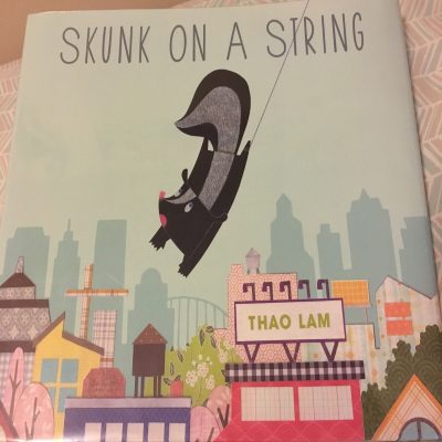
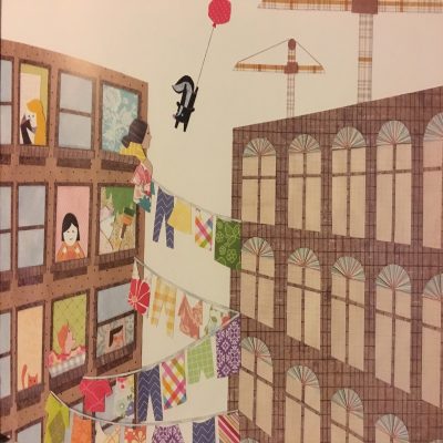
  7. Analysis: Skunk on a String follows a skunk who is stuck to a balloon string as he tries to untie himself. The skunk floats through the city on a wild adventure in hopes of reaching land again. I believe that Skunk on a String is a neat children’s picture narrative that tells a story without the use of words. Through the picture illustrations, young children are able to still understand the context of the story even if they are not able to read. Moreover, the use of only pictures allows for children to develop their imaginations in creating a story for the skunk. When looking for certain picture book codes, I noticed that although many of the pictures told a certain story, some pages had pictures scattered throughout in no particular order. This allows for the reader to interpret their own version of the page and breaks the element of traditional storytelling.

I felt that the illustrations in Skunk on a String were beautiful. Many of the images in the book were filled with different patterns and looked as if they were cut from paper. The colors used in the book were bright, which I felt added to the happy narrative of the story. Something interesting I noticed was that the background on the pages was white; there were no detailed images of a sky, besides a few clouds on a page or two. I felt that this brought more attention to the illustration, reinforcing the fact that the images were the main aspect of the book. The illustrator also chose to only frame some pages; so, whereas you are on the journey with the skunk at times, at other times, you are viewing the skunk through a window.

Finally, in the back of the book, the author explains how when she first came to Canada from Vietnam, learning English was not easy, and it was picture books that helped her better understand the world she was living in as well as sparked her interest in visual storytelling. Moreover, the section explains her love for colored and textured paper, which stated previously, is reflected throughout the book’s artwork. I believe that Skunk on a String does a great job in showing how picture books can help children who struggle not only with reading, but maybe learning a new language, all while offering stunning visuals to keep children engaged.

Posted in Uncategorized | Tagged , , , , , | Comments Off on Skunk on a String

All My Stripes

  1. Title: All My Stripes
  2. Author(s): Shaina Rudolph, Danielle Royer
  3. Illustrator/Photographer: Jennifer Zivoin
  4. Publisher and Year: Magination Press, 2015
  5. Number of pages: 26
  6. Genre: Fiction
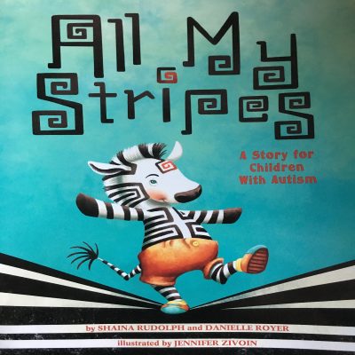
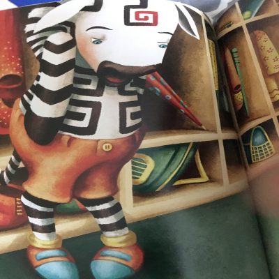
  7. Analysis: Zane the zebra has a lot of stripes, but there is one stripe that makes Zane feel different from his peers, his autism stripe. Zane worries that this stripe is the only thing that his classmates notice about him. With the help of his mom, Zane starts to appreciate all his stripes, such as his pilot stripe, honesty stripe, or caring stripe and the unique attributes that he has.

When analyzing the text through theoretical frameworks, I feel as though this book is a great mirror and window for not only kids with autism, but kids who have and have not heard of autism. For children who are autistic, All My Stripes, teaches the importance of loving oneself and being proud of your differences; for children without autism, the book shows a glimpse of what life is like for certain kids who are autistic. The book aims to show representation for children who have feelings of neglect and loneliness due to their differences.

The book’s illustrations are very colorful and give a sense of happiness but can be symbolic. For instance, in the beginning of the book when Zane is telling his mother about his day, it is raining. The rain helps to portray the image of sadness that Zane is feeling. After Zane learns to appreciate his stripes and cheers up, it becomes sunny outside. Furthermore, the book is unframed which allows for readers to be “right in the room” with Zane, giving a more personal feeling to his story and allowing Zane to be more relatable.

Finally, the authors close the book with a reading guide and a note to caretakers and parents about how to deal with autism. In the reading guide, sections of the book are broken down and examples are given on how autism affects Zane and real children. I think these additions were great in the book because they show support outside of just simply writing about autism. These additions offer greater awareness and help about autism in the real world.


Posted in Uncategorized | Tagged , , , , , , | Comments Off on All My Stripes

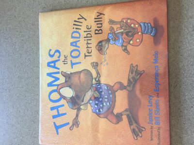
Thomas the Toadilly Terrible Bully

Author: Janice Levy

Illustrators: Bill Slavin and Esperanca Melo

Publisher: Eerdman’s Books for Young Readers, 2014

Length: 29 pages

Genre: Fiction

Analysis:

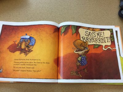
Thomas the Toadilly Terrible Bully is a fun story about Thomas the Toad, the new boy in town. Since he can’t fit in, he decides to become a bully- but nobody takes him seriously. Eventually, he comes across a toad even more timid than he named Gomer, and tries to scare him, and thinks he has succeeded, only to find that there is a giant toad standing behind him who is going to eat them both if they don’t run! Thomas sticks up for his friend and fends off the big bully, and makes friends with the little toad.

This book, colorful and fun to look at, makes a great book for younger audiences with the message that bullying is bad, and to just be yourself. The illustrations portray the struggles of Thomas the Toad very well. On page two, Thomas is depicted as inside a frame on the page, where all of the other toads are outside the frame. On the next page, the illustrations change the meaning of the text slightly. The text simply describes that Thomas couldn’t pus anyone around, but the image shows Thomas as being laughed at by everyone else. This triggers a sympathetic reaction from the readers. Thomas, who is trying to be the bully, is actually being bullied by everyone else! On the next two pages, he is shown as very small with lots of white space around him. This picture book code demonstrates a sense of insecurity of Thomas. This is especially portrayed because in one of the pictures he is looking in a mirror, surrounded by white space, so it looks like he is completely alone in the world. Then, in a very colorful picture, he is depicted sitting on top of a mushroom with no horizon line. The lack of a horizon line can symbolize loneliness, or feeling lost.

Then, when he and Gomer (the little toad) are approached by the big bully, more picture book codes are used to demonstrate the power the big bully has. He is far bigger than the other toads, and is higher up on the page. Once Thomas has the idea of how to defeat him, however, Thomas is shown higher up, demonstrating his control over the situation.

Perceptually, this is a very pleasant and fun book to read. Fortunately, it also has some ideological substance. Specifically, it makes the main character very relatable as it shows why bullying is bad and you should instead be true to yourself.

Posted in Uncategorized | Tagged , , , , , | Comments Off on Thomas the Toadilly Terrible Bully

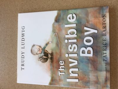
The Invisible Boy


Author: Trudy Ludwig

Illustrator: Patrice Barton

Publisher: Alfred A. Knopf, 2013

Length: 30

Genre: Realistic fiction

Analysis:

This book is about Brian, a boy who feels invisible at school. He is ignored by the teacher and his classmates, never chosen to be on kickball teams, and is excluded at lunch. When a new student, Justin, comes to school, Justin gets made fun of and Brian reassures him. After this act of kindness, Justin and Brian become friends, and he no longer feels invisible.

This story is very touching because everyone has felt alone and invisible at some point in their lives. The text tells the story of Brian very well and allows the reader to sympathize greatly with him. However, it is the illustrations which draw the reader in completely. They use color to demonstrate how Brian is seen. At the beginning, everything is in color, except for Brian and the objects close to him. Having Brian be the only thing in the picture which is black and white shows how excluded he feels, and how he is treated as though he were invisible. The illustrator uses white space to demonstrate how small Brian feels in this world. However, when Justin is introduced, Brian smiles at him, and part of his face gets a little color in it! As their friendship strengthens, Brian becomes more colorful, demonstrating that he is finally being seen. This use of color to portray his connections with people is very encapsulating because not only is there a textual difference, but the reader can visually see Brian becoming more welcomed.

Another part of this story which I love is Brian’s illustrations. This almost seems like a side story because it is casually dropped in and would be easy to overlook, but even when Brian is invisible in black and white, he draws in vibrant colors. His imagination is alive throughout the book.  I love that the author chose to have Brian be an artist because it defies typical gender roles. Aren’t girls supposed to be the creative ones and boys be the athletic ones? Instead, his artwork is part of why he is able to make friends with Justin, and he gets praised for it.

This book also depicts many different races, which I also greatly appreciate. There are too many books which are whitewashed and many books which purposefully depict race are about heavier topics. In this one, the multiracial classroom seems completely normal, and is very accurate to what classrooms tend to look like today. I am glad that the illustrator chose to depict the racial makeup of this school realistically.

This book serves as a great mirror for the reader, allowing them to relate to the struggle of Brian and feel for him, reflecting on times in their own life where they may have felt the same way. Small acts of kindness can make a huge difference.

Posted in Uncategorized | Tagged , , , , | Comments Off on The Invisible Boy