This Is Not My Hat

hathatpage

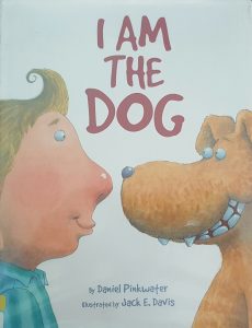
Title: This Is Not My Hat

Author: Jon Klassen

Illustrator: Jon Klassen

Publishers and Year: Candlewick, 2012

Number of pages: 32

Genre: Fiction

This Is Not My Hat tells the story of a fish’s attempt to steal another fish’s hat. The thief fish hides with the assumption that the victim fish will not be able to find him. However, in the end the victim fish finds the thief and takes back his hat.

This book is an excellent example of literature functioning as both a mirror and as a window. It is an example of a mirror because it gives the reader an opportunity to see their own thought process/perspectives in the thief fish. Any reader can relate to the thief fish because people, in general, are often naive in thinking that things done in secret will remain hidden. The text of this book takes us through that perspective and allows us to connect with that thought process. The illustrations, however, provide a window for the reader to look through. The illustrations reveal the thought process and perspective of the victim fish. This perspective completely contradicts the text and leaves us with pictures that tell an entirely different story. This contradiction provides the window that allows the reader to understand an outside perspective.

Another method used to depict this was the intentionality of the illustrations. Although one might think that the thief would carry more power, the readers see the opposite portrayed in the illustrations. Rather, the readers notice that the victim is drawn significantly larger than the thief. I believe this was intentionally done to show that the power actually lies in honesty. The small fish felt and acted powerful in his attempts. However, he was continually swimming towards confinement (the place where leaves are close together) where the truly powerful fish would find him before swimming back into the ocean. Overall, the author did a phenomenal job of using contradictory text and illustrations to speak into the turmoil children might experience when deciding between right and wrong. Allowing children to see their own emotions and thought process as well as the outside perspective connects them to the world around them in a new way. It helps to erase the naivety and smallness of thinking people can get into.

The contradicting text and illustrations speak loudly in this text. The author/illustrator did a phenomenal job balancing the two. Despite the two contradicting themes, the story follows the normal thought patterns well. The way the text is displayed and even the diction used directly influences our understanding of the story. Overall, the author conveys that the things that are hidden will always come to the light so people might as well be honest with them in the first place.

Loretta Ace Pinky Scout

lorettalorettapage

Title: Loretta Ace Pinky Scout

Author: Keith Graves

Illustrator: Keith Graves

Publishers and Year: Scholastic Press, 2002

Number of pages: 30

Genre: Fiction

Loretta Ace Pinky Scout is the story of a young girl who, due to pressures of living in a perfect family, aspires to perfection herself. It tells the story of her attempt and failure at winning a marshmallow-roasting badge. This failure sends her into a spiral with the realization that she is not perfect after all. A visit from the spirit of her grandmother reveals the imperfections in all of the people she viewed as perfect, allowing Loretta to see that it is okay to have flaws.

This book functions as a mirror to its readers. All people, adults and children alike, compare themselves to others at times or strive, sometimes without knowing it, for perfection in one area or another. This book allows children to see the benefits of imperfections and flaws in Loretta and her family with the intent of allowing them to come to terms with their own limitations and flaws in a healthy manner.

The dynamic of power is interesting in this story in that Loretta is portrayed by the illustrator as very small compared to most objects (i.e. World-dominating chicken, scout book, etc.). This shows the readers a lack of power, despite the fact that the words are emphasizing her power. I think that is important because all of this takes places before she realizes the beauty in her flaws. The only time she is shown as large is the very last page. On this page she is receiving a medal for saving the world. I think that this shift in power is crucial in allowing the reader to see that that he or she is only truly powerful when they accept themselves as they are rather than trying to be a perfected version of themselves.

The images in this story do a fantastic job of showcasing Loretta’s accomplishments in a way that add to the image of perfection. The readers are visually overwhelmed with her deeds and character, heartbroken with her over her failure, and able to champion her well in her new found identity as an imperfect but powerful human. In addition to the images playing a major role in the story, there are strategically placed thought bubbles that give us greater clues to Loretta’s thought process. I think this was an intentional and genius decision of the illustrator that really helps to move the book along. Overall, this book addresses an important self-worth issue among children: Perfection is a fake ideology. This shatters the glass on perfectionism, and thankfully so. Hopefully children will be able to read this and realize that, like Loretta, they do not need to be perfect to be accepted or even good.

The Dark

thedarkthedarkpage

Title: The Dark

Author: Lemony Snicket

Illustrator: Jon Klassen

Publishers and Year: Little Brown and Company 2013

Number of pages: 36

Genre: Fiction

This book is about a little boy who is afraid of the dark that lives in his basement. The story starts off by him describing the dark. However, the dark eventually beckons to him and reveals to him the light within the dark (a light bulb in a dresser of the dark, scary basement). After this, the boy overcomes his fear of the dark, and they live in harmony.

This text functions as both a mirror and a door. It functions as a mirror because many children are indeed afraid of the dark. Throughout the book common fears and misunderstandings about the dark are addressed both in the text and in the illustrations. This allows the audience to remember their own fears and connect with the boy on a deeper level. I believe it is a door as well, however, because the readers get to watch as the boy overcomes his fear of the dark and learn the truth of the dark. This presents the reader with the opportunity to take the same leap in their own lives.

In this book, color is intensely used to distribute power. There is not a lot of color used in the book, but there is an intense use of shadowing. There is a stark contrast between the dark and the light, with the dark clearly overpowering. The ominous darkness that the illustrator used plays into the fear that is evoked through the author’s words.

In addition to this, the illustrator was very purposeful with his placement of the boy. On the first page the readers see him as a small, two-dimensional character squatting low to the ground on the left-hand side of the page, just out of the line of the shadow. So, although being in the lit part of the room helped to make the boy secure, he was depicted as small, weak, disadvantaged, and closed minded by the illustrator. As the story progressed, the pages got darker and darker while the boy got smaller and smaller. Eventually the boy wasn’t even on the pages anymore; it was only darkness. This speaks volumes to me of the power that the darkness held over the boy. Once the boy meets with the darkness and the colors/light have left completely from the pages, the story starts to change again. Color and light is slowly brought back into the frames quickly to show the vibrancy and lack of fear. Eventually the author brings the story back full circle, and it ends with the exact same picture of the boy in the left-hand corner. This time, however, there is contentment on the boy’s face rather than fear.

This intense use of shadowing helps the readers to follow the progression of fear and then freedom from fear throughout the book. Although the placement of the text does not provide any additions to the story, it is fairly plain text that simply serves the purpose of stating the words. This goes well with the lack of color seen throughout the story. This helps the book achieve its goal of unpacking fear in a new way. It reveals the benefits of facing fears in order to gain freedom from the fear that can be crippling. It empowers children to walk fearlessly and to be brave in the face of fear.

This Is A Moose

MooseMooseLaunch

Title: This is A Moose

Author: Richard T. Morris

Illustrator: Tom Lichtenheld

Publishers and Year: Little Brown and Company, 2014

Number of pages: 39

Genre: Fiction

This book is takes the reader on the set of a movie about a Moose with a wild heart and big dreams. On the set the Moose reveals his big dreams of becoming an astronaut, much to the horror of the director. Even though Moose is continually put down for his dreams, he never gives up.

I believe that this text operates as a mirror for the intended audience. I believe this book acts as a mirror because it could possibly reflect the reader’s own feelings. Children have wild and crazy dreams at times. However, adults tend to snuff out the hope for such dreams with our words or our actions if not careful. The author presents the thought that children can achieve their dreams despite what others think they should be or should do. This opens a door for them to believe it for themselves and continue pursing dreams that might otherwise seem impossible.

Throughout the book, power is given largely to the negative and discouraging words being spoken over the animals. The pictures often conflict with the discouraging words in that the animals continue to pursue their dreams despite repeated warnings that “a moose can’t do that” or “a giraffe can’t be this.” The contradiction seen between the text and image is a powerful statement to children to push through persecution and reach for the stars.

The illustrator’s use of vibrant colors and attention-grabbing text draws in the reader. The pictures are comical enough to engage the reader from the first page. However, the progression of the story is clearly shown in a very memorable way. The text in this story plays just as an important role as the illustrations, however. The text is extremely large, very vibrant, and often uses an odd, attention-grabbing font. Word bubbles are used to express dialogue in a fun way that also alerts the reader to the urgency of tone. This heightens the emotion behind the words being spoken and makes Moose’s victory that much greater. In addition to this, the readers see the progression between Moose’s hopes being openly spoken, verbally torn apart, and the perseverance it took to see him succeed. Overall, this book helps us to realize that dreams, like people, come in all shapes and sizes and that people should never allow our perception of a person to limit their potential. Believe /encourage people to pursue their dreams, and don’t let the world put anyone’s potential in a box.

I Am The Dog

20160525_113420_resized 20160525_113439_resized

Title: I am the Dog

Author: Daniel Pinkwater

Illustrator: Jack E. Davis

Publishers and Year: Harper Collins Publisher, 2010

Number of pages: 30

Genre: Fiction

This book tells the story of a boy who switches places with his dog for the day.  It goes through the day’s events with the roles reversed, and the readers enter the mind of the dog through the boy.  The story culminates with the conclusion that being a dog is better than being a boy.

I believe that this book is being used as a window. Many children have pets in their homes or know someone who does. By Jacob pretending to be a dog for a day, the readers get an up close and personal look into the mind of a dog. While reading the book I found myself thinking like (the readers assume) a dog would think and focusing on things a dog would focus on. Since children do not always put themselves in someone else’s shoes easily, this book provides an excellent window into the mind of their pet. They are able to realize the things that are important and possibly build more compassion towards them. Not only does this give them a window into the mind of a dog, but it opens them up to being able to step into the perspectives of the people around them as well.

In this book, power is distributed evenly. I noticed from the first time reading it that the illustrator drew the boy and his dog to be equal in size. Throughout the entire book they stay this same size. This shows me the equality between the two. They are switching places but the power never shifts. They remain equally important throughout the book. This speaks of the importance of having as much value for someone else’s’ perspective as your own.

As far as cultures go, there is only one culture represented: white middle class. There is no diversity in the characters throughout the book. Even during the scene at the boy’s elementary school, every single child is white.

The visuals in this text help bridge the gap between the new mindset the readers are being introduced to and the common actions of dogs that the readers see on a daily basis. For example, the readers see the dog excited for food. The readers have all seen that at one point of another. However, seeing that while hearing the intense emotion of excitement from the dog’s perspective gives opportunity for children to connect the new information-to-information they already have. There is not much to be gained through the structure of the text, however. The text is not formatted in any particular way that brings special meaning to the story. However, the text itself does a fantastic job of incorporating sounds and stream of consciousness that a dog might have which helps the message come across in a very clear way. Overall, this book reminds us that it is important for people to view others with as much value as they would view themselves and to be able to view situations through the lens of another.