Author: Marsha Diane Arnold
Illustrator: Pierre Pratt
Publisher and year: Puffin Books 2008
Number of pages: 30
Genre: Fiction
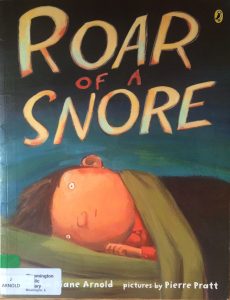
Roar of a Snore is about a boy who is woken up by a very loud snore and he goes on a hunt to figure out who is snoring so loud. In a series of events he wakes his family and friends up to see if they are the snoring person and then they wake up and help the boy find the snorer. In the end it turns out that the snoring person is actually a tiny cat and the family ends up sleeping in the barn with all their animals and the tiny snoring cat.
This text would function as a window for readers since they are looking into what is happening and the plot is something that they probably will not go through. If the reader is someone who lives on a farm they might be able to connect with the images since there are a lot of farm animals within the book. Sadly culture is poorly represented in this book; there are no characters of color, just a white family living on a farm. The images at first are pretty plain and not that much going on but once the boy starts waking up his family members the images get more and more hectic and detailed. The images have a lot of different colors that are not too bright, this makes it feel more like it is at night. The pages are full with images and the only time white is seen is where the text is. Since the images are not framed the reader gets the feeling that they are going on the hunt with the boy and his family to find the snorer. In the images the people are all facing the right while they are trying to find the snorer, this shows that they are moving forward after waking someone up and finding out they are not the snorer. Once they are able to find the snoring cat they face the left, which shows they are no longer moving forward in the story since they have found the snorer. I did not see a lesson that was supposed to be learned from this text; Roar of a Snore is meant to be more of a comedy that doesn’t have much meaning behind. It was a cute story that was fun to follow since a whole farm was woken up by a tiny cat.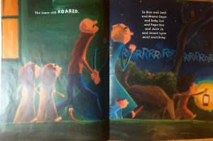
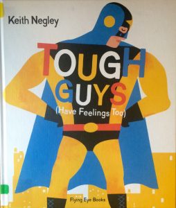 Tough Guys (Have Feeling Too) is a picture narrative book that talks about how its not always easy being the tough guy and sometimes the guys want people to know that their feelings get hurt too. I believe that this book would be considered a mirror for boys and a window for girls. For boys they see that they aren’t the only ones that get their feelings hurt and that they do not need to be tough all the time. For girls since this book is titled Tough Guys it might be hard for them to connect. Instead they might better relate to a book that talks about how girls are tough too and not always emotional. In the illustrations different races and cultures are represented. Every picture has a male in it and the book does a good job at having them be all different races. There are also different aspects of culture in the illustrations. For example there is a picture of a man in a Lucha Libre uniform which is a type of wrestling that is very popular in Mexican culture. There is also an image of a two men in Tae Kwon Do uniforms, which is a popular and historical Korean activity. Another example is a cowboy and his horseback riding which is a popular American activity. The book shows many different cultures allowing many different people the ability to connect with the text. The images in the text are always going towards the right, which shows that the characters are not as secure, this makes sense that they are all facing the right because all the men feel insecure for having feelings. On the last page there is an image of a father and son and they are facing forward. I took this, as they are content with being able to admit they do have feelings. Since there is minimal text within the book the images make the story interesting and comical but still have a purpose that teaches the lesson that it is okay to show feelings even if you are a tough guy and that you shouldn’t make fun of someone for having feeling. The images are very colorful even when a picture is meant to take place at night, which adds to the lightness of the text. I am unsure if I would use this book in my classroom since only the males in the class would be able to connect due to the lack of females. I wish this text was simply called Everyone Has Feelings and that they showed it is okay for everyone to have feelings to get rid of the negative stereotype that only girls are able to show their emotions.
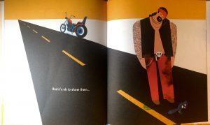
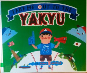 Take Me Out to The Yakyu is a story about a boy who loves baseball in American and Japan. Through out the story he explains his favorite part about baseball in both countries. I believe that this text would be considered a window because not a lot of people have the opportunity to get the same experiences as the boy in the story so they are unable to connect on a personal level. This text can also be considered a mirror since baseball is a big part of American culture. Although Americans are unable to connect with the Japanese baseball games, they both are the same sport. So if an American or Japanese reader picked up with book they would have the opportunity to connect with it. I really love how this text displays culture. It showed both American and Japanese culture equally and I actually learned some new things about Japanese culture from this book. The images are the main thing that really shows the different culture. On all the left pages there are images of what the boy does at American baseball games and on all the right pages it is an image of what the boy does at Japanese baseball games. So for example on page 10 he is talking about the food he gets at the games. On the left side there is a picture of a hot dog and peanuts, on the right side there is a picture of soba noodles and edamame. The images are full of color and have a lot of detail, and the text mirrors the pictures perfectly which helps describe what is going on in the culture one might not know well. One of my favorite things about the text is that on each page they have American sayings like fastball then on the opposite page they have the Japanese version of that saying. I never expected to learn a couple words in a different language from a children’s book. The text really shows two different cultures and that it is okay to have two different things part of your life. I also think that this text does a good job at showing that activities may not be as different as we think in other cultures. In both countries they are playing the same sport with the same rules. The only difference is the culture that is surrounding the game. I really enjoyed this text and I think it would be a great book to use in the classroom to show that culture can make people different and that it is important to have a good understanding of culture and that its okay to be different.
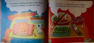
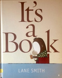 t’s a Book is a story about a mouse, a monkey and a donkey (the donkey is considered a jackass in the book). The monkey has a book and the donkey is very confused by the book because he only has technology and asks the monkey many questions about the book. Throughout the whole story the monkey tries to explain the book to the donkey. In the end the monkey gives up on trying to explain the process of using books and the concept of libraries.
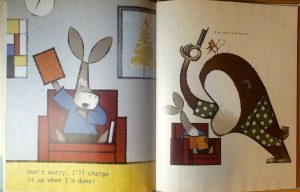
 Illustrator: Brooke Boynton Hughes