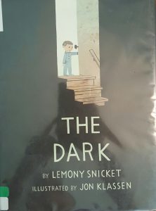

Title: The Dark
Author: Lemony Snicket
Illustrator: Jon Klassen
Publishers and Year: Little Brown and Company 2013
Number of pages: 36
Genre: Fiction
This book is about a little boy who is afraid of the dark that lives in his basement. The story starts off by him describing the dark. However, the dark eventually beckons to him and reveals to him the light within the dark (a light bulb in a dresser of the dark, scary basement). After this, the boy overcomes his fear of the dark, and they live in harmony.
This text functions as both a mirror and a door. It functions as a mirror because many children are indeed afraid of the dark. Throughout the book common fears and misunderstandings about the dark are addressed both in the text and in the illustrations. This allows the audience to remember their own fears and connect with the boy on a deeper level. I believe it is a door as well, however, because the readers get to watch as the boy overcomes his fear of the dark and learn the truth of the dark. This presents the reader with the opportunity to take the same leap in their own lives.
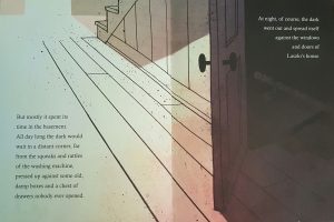
In this book, color is intensely used to distribute power. There is not a lot of color used in the book, but there is an intense use of shadowing. There is a stark contrast between the dark and the light, with the dark clearly overpowering. The ominous darkness that the illustrator used plays into the fear that is evoked through the author’s words.
In addition to this, the illustrator was very purposeful with his placement of the boy. On the first page the readers see him as a small, two-dimensional character squatting low to the ground on the left-hand side of the page, just out of the line of the shadow. So, although being in the lit part of the room helped to make the boy secure, he was depicted as small, weak, disadvantaged, and closed minded by the illustrator. As the story progressed, the pages got darker and darker while the boy got smaller and smaller. Eventually the boy wasn’t even on the pages anymore; it was only darkness. This speaks volumes to me of the power that the darkness held over the boy. Once the boy meets with the darkness and the colors/light have left completely from the pages, the story starts to change again. Color and light is slowly brought back into the frames quickly to show the vibrancy and lack of fear. Eventually the author brings the story back full circle, and it ends with the exact same picture of the boy in the left-hand corner. This time, however, there is contentment on the boy’s face rather than fear.
This intense use of shadowing helps the readers to follow the progression of fear and then freedom from fear throughout the book. Although the placement of the text does not provide any additions to the story, it is fairly plain text that simply serves the purpose of stating the words. This goes well with the lack of color seen throughout the story. This helps the book achieve its goal of unpacking fear in a new way. It reveals the benefits of facing fears in order to gain freedom from the fear that can be crippling. It empowers children to walk fearlessly and to be brave in the face of fear.
