The Keeping Quilt

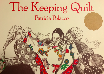
Author: Patricia Polacco

Illustrator: Patricia Polacco

Publisher and Year: Aladdin, 2001

Number of pages: 32 pages

Genre: Picture Book

The Keeping Quilt tells the story of a handmade quilt and a remarkable family. This quilt was made of Uncle Vladimir’s shirt, Aunt Havalah’s nightdress, Aunt Natasha’s apron, neighbor’s flowers and animals from scrap of clothing, great grandmother Anna’s babushka and old dress. It has been made and kept across six generations, along with love growing and time passing.

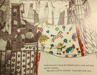
The author, who is also the illustrator, used two and six B pencils and acetone markers for the illustrations. The story starts when the author’s great grandmother Anna came to America and lived in New York City. The street looks very crowded with people across two pages who are minding their own business. Everything is black and white except Anna’s babushka which is bright red. Anna sits in the crowd, holding her umbrella, and her face seems to be absent from emotions. Some people look happy and are talking with each other.

Everything continues to be black and white except this babushka and later the quilt. When Anna went to school and started learning English, she seems scared in the picture. She stands in the left corner, looking down on the ground while other children try to talk to her. Then we see Anna alone dancing and swirling with her babushka up in the air. She seems very happy and free. We see three Annas in the picture which implies she is moving around.

Later the quilt was made. Anna, Anna’s mother and their neighbors sit around a big table. Everybody seems calm and immersed in their work. The quilt looks beautiful. The quilt was then passed on in the family and was used for various purposes. Each page contains a different event. In the end, the author is holding her baby girl Traci Denise. She believes someday Traci will leave home and take the quilt with her.

This beautiful quilt served as a window which helps us peek through this long family history. It leads us back in time to see the changes of the culture of society. When Anna and Sasha got married, men and women celebrated separately. When grandmother Carle and Grandfather George got married, men and women celebrated together but they still did not dance together. When the author’s mom and dad got married, friends who were not Jews came to the wedding. One thing that hasn’t changed is the family tradition of keeping things like gold, bread, and salt in the bouquet. Like the author said, “It is a wonderful way to not only introduce my remarkable family, but also demonstrate their personal triumphs, disappointments, and their ever-powerful love that has reached across six generations and an ocean of time.”

Posted in Uncategorized | Tagged , , , , | Comments Off on The Keeping Quilt

White Socks Only


Title: White Socks Only

Author: Evelyn Coleman

Illustrator: Tyrone Geter

Publisher: Albert Whitman & Company

Year: 1996

Number of Pages: 32

Tags: Culture, Diversity, Emotion, Family, Historical fiction, Picture Book, K-5, Taylor Krueger

Genre: Historical Fiction Children’s Book

Analysis: This book shares the experience of a young girl’s Grandma in Mississippi during her childhood. One day she went into town to see if it was hot enough to fry an egg on the sidewalk. During this time period segregation was apparent in the South. While out in town she saw a “Whites Only” sign on a water fountain, so she took her shoes off and stepped up for a drink in her white socks. She misunderstood the sign, so it was her innocence that set the response of others in motion. This brave experience sparked an argument based on hatred of color. She showed that bravery and some help from a magical friend could overcome hate.

The illustrations of this book are bordered by the edge of the page. The illustrations are fuzzy and have large visible strokes of color. This gives the images depth and a different perspective from the reader. The reader is viewing the illustrations from near the main character  almost as though the reader is right in the scene. There are moments throughout the scenes where the reader seems to be viewing the actions of the characters from afar. The illustrations allow the reader to peer through a window into this time period of racism in the South. They have the reader feel the emotions of the main character during her trip to town. Thus there is a connection of empathy toward and fear for the young girl.

The colors used throughout the book are soft and vibrant which give insight into the actions of the characters. The colors of the illustrations blend to the page that contain the text, which seems as if the image goes off the page. The use of brush strokes is apparent in all the illustrations giving them depth and a uniqueness.

There are many emotions that are shown through the facial expressions of the characters. The structure of the characters are depicted through the illustrations and add to the meaning of the text. Throughout the book the main character, Grandma, is shown to have the expressions of happiness, sadness, fearfulness, and confusion. She is perceived to be happy when she is walking into town and frying an egg on the sidewalk, and then sad and scared when she is confronted for taking a sip of water from the “whites only” drinking fountain. The main character is shown large in the illustrations where she is happy and enjoying the freedom in town as she seems to be confident. She is very small and lower on the page (in some illustrations actually lying on the ground) when she is confronted by a white male. The white male is shown to have the power as he is looking down at the young girl on the ground. The illustrations and text of the book share an ideology issue for the reader. Throughout the time of the book racism and segregation in the South was very prevalent. This book shows an example of how African Americans were treated during this time in history. The ideology of this book sends a strong message to the reader as they can experience the discomfort and uneasiness of the characters.

This book is a representation of a multimodal text as the words and illustrations interact to fill in the gaps for the reader. The text and illustrations elaborate the theme and important meaning of the book. The images are a visual representation of the words and allow the reader to further understand them. This book uses the images and text to send a strong informational message of history to a young audience.

Posted in Uncategorized | Tagged , , , , , , , | Comments Off on White Socks Only

Happy to Be Nappy

  1. Title: Happy to Be Nappy
  2. Author: bell hooks
  3. Illustrator/Photographer: Chris Raschka
  4. Number of Pages: 33
  5. Publisher and Year: Hyperion Books, 1999
  6. Genre: Realistic Fiction
  7. Analysis: Happy to Be Nappy is a celebration of all the different hairstyles that Black girls have. Whether long or short, styled or not styled, there is a reason to appreciate all different types of hair.

I view Happy to Be Nappy as a mirror for young Black girls who struggle to see value in themselves when looking at other texts. Representation is important at a young age and when everything around you is shaming natural hair, it is refreshing and uplifting to see a book that encourages being natural. The front cover portrays a young Black girl with her locked hair, hands on hips, and smiling, taking up a big portion of the cover. Next to the little girl is the title, and while the title is big, the little girl is bigger. This framework shows that this little Black girl, or ones like her, are the main focus of the book.

The illustrations in Happy to Be Nappy were drawn with paint. The colors used are very vibrant and alive; the color choice adds to the happy theme in the book. The book also uses a wide variety of colors, which I feel is symbolic of the different types of hair mentioned throughout the story. Happy to Be Nappy also depicts girls throughout the story smiling and having fun. The choice to show the young girls in the story as carefree was another way in which the illustrator could have been reaffirming Black girls that there is joy to be found in themselves.

Happy to Be Nappy does a great job in showing representation for young Black girls who may not otherwise see it in their everyday lives. In a sociology course I took last semester, we discussed the negative portrayal of Black women in the media. Seeing Happy to Be Nappy, by bell hooks, a Black Feminist, I was immediately drawn to this story. Through this book, young Black girls can learn to appreciate the many different styles that comes with having natural hair, as well as, learning to appreciate themselves.

Posted in Uncategorized | Tagged , , , , | Comments Off on Happy to Be Nappy

Mudkin

  1. Title: Mudkin
  2. Author: Stephen Gammell
  3. Illustrator/Photographer: Stephen Gammell
  4. Number of Pages: 32
  5. Publisher and Year: Carolrhoda Books, 2011
  6. Genre: Fantasy
  7. Analysis: Mudkin is the story of one little girl’s extraordinary day playing outside after a rain shower. The girl meets Mudkin, a friendly creature made of mud, who makes her the queen of a mud kingdom. The girl rules over Mudkin, and others like him, until a rain shower washes everything away. Although she is no longer queen, the crown Mudkin gives her lasts forever.

While I don’t see Mudkin as a window, mirror, or door, I do believe it is a story that is very relatable for many readers, young and old. The nostalgic feeling of being sent outside to play after a rainy day and letting your imagination run wild, is something which resonates with the young child in all readers. On the front cover of the book, Mudkin is front and center. I feel that this depiction of Mudkin symbolizes his importance throughout the book. Since Mudkin is a figment of the young girl’s imagination, this picturebook code can also be symbolic of her imagination and the fact that it is a driving force in the story.

Although, Mudkin is not a picture book, the book has multiple pages with no text that help to advance the story. I feel that this further plays with the concept of imagination in the story, because the reader gets to create their own dialogue for these pages. Moreover, when Mudkin speaks to the little girl, his dialogue is illegible. Where words would usually be, are instead, smudges of mud where the reader must use context clues to interpret. For younger readers, however, they might create a completely different dialect for the story than would older readers who are aware of context clues. In doing this, I believe that the author further relies on children’s imagination to help with the story.

The illustrations in Mudkin were drawn with watercolor paint, and this makes sense because the story takes place after a rain shower, so everything is wet. A lot of the drawings are also messy in a way; this adds to the depiction of playing in mud and getting dirty. Mudkin benefits from the illustrations in it; I believe that they add to the story. Overall, Mudkin is a tribute to a child’s imagination. Even when days are gloomy, children can still find ways to make the best of them. I believe that Mudkin does a great job in capturing that portrayal.

Posted in Uncategorized | Tagged , , , , | Comments Off on Mudkin

The Island

  1. Title: The Island
  2. Author(s): Armin Greder
  3. Illustrator/Photographer: Armin Greder
  4. Number of Pages: 32
  5. Publisher and Year: Allen & Unwin, 2007
  6. Genre: Fiction
  7. Analysis: In The Island, an unknown man appears on an island, shocking the natives of the land. The villagers wanted to send him back to sea, but the village fisherman suggested that they take him in so that he does not die at sea. The villagers’ irrational fear of the man eventually leads them to send him back out to sea.

I believe that The Island’s ideological framework is one that reflects our society and the way in which we handle refugee situations. The unjustified fear that people have of those who are different from us leads to hate and an unwillingness to accept them in our society because we fear that they will negatively impact us. This fear is seen throughout the story; the villagers succumb to mass hysteria and their irrationality causes them to expel the unknown man even when he has done no wrong. It is this ideology that makes The Island a mirror for readers.

Picturebook codes are prevalent throughout the story and help to enhance the symbolism that the author is trying to depict. On the cover of the book, there is a big black wall that takes up much of the page. The wall is also drawn from the perspective of someone looking up at it, giving the idea that we are outside of the island away from the secluded villagers. The images throughout The Island further help the author illustrate the story’s ideology. Whereas the man is naked and frail, the villagers are all heavy set with distorted or exaggerated facial features to show their anger and disgust with the man. The villagers are also drawn in with very dark/bold black outlines and clothing; the villagers can be thought of as a juxtaposition of the sea, which is also drawn as very dark and bold. The sea and the sky above, as well as the villagers, are all dark and gloomy.

In conclusion, The Island challenges readers to reflect on societal structures and how we deal with differences. The illustrator uses simple, yet bold illustration to develop the symbolism he wants to portray. The Island’s ability to be an easy read, while offering a strong critique of moral beliefs, makes it a very enjoyable book.

Posted in Uncategorized | Tagged , , , , | Comments Off on The Island

Train to Somewhere


Title: Train to Somewhere

Author: Eve Bunting

Illustrator: Ronald Himler

Publisher: Clarion Books

Year: 1996

Number of Pages: 32

Tags: Emotion, Family, Friendship, Historical fiction, Picture Book, K-5, Taylor Krueger

Genre: Historical Fiction Children’s Book

Analysis: This book shares the story of a young orphan girl, Marianne, on her journey to find a family. It shows her trip on the orphan trains and the stops along the way where people chose orphans to join their family. Throughout the book Marianne is waiting to see her mother’s face at one of the stops, but never finds her. The journey is tiring and allows Marianne to find strength and hope in herself to persevere and end up with a caring family.

The illustrations of this book take up one whole page. The images are bordered with a thin black line that keeps them from going to the edge of the page. These borders are thin which could represent the speed of the train, as the characters are constantly moving on their journey to find a family. The framed illustrations allow only a limited glimpse into the world of the characters. The reader seems to be always watching from afar rather than being present in the scenes. The illustrations create a window effect for the reader by allowing the reader to look into another world of the past. It lets the reader peer into the lives and feel the emotions of the characters during their journey. There are throughout the book small illustrations that are present on the pages that contain the text. They are always images of the train traveling to its next stop, which shows the scenery and setting of the locations.

The colors used throughout the book are very warm and connect to the story and emotions of the characters. There are not many bright colors as a majority of the time the use of browns, beiges, and grays are present. The illustrator used watercolors to illustrate the book, which adds great depth to the images and characters. It’s very eye catching and interesting to look at from the reader’s perspective. There is a bright use of color to represent the jacket of the character Nora, who was close friends with Marianne. The bright color blue is used to show her youth and innocence throughout the book.

The illustrations of the characters and settings have the perceptual view of orphan children finding a family to call home. There are depictions of young children jumping into the arms of their new parents, children riding the train, and the fear of many while at the train stops. The structural view of the characters show a representation of hope. There is a constant pattern of facial expressions of the characters throughout the book as the beginning illustrations show sadness and worry that the orphans will never be picked. Throughout the novel the succession of children being picked and joined with a family shares facial expressions of happiness and comfort of finding a home. For the most part all of the orphan children are shown to be the same size, but there are moments where the more valued children are illustrated larger and have more youthful facial expressions.

This book shows the historical ideological issue of orphan trains and children without homes and families. It gives information on a topic that might have been unknown by the reader. It shows the transformation of children coming from orphanages and finding a caring family. It allows young children to understand the stories of the characters and the struggles of their journeys.

This book is a representation of a multimodal text. There is an interaction between the text and the illustrations that use each other to fill in the gaps for the reader. The illustrations further elaborate the meaning of the text and gives the reader a visual representation of the words. The text and illustrations enhance the message of the story and helps share the history of the orphan trains. They are both equally important in order for this message to be understood by the reader.

The introduction of the book elaborates the story of the characters and gives background information of the orphan trains. It allows the reader to further understand the impact the orphan trains had on children and their newfound families, as there were a lot of children who went through this journey. The introduction shares to the reader that this book is based on true events, but the characters and locations are fictional.

Posted in Uncategorized | Tagged , , , , , , | Comments Off on Train to Somewhere

Those Shoes

  1. Title: Those Shoes
  2. Author(s): Maribeth Boelts
  3. Illustrator/Photographer: Noah Z. Jones
  4. Number of Pages: 35
  5. Publisher and Year: Candlewick Press, 2007
  6. Genre: Realistic Fiction
  7. Analysis: In Those Shoes, Jeremy wants a new pair of shoes, the ones that everyone is raving about. When Jeremy asks his grandma to buy him a pair, she tells him that they don’t have room for “want,” only “need.” In the end of the book, Jeremy realizes that things he has are more important than anything he could ever want.

Although Those Shoes is relatable for many young children, as a Black male speaking from personal experience, this story resonated with me heavily. I have seen and experienced Jeremy’s situation first-hand. As a child, for some reason, image is deemed as important; everybody wants to be cool or have that “cool” item. Often times, we get wrapped up in the idea of wanting material items in order to fit in. We get so consumed in wanting, that we take for granted the things we are fortunate to already have. Jeremy’s grandma is symbolic of the parents or caretakers who may not be able to get a child everything they want, but who make sure that their children are never in need. Those Shoes is a mirror for me simply because I see myself and so many others in Jeremy. However, for those who are not familiar with Jeremy’s situation, this is a window or door.

On the front cover of the book, “Those Shoes” are in big letters on a billboard, as well as a picture of the shoe. This billboard is above the characters, giving the impression that the shoes are bigger than the characters. In a circle, on the right, are three kids flaunting their new shoes, and on the left, is Jeremy, looking at the other children with his head hanging low. The cover shows Jeremy’s insecurity, contrasted with the other children’s confidence. I felt that the illustrations in Those Shoes did not add much to the text. For someone reading this story, they would not need the pictures to understand the story.

In conclusion, I feel that Those Shoes helps to teach children the value of intangible things. A loving family and good friendship are two things that Jeremy would not trade for the world. Although Jeremy did not get his shoes, he is appreciative that his grandma made sure he had warm snow boots, which was something Jeremy needed.

Posted in Uncategorized | Tagged , , , , , , | Comments Off on Those Shoes

Fly Away Home


Title: Fly Away Home

Author: Eve Bunting

Illustrator: Ronald Himler

Publisher: Clarion Books

Year: 1991

Number of Pages: 32

Tags: Emotion, Family, Fiction, Picture Book, K-1, 2-3, Taylor Krueger

Genre: Fiction Children’s Book

Analysis: This book shares the story of a father and son who are homeless and live in the airport. They have one rule of living that they follow: “don’t get noticed,”. The young son has multiple questions of what life is like outside of the airport, as he wants to go back to the days before his mother died. His father works on the weekends to support his son and hopefully have enough savings to move out of the airport. The father and son share their daily routines and experiences that make up their life. At the end of the day, the son knows his father is providing the best he can for his family.

The illustrations of this book are bordered by the edge of the page. The illustrations are fuzzy and allow the character of the brushstrokes to show. The visible brushstrokes gives the images depth and an interesting perspective for the reader. The reader is present in the illustrations as they are viewing the actions of the characters from afar. The illustrations 
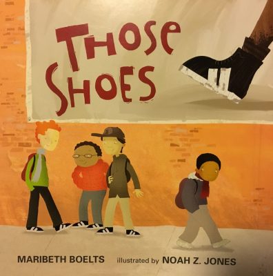
allow the reader to peer through a window into the lives of the characters as their experiences may be different than many other people. The images share the emotions and worries of the characters with the reader as there is a connection through the illustrations.

The colors used throughout the book are sad and dark which give insight into the emotions of the characters. The colors are mainly blue, which could represent the sadness of the young son as he wonders what life would be like outside of the airport. He wants to fly away like the bird he saw by the window in the airport. The use of brushstrokes is apparent in the illustrations giving the images depth and a greater interest from the reader.

There are multiple emotions that are shown through the facial expressions of the characters. The structure of the characters are depicted through the illustrations and elaborate the text. Throughout the book the young son is shown to have the expressions of sadness and happiness. He is perceived to be sad when he explains the current living condition of himself and his father at the airport. He wants life to go back to the way it was before his mother died, but he knows that will not happen for quite some time. He is perceived to be happy when he explains his friendship with Denny and the future he can have once his father saves enough money to buy an apartment. The main characters are shown to be smaller than the surrounding people in the illustrations. This could be because of the lack of power they have in the crowds of people as they are homeless, or it could represent their rule of not being noticed.

The illustrations and text of the book represent an ideological issue for the reader. Throughout the book homelessness is present as it shows the struggles families have through this experience. It shows how real this issue is in our country and shares the story of a family going through this devastating state. The ideology of this book sends a strong message to the reader as it is often unknown to many young children the effect homelessness has on families.

This book is a representation of a multimodal text as the words and illustrations work together to fill in the gaps for the reader. The text and illustrations enhance the message and important meaning of the book. The images are visual representations of the words and allow the reader to further understand the theme of homelessness. This book uses the images and text to send a strong message to young children.

Posted in Uncategorized | Tagged , , , , , , | Comments Off on Fly Away Home

Ron’s Big Mission

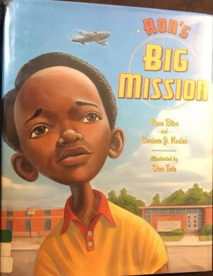
Author: Rose Blue and Corinne J. Naden

Illustrator: Don Tate

Publisher and Year: Dutton Books for Young Readers, 2009

Number of pages: 32

Tags:  

Analysis: This book’s setting takes place in South Caroline in the 1959. The main character is Ron who is a nine-year old African American boy. Ron enjoyed going to the Lake City Public Library. He loved to read books. Ron looked for books that showed children like him, but that was difficult because there weren’t many books about black children on the shelves. Instead Ron, found books about airplanes. In a segregated time, Ron was not allowed to check out books for himself because of the color of his skin. He had to rely on either reading the books at the library or the kindness of others to check them out on his behalf. Ron went on a mission to obtain the right to check out books. He demanded the right to check out his own books. He took a stand and despite others telling him to just let it go, his persistence enabled the librarian to give in and Ron got his own library card. The story is a fictionalized account of a real incident of Ron McNair who grew up to be an astronaut.

This book can serve as window to understand some of the difficulties that aroused during times of segregation. This is also an inspirational story of standing up for what you believe in. Although Ron was only nine years old, he made a big difference. At his young age, Ron knew it was not fair that he did not have the opportunity to check out books and did something about it.  This book can also serve as a mirror for children who are of color or for children who have an issue about which they hold strong opinions about. This book does a good job illustrating how a young boy can make a difference. This book can also be a door to teach children that they can stand up for what they believe in and make a difference.

The ideology this book explores is persistence during the time of segregation. This book is based on an event of Ron McNair’s life. He grew up to be an astronaut. Ron was a hero in his neighborhood in Lake City for being the boy who stood up for his rights. When he grew up, he was a national hero, serving as a US astronaut. Mr. McNeir lost his life in the space shuttle Challenger.

The illustrations used in this book use an open frame, so our view is from the outside. The images add to the words. The cover shows Ron taking up most of the page. This indicates that he is strong, since he goes on a mission that makes a difference in the world. In many of the pages Ron is on the right side. This is indicating that he less secure and moving forward. He is on the move. When Ron is demanding to be able to get his own card he is higher on the page than the rest of the characters, indicating higher status. The colors are darker which indicate more confinement

Posted in Uncategorized | Tagged , , , , , , , | Comments Off on Ron’s Big Mission

The Matchbox Diary


Title: The Matchbox Diary

Author: Paul Fleischman

Illustrator: Bagram Ibatoulline

Publisher: Candlewick Press

Year: 2013

Number of Pages: 40

Tags: Culture, Emotion, Family, Fiction, Historical fiction, Picture Book, K-5, Taylor Krueger

Genre: Historical Fiction Children’s Book

Analysis: This book shares the story of a young girl and her grandfather and the diary that impacts their life. The grandfather shows the girl his matchbox diary that contains memories from his past. His family was immigrants from Italy, and they experienced the long journey on the ship to America. Grandfather told his life story and the reasons for putting the items in his matchbox diary. The young girl appreciates her grandfather’s story and begins to think of momentos she can add to her very own matchbox diary.

The illustrations of this book take up the majority of the page. The illustrations of the grandfather’s journey of immigrating to America are bordered by thick lines. The borders of thick lines could represent the length of the journey as it was a long and miserable period of time. The bordered illustrations allow the reader a small glimpse into the world 
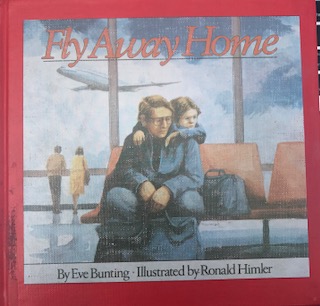
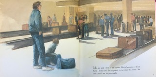
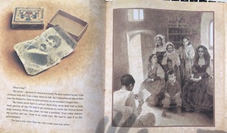
of the characters. It lets the reader peer into the experiences and journeys the characters endured during this time period of immigration. The illustrations create a window effect for the reader to look into a world of the past. The reader seems to always be watching the character’s from afar due to the bordering of the illustrations. There are illustrations that are from present time where the grandfather is talking to the young girl. These images are bordered by the edges of the page rather than thick lines. The changes of imagery show the reader the change in the time periods. There are small illustrations that are present on the pages that contain the text. These are always images of the matchboxes and the items that are placed inside during the grandfather’s journey.

The colors used throughout the book change as there are different time periods represented. The illustrations that share the grandfather’s immigration experiences are in black and white. They are faded images that allow the reader to understand the aging of the time. The illustrations of present time are bright and cheery. There are shades of red, brown, and blues to share the emotions of the characters.

The illustrations of the characters and settings have the perceptual view of the grandfather sharing his memories with his granddaughter. There are depictions of his family receiving letters from their father, him as child traveling on ship to America, and the experiences of his family adjusting to their new life in America. The structural view of the characters show the representation of strength. There is a transformation of facial expressions of the characters throughout the book as the beginning illustrations show sadness and worry that the family will not make it through the long journey to America. Throughout the book the family finds comfort in their new home and the grandfather is proud of his matchbox diary. These illustrations show happiness and calmness in the facial expressions of the characters. The characters throughout the book are shown to be the same size, but once the grandfather learns to read and write and make a living for himself he is depicted to be more confident and larger on the page.

This book shows the historical ideological experience of immigration for many families. It gives information on the journey people have to change their lives for the better. This book shares the story of a family going through the rough ship ride to America in order to reconnect with their father. It allows young children to understand the history of immigration and the problems that people were faced with on their journey to America.

This book is a representation of a multimodal text. There is an interaction between the text and the illustrations that fill in the gaps for the reader. The illustrations enhance the meaning of the text and the stories that are shared. It gives a visual representation of the words throughout the book. The text and illustrations elaborate the powerful and heartfelt experiences of the characters and the overall message of the story. They are both equally important in order for the message to be understood by young readers.

Posted in Uncategorized | Tagged , , , , , , , | Comments Off on The Matchbox Diary