In The New World: A Family In Two Centuries

Image result for in the new world a family in two centuries

  1. In The New World: A Family In Two Centuries
  2. Author: Gerda Raidt
  3. Illustrator: Christa Holtel
  4. Publisher and Year: Charlesbridge Publishing, 2015
  5. Number of Pages: 37
  6. Genre: Nonfiction
  7. Gerda Raidt’s book, In The New World: A Family In Two CenturiesGrandpa Takes Me To The Moon, is the heartwarming story of a German-American man and his young children/wife grandson returning to the German homestead his great-great-grandparents left 150 years earlier, something the author claims to have to have done with her own family. The author does not overwork much about this story, but she does do it in a way that’s subtle yet potent enough to get wedged in the minds of children, showing how good communication from author to reader is so important in breaking down barriers in communication that might have otherwise existed due to this book being translated from its original German and overcoming that issue. So far as the picturebook codes are concerned, the primary code in this book is that of colors. Throughout the book, the vast fields and towns of Western Europe and the American Midwest (where the family is from in the US) are compared and contrasted, with bright colors throughout, showing that the situation is rosy throughout by the book’s estimation by the time the conclusion rolls around. The illustrator chose a lovely strategy of using many shades of watercolors for the European continent, and it is very poignant when contrasted with the dark, gloomy shades that are also an integral part of the book’s artwork. Finally, when it comes to special features, the only one that comes to mind is just a well-written summary of the family’s homesteads in Nebraska and Bavaria at the end, and a touching anecdote about the author’s great-uncle (from whose perspective the 19th-century portion of the book is written). The ideology of the book is that the author wants everybody to be able to connect with their heritage, while still fitting in with their fellow citizens of the country in which they currently reside. Raidt shows us this ideology by providing a safe, fun way to teach about tolerance and diversity through a family’s search for the American Dream, and how the true story did just that.
Posted in Uncategorized | Tagged , , | Comments Off on In The New World: A Family In Two Centuries

Grandpa Takes Me To The Moon

Image result for grandpa takes me to the moon

  1. Grandpa Takes Me To The Moon
  2. Author: Timothy R. Gaffney
  3. Illustrator: Barry Root
  4. Publisher and Year: William Morrow and Company, 1996
  5. Number of Pages: 32
  6. Genre: Whimsical Fantasy
  7. Timothy R. Gaffney’s book, Grandpa Takes Me To The Moon, is the heartwarming story of an old man and his young grandson discussing the Apollo missions (and coming in and out of the Earth’s atmosphere firsthand) is told through images that gently evoke the spirit of hope and optimism about America’s place in space during the late 1960’s and early 1970’s. It describes how, during an otherwise tumultuous era, the American public just stopped worrying about the struggles they had in their everyday lives and got together to salute the brave men who went into the cosmos in the name of science and peace, something the author clearly values in how he nostalgically describes the real life impact those missions had on him as a young boy interacting with the people around him at that time. Readers of this story might ask themselves “Why do we have so much strife on this planet when science can achieve such amazing feats as the NASA Space Program?”-a fair line of inquiry in my opinion. However, the author does not get furious or overworked about this or any other issue, but he does do it in a way that’s subtle yet potent enough to get wedged in the minds of children, showing how good communication from author to reader is so important in breaking down barriers  and overcoming whatever squabbles we may have here on Earth. So far as the picturebook codes are concerned, the primary code in this book is that of colors. Throughout the book, outer space is a limitless expanse of black. Root chose a lovely strategy of using brightened-up colors on Earth’s surface in many shades of watercolors, showing that for this book, the Earth’s surface is much more diverse and rosy. Finally, when it comes to special features, the only one that comes to mind is just a well-written summary of the Apollo missions at the beginning to provide context for the reader. The ideology of the book is that the author wants everybody to be able to fit in with their fellow human beings to realize the things that unite, rather than divide, us. Gaffney shows us this ideology by providing a safe, fun way to teach about tolerance and diversity through one of history’s greatest moments, and how the moon landing and subsequent missions made a difference in how the world saw itself in general.
Posted in Uncategorized | Tagged , , | Comments Off on Grandpa Takes Me To The Moon

Gilberto and the Wind

Image result for gilberto and the wind

  1. Gilberto and the Wind
  2. Author: Marie Hall Ets
  3. Illustrator: Marie Hall Ets
  4. Publisher and Year: The Viking Press, 1963
  5. Number of Pages: 32
  6. Genre: Whimsical Fantasy
  7. Marie Hall Ets’s book, Gilberto and the Wind, is the heartwarming story of a young Latino boy interacting with the wind as it takes his kite and sailboat away, whistling ominously before it caves into its guilt and gives both back to him at the end. Then, the young lad sleeps peacefully under a willow tree as the wind slowly lulls him into slumber. The author does not get furious or overworked about this or any other issue, but she does do it in a way that’s subtle yet potent enough to get wedged in the minds of children, showing how a simple, cute story about the wind and a young boy is so important in breaking down barriers between children and nature (a message just as, if not more relevant, now as in 1963) and overcoming ignorance of natural resources’ worth. So far as the picturebook codes are concerned, the primary code in this book is that of colors. Throughout the book, the background is in beige and white. Ets chose a lovely strategy of using three shades of watercolors for this book, and it is even more poignant when contrasted with the colorful, boisterous shades of many children’s books that are seen today. Finally, when it comes to special features, there are really none-it is just a well-written, onomatopoeia-filled classic piece of children’s literature. The ideaology of the book is that the author wants everybody to be able to fit in with their fellow human beings while being able to appreciate the things in nature that need to be appreciated, rather than destroyed by us, while at the same time not being too preachy and just talking about the wind in a year when Rachel Carson’s Silent Spring came out, a much more heavyhanded view on the environment. She shows this ideology by providing a safe, fun way to talk about the wind and nature in general.
Posted in Uncategorized | Tagged , , | Comments Off on Gilberto and the Wind

Big Hair Don’t Care

Author: Crystal Swain-Bates
Illustrator: Megan Bair
Published: Goldest Karat Publishing 2013
Pages: 30
Tags: Jamal Jackson, Realistic Fiction, k-5, Picture Book, Multicultural, Fashion, Diversity, Crystal Swain-Bates
Genre: Fiction
Analysis:
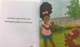
Lola is a young African American girl with big curly hair. She is proud of her hair regardless of how other people see it or the downfalls of having giant hair. She loves her hair so much that she tells everyone every chance she gets that she loves her hair and even styles her dogs hair to be like hers.
I love this book. The ideology of self-love for young black girls is necessary to be communicated. This book serves as a mirror for girls and boys that may have curly natural hair. This book helps boost self-esteem and give confidence to a child that may be self-conscious about having hair that is different than their peers. Sometimes children can say mean and hurtful things to other children of color about their hair and schools have even gone as far as to ban natural hair, labeling it too distracting. This message is one that I can even see myself giving to my children. Lola is confident and carefree, as children should be at this age. The author even brings in other historically African American hair styles as reference and Lola loves them all. She is most passionate about her hair how it naturally grows.
The illustrations help to communicate the ideology. The focus on many of the pictures is the hair. The depictions of the African American characters as vibrant and happy. The full page illustrations pull you into Lola’s world, while the vibrant bright colors help readers feel the pure joy and happiness in this young girl who is unapologetically black and happy. The illustration of the children going to school is also very diverse which looks more like a school now day would look.

Posted in Uncategorized | Tagged , , , , , , , | Comments Off on Big Hair Don’t Care

My Friends

Author: Taro Gami
Published: Chronicle Books 2005
Pages: 34
Tags: Jamal Jackson, Fiction, Preschool- 3rd, Picture Book, Friendship
Genre: Fiction

Analysis:
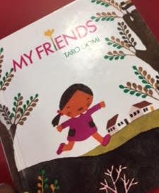
This book is about a young girl who goes on a fun filled adventure in which she learns many aspects of everyday life. While she is learning she is also spending time with and appreciating the nature around her. She learns all of the abilities from her friends, which consist of both animal and human kind alike.
This story is simplistic and better suited for younger children. The use of vibrant color and animals helps children to learn to identify animals and be entertained while they read. This book serves as more of a door as it encourages readers to find the fun and enjoyment in reading and learning. There are a few messages being communicated through the characters learning adventures. The first message that I noticed was that animals are friends. A majority of the book is the girl learning from her friends that are animals and enjoying them. This ideology is one that can be beneficial to communicate so that children have a love for nature. Another message is that people who teach you things are friends. In most situations, this is a good thing because friends help you better yourself. The last ideology being communicated would be that learning is an ongoing process. By communicating these ideologies children learn from this book that learning is a fun and never ending process.
The illustrations help add to the lightheartedness of the story. The girl is a minority which is a positive but also is always drawn happy. She is happy to be learning, this helps communicate the ideologies. The images are also all bright and colorful and the picture book code of color suggests that this makes the images be more positive and happy. The only problem I could see is the drawing of fierce animals as cute and cuddly might send the wrong message, but with a little cautioning from parents this can be overcome. Overall, the illustrations add to the narrative and helped communicate the ideology.

Posted in Uncategorized | Tagged , , , , , | Comments Off on My Friends

This is the Dream

Author: Diane Z. Shore & Jessica Alexander
Illustrator: James Ransome
Published: Harper Collins 2009
Pages: 40
Tags: Jamal Jackson, Historical Fiction, Family, Culture, Diversity, Juvenile Fiction, k-5,Diane Z. Shore, Jessica Alexander, Award Winning
Genre: Historical Fiction

Analysis:
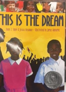
The story is about the Civil Rights movement. The story is told in poertry form and starts during times of segregation and Jim Crow. The story progresses softly, covering the leaders and actions that helped to change society and finishes with examples of a diverse and intermixed society.
The dream that the title is referring to is the dream mentioned in Dr. Martin Luther King’s I have a dream speech. The book serves as a window and educational material for children learning about the civil rights movement and the progress of society. The author communicates through the text alone that times were different and has improved to reach the dream of equality. It briefly glosses over topics like separate water fountains, libraries and bus privileges. The texts also include the various heroes and actions that lead to the change required. The use of the illustrations is what really adds to the emotion of the text.
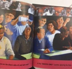
The use of illustrations allow for the message to be communicated more clearly. For example the words alone may not show the differences in schooling and resources in the library. By juxtaposing the images of the two communities, the illustrator shows how inaccurate separate but equal really was. The use of real images of people’s faces from the time in the margins also shows the climate surrounding the issues and actions of the brave activists. The faces around the boarders when the sit ins were happening and the faces in the crowd when the black students entered the white school both add emotion to the story. Through the faces you are able to feel the anger during the time. The illustrations toward the end also help to show how much better the times are. The depiction of diverse groups of people all being happy towards the end suggests that the time we live in now is truly the dream those activists had for society. Overall the illustrations play a huge part in communicating the problems and improvements in society during the time and now.

Posted in Uncategorized | Tagged , , , , , , , , , | Comments Off on This is the Dream

On Market Street

Author: Arnold Lobel
Illustrator: Anita Lobel
Published: Harper Collins 1981
Pages: 40
Tags: Jamal Jackson, Fiction, Award Winning, Preschool- 3rd, Alphabet, Anita Lobel, Arnold Lobel
Genre: Fiction

Analysis:
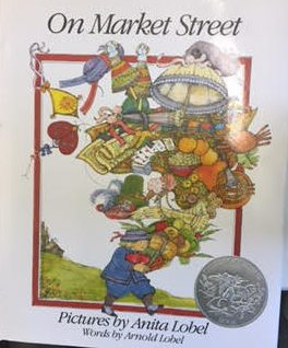
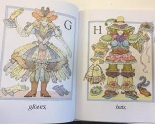
A boy wakes up and goes down to Market Street to buy a few items for a friend. When he recounts sll of the items he was able to buy, he goes through the list A to Z describing what he got. Each item being described is transformed into a vibrant outfit.
This book does not have much of a plot, but it is an award winner for its illustrations. The drawings used for each letter are fascinating and creative. On each page there is a framed image and the image is of a person dressed as or made up of items that can be found at the market. A younger reader would get real enjoyment and entertainment from seeing the pictures, but would also get practice at learning the alphabet. The word and objects used are simple ones that can be easily learned by the children but also make the illustrations interesting. Like zipper for Z is a cool word but the illustrations of a man made of zippers is also an interesting drawing. I have critiques on the representation of the book however. The characters are all white which isn’t a bad thing but could be better. If characters can be made out of ice cream they should be able to be made out of varying ethnicities.
The only ideologies I can see being communicated is that the market, or shopping, is a fun experience. It’s also interesting that that items were all given to his “friend” when he returned home. This could be a message about sharing or giving being a fun thing to do. As a young reader it would be easy to learn messages of materialism through the purchasing of all these items but the boy gives it all away reminding the children that the fun was in the shopping and trying on of different items not necessarily having the items.

Posted in Uncategorized | Tagged , , , , , , | Comments Off on On Market Street

Freedom on the Menu: The Greensboro Sit-ins

Author: Carole Boston Weatherford
Illustrator: Jerome Lagarrigue
Published: Puffin Books 2007
Pages: 32
Tags: Family, Culture, Realistic Fiction, historical Fiction, picture book, k-5, Race, Carole Boston Weatherford
Genre: Realistic Fiction

Analysis:
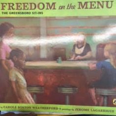
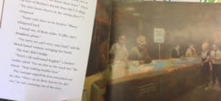
The story follows a brief time period in Connie’s childhood during the civil rights movement. Connie wonders why she is not allowed to be served at a lunch counter and one day witnesses a group of Black men doing a sit in at the same lunch counter. As time goes on and sit-ins and protests sweep the nation Connie finds herself surrounded by activism from the people in her life. After getting news that the lunch counter was serving Blacks, she went and finally got her banana split.
The story serves as a picture book way to introduce the idea of racism and the civil rights movement to children. The Greensboro Sit-Ins were a key part in the growth of the civil rights movement and should be discussed. The use of a child’s point of view makes it an easier read for the children who might be looking to learn about the way society once was and how peaceful protests took place to fix it. The book also serves as a nice tool for parents looking to educate their children on the times. The use of no names for the rest of Connie’s family makes it where the reader can see their family reflected in each of the characters. This allows for the roles each character plays to represent any one of the young people that courageously joined the movement. At one point even Connie wants to join but could not. This reflects the call to action many felt during the time and allows readers to feel it as well. The ideology being communicated is one of praise for the non-violent protests and discontent with the times. This is communicated best through the child who just wants her banana split and cannot figure out what is preventing this. I feel like the banana split symbolizes the freedom that she wanted and eventually got.
The use of illustrations add to the text. The paintings follow closely with the story. As the mood of the story shifts from unsettling to content, the illustrations go from dull to vibrant. The use of blurred looking oil paintings give an older, flash-back feel to the pictures. This allows for readers to feel that the time period is becoming a distant memory, but is very real. In the part of the book before the sit ins, the pictures feel cold and uninviting but once the protests begin you can feel the colors coming to life leading up to the vibrant banana split at the end.

Posted in Uncategorized | Tagged , , , , , , , | Comments Off on Freedom on the Menu: The Greensboro Sit-ins

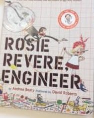
Rosie Revere, Engineer

Author: Andrea Beaty
Illustrator: David Roberts
Published: Abrams Books for Young Readers 2013
Pages: 40
Tags: Adventure, Diversity, Science, Fiction, K-5
Genre: Fiction

Analysis:
The main character is a girl, Rosie, who has dreams of being an engineer. She is great at building things, but her favorite uncle made fun of her for a failed design. Her motivation is given back to her by a distant aunt that happens to be Rosie the Riveter. After becoming motivated again she would build any and everything she wanted, vowing to never give up on her engineering dreams again.
This book is a great book in terms of representation. The characters throughout the book are multifaceted and diverse. Having a female protagonist helps the book serve as a mirror for young girls who may want to go into a STEM field but get discouraged because of certain ideologies which communicate that girls can’t be engineers. The Ideology that women are strong and can do “men’s” work is communicated throughout the text. Bringing in Rosie the Riveter, the symbol for strong and empowered women during WWII, as a source of encouragement is very symbolic. The message basically becomes you can do it because women of the past have done it and believe in you. The narrative also serves as a door as it can lead to young girl readers following their dreams.
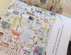
The illustrations throughout the text also help add to the ideology. The small rosy cheeked main character is young and depicted as fun. When she is drawn at home, or in her “lab” she is surrounded by hundreds of inventions and gizmos. Many of them look silly and bizarre but I would argue that is the point. The fact that most of her inventions look as though they come right out of a child’s imagination communicates that it does not matter how silly it may seem, always use your imagination. The illustrator also uses vibrant colors on most pages to add fun imagery alongside the fun rhyme scheme used in the text. The light hearted fun aspect of this book allows for the social justice aspect of the book to be added without needing to be too serious. This creates the perfect type of book to read to your young daughters that you want the world for.

Posted in Uncategorized | Tagged , , , , , | Comments Off on Rosie Revere, Engineer

Knock Knock: My Dad’s Dream For Me

Author: Daniel Beaty
Illustrator: Bryan Collier
Published: Little, Brown and Company 2013
Pages: 40
Tags: Award Books, Culture, Diversity, Family, Realistic Fiction, Fiction, Father, Emotion, 2-3, 4-5, Jamal Jackson,
Genre: Realistic Fiction

Analysis:
The story follows a young African American boy who plays a “knock knock” game with his father every morning. One day the knocks stop coming and the boy is left sad and wondering where his father is. In an attempt to contact him, the boy writes a letter to his father only to find that a response mysteriously appeared. In the response the boy is encouraged to be strong and learn to live without his father.
In analysis of this text, the first topic to discuss is the framework of the book as a window, mirror and door. Although the story is about a child who lost his father to incarceration, the story does not explicitly say this giving it the power to shed light on the life of a fatherless child, regardless of cause. This can create a window for someone on the outside trying to gain a perspective on how it might be to grow up without a father. The story mainly serves as a mirror and door combination however. The book delivers a message of love and encouragement in the place of the father. For a fatherless child that sees himself reflected in the boy, the love that the book provides acts as a door for the possibilities that a child has at maturing and becoming an adult without their father.
The illustrations in the book come in two forms, ones that are not framed and close up and ones that are framed. The pictures that run off the page are inviting and warm; these illustrations also happen at times in the text where the boy is excited about and enjoying life. The ones that have frames are when the boy is reflecting on his father’s absence and when he is reading the letter his father wrote. This could be a parallel of how the boy feels about his father at the time. He is full of love when thinking about his father at first, but near the end his father becomes a distant memory. Once the boy reads the letter about how to love himself and become a man without him, the pictures are full page and inviting again. This reflects the love being back even though it came in the form of a letter.
There are also picture book codes that are present. When the boy is writing to and reading the letter from his father he appears more times on the page than usual. The code of diminishing return suggests that it reflects the character losing control. This shows how he is no longer in control of his emotions about his father. When reading the reply it is a foreshadowing of how he is about to regain the love he was missing and not be in control of it. The code of colors also applies. The character and background is bright until the boy starts to forget his dad. Afterwards the colors take on a darker hue until the response letter arrives.

Posted in Uncategorized | Tagged , , , , , , , , , , , | Comments Off on Knock Knock: My Dad’s Dream For Me